Nights And Mares Toys is my line of unique and unusual dolls, skulls, and taxidermy displays. In this article I will focus only the dolls. Some of these characters are figments of my imagination, while others are very specific commissions. From elegant ladies to wild winged shape-shifters, each of my creations is made with all of my heart and all of my craft. I take into account every possible little detail, including undergarments that will never see the light of day, nail polish, individual hairs on the eyebrows, jewelry that actually sits in pierced holes, etc.
Nights And Mares is a strictly no-kill workshop. Every taxidermy element, every feather, or bone, or tooth, or wing or hoof, are specimens that I gathered from local roadkill or natural farm deaths. I live and work in a rural part of Chile, and there is no shortage of animal remains if you know what to look for.
Lenora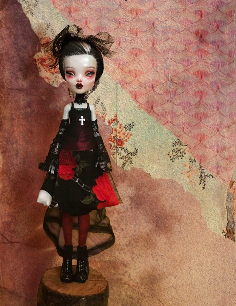
PERSONALITY: Leonora is a porcelain-skinned beauty and she knows it. Her skin is flawless, with tiny freckles like intricate constellations, ruby red lips, and half closed eyes.
 DESCRIPTION: Lenora’s face was an absolute joy to create. It took days of delicate painting with the tiniest of brushes to get her skin tone and expression just right. What took even more time and required even more tiny detail was her dress. Hand made from three types of cotton fabric, chiffon, lace, ribbon and leather, her dress is light weight, elegant and perfectly fitting. Underneath she has black lingerie and red high stockings. She wears long black lace gloves and a matching ribbon on her black and silver hair. For jewelry she wears only a black lace choker and a simple silver cross on her neck. Even her fingernails are individually painted. Her tiny boots are handmade from leather, plastic and adhesives, with hand-painted tiny gold buckles. She is a picture of perfection. She stands perfectly balanced on a wood cut stand, with a soft felt base. Together with the stand she measures about 26 cm tall.
CURRENT HOME: Among dolls and curiosities. USA.
Hel
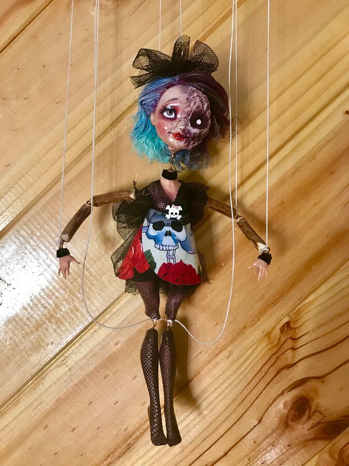
PERSONALITY: One of the three children of Loki and Angrboda, Hel is the ruler of the land for the dead that did not die in battle. In life, Hel was a beautiful and polite girl. Well, at least half of her was. Her other half was rotten and withered like that of a corpse. Hel is well mannered and elegant. She has nothing against living people, but she prefers the company of the dead. Her kingdom “Hel” is not a place of punishment, it is a great hall that provides a sanctuary to all those who did not die fighting. Her hall is for women, and children, and the old, and the sick… for all of us who will most likely not go to Valhalla.
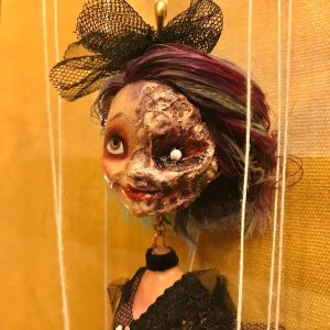 DESCRIPTION: My Hel is a tiny marionette. As she hangs effortlessly on her strings, she appears weightless and elegant; polite, but a bit of a tease. The half of her face that is alive is innocent and radiant, like that of a gullible child. The side that is dead is void of all expression of life, but it is neither evil nor scary, it is simply dead. Death is a part of every life, and Hel wears that side of her without hesitation or embarrassment. She knows that were are all already dead and she does not judge us for it.
In the hands of a handler, however, Hel can move her arms, wrists, knees, and bow her head, in a playful manner.
She is hand crafted and constructed from wood, plastic, discarded doll parts, copper wire, and cloth. Her arms are made of wood from the forest by the river where I live – hand carved and polished to match her size and personality. Her face is sculpted and painted as well as lacquered for protection. Her hair cut, colored and styled in various shades of blue, purple and black. Her dress and undergarments are tailored and hand stitched to present a cute but daring little girl.
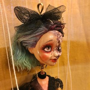 Hel’s lacquered, black, wooden handle is lightweight and easy to use with one hand or both. The strings are threaded through tiny holes and anchored by shiny black beads. On their other ends, the strings are attached to Hel’s joints. The attachments are easy to remove should the owner chose to replace the strings, lengthen or shorten them, or move them to different joints on the body. As a matter of fact, she does not even have to be a marionette. Many of the strings can be removed and she she can be hung as a display doll, or sat, or laid out, or otherwise posed, should one find the strings unsightly or the movements unnecessary.
Head to toe she measures 28cm. Arms outstretched, fingertip to fingertip she is also 28cm. With her current strings from handle to toe, the whole assembly is 66cm.
CURRENT HOME: Home of a doll and taxidermy collector. USA.
Purslane
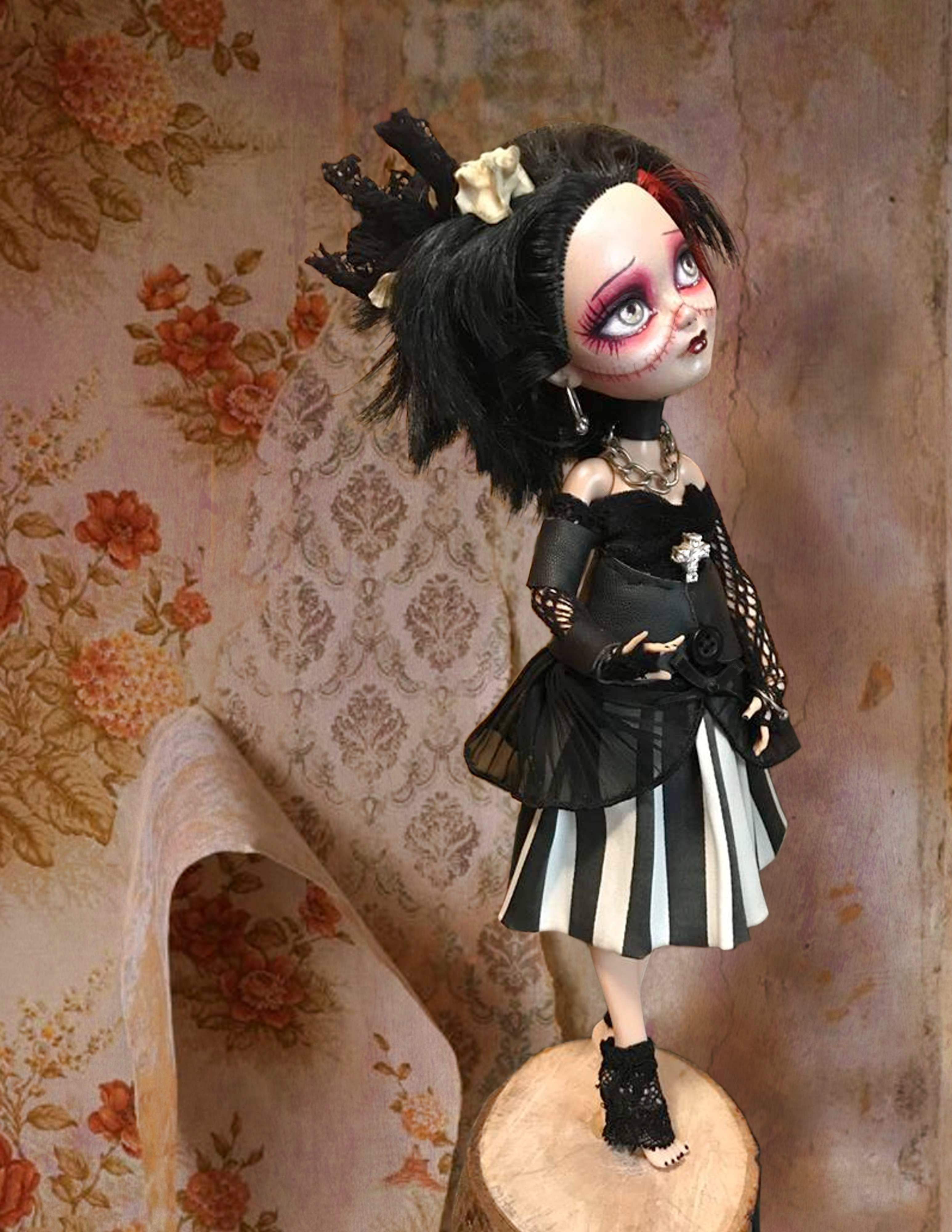
PERSONALITY: This girl knows exactly what she likes and she will stop at nothing to get the perfect accessory to make her feel like “herself”, even if that accessory is a new face.
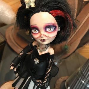 DESCRIPTION: Purslane is a remodeled doll, with a hand painted face, handmade garments and haircut, and a collection of unique accessories picked especially by Lady Purslane herself. In her hair she wears ribbons as well as real animal vertebrae. Her right ear is actually pierced. She is wearing earrings, a chain and a choker around her neck, and bracelets and anklets of stainless steel as well as leather. Her outfit is made of silky fabric, lace, leather, velvet and fishnet. She stands effortlessly on a wooden base, which is lined with black velvet. Her attachment to the base is virtually invisible. She appears to just be casually standing on it on her tiptoes. Purslane’s head, hips, arms, elbows and wrists move in almost all humanly achievable directions, but she prefers this pose the most. Her actual hight is almost 25 cm, but with the base she stands the full 30 cm.
CURRENT HOME: Among other collectable dolls. Australia.
Aiden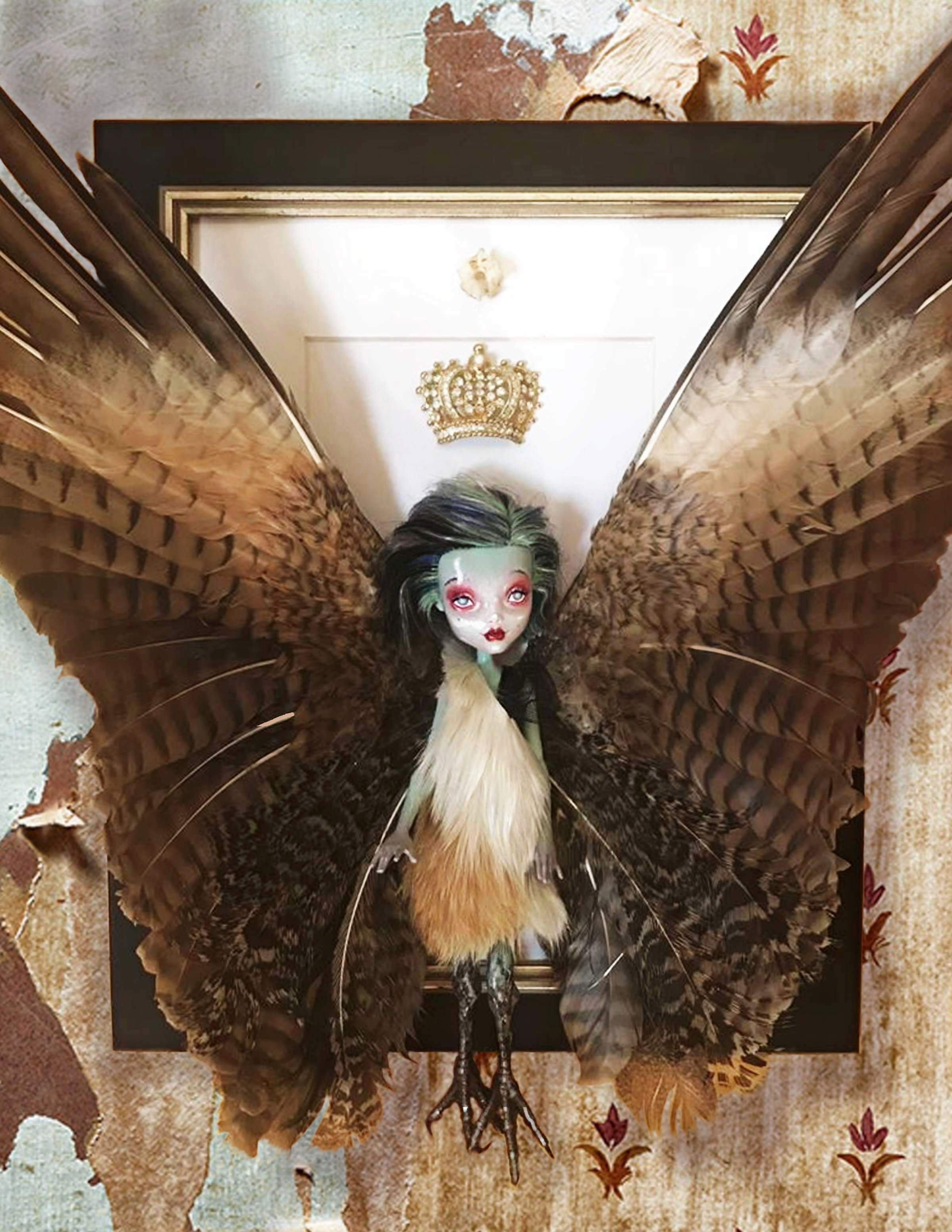
PERSONALITY: Aiden is a shapeshifter. She can be all girl or all bird, but she prefers to display her favorite parts of both. In her most comfortable moments she takes advantage of her highly functional bird feet, while also enjoying the dexterity of human hands. She displays her magnificent wings every chance she gets, and while her face can pass for a human girl, it always maintains an owl-like stare. She is a quick and silent hunter. Her small fairy size limits her kills to field mice and road lizards, but that keeps her satisfied. She prefers to come out at night, but is stealthy enough to hunt in daylight as well. Make no mistake, however, she is no beast. In her human form, Aiden is a very clever and well-spoken young lady, when she needs to be.
 DESCRIPTION: Aiden is my most unusual OOAK taxidermy doll to date. Her body is constructed out of various plastic doll body parts, hand painted to give her a new face an personality. Her plastic doll’s legs gradually transition into real talons from a roadkill bird that I collected not far from my rural home. Her magnificent wings also come from a road accident avian victim, combined with feathers from my personal chickens and peacocks, and shaped to look like what I imagine angel wings look like, but also predator wings. She wears a tiny pelt dress made of hand-tanned rabbit fur, also roadkill. Her hair is styled and died to reveal several shades of grey, blue and black and well as silvery white. Her face, body and feet are lacquered for protection and for aestheticism. The delicate sheen gives the face a feel of some kind of a sentient porcelain.
Aiden is a wall display doll. She is permanently mounted onto her picture frame. Above her head is a crown of costume jewels and a vertebrae from a small mammal, possibly a weasel of a cat.
It was a rare alignment of all these roadkill parts that came to me around the same time, plus the inspiration for this particular doll face that made the creation of Aiden possible. This is why an Aiden replica (honoring my no-kill taxidermy code) is virtually impossible. I can create other winged dolls, but there will be variation in wings, fur, and talons.
Her dimensions are: across or wingtip to wingtip = 43cm, lengthwise or top of the frame to bottom of feet = 43cm, depth or from wall to tips of the wings = 17cm. The doll herself, from head to talon = 26 cm.
CURRENT HOME: I created Aiden as a personal companion for myself. She lives even now in my home studio. However, she says that if the right new human comes along, she would be willing to travel, and see other parts of the world.
If you suspect you may be that human, you can view her complete profile and details here.
Patches
 PERSONALITY: Playful, innocent, easily engaged, but also easily bored.
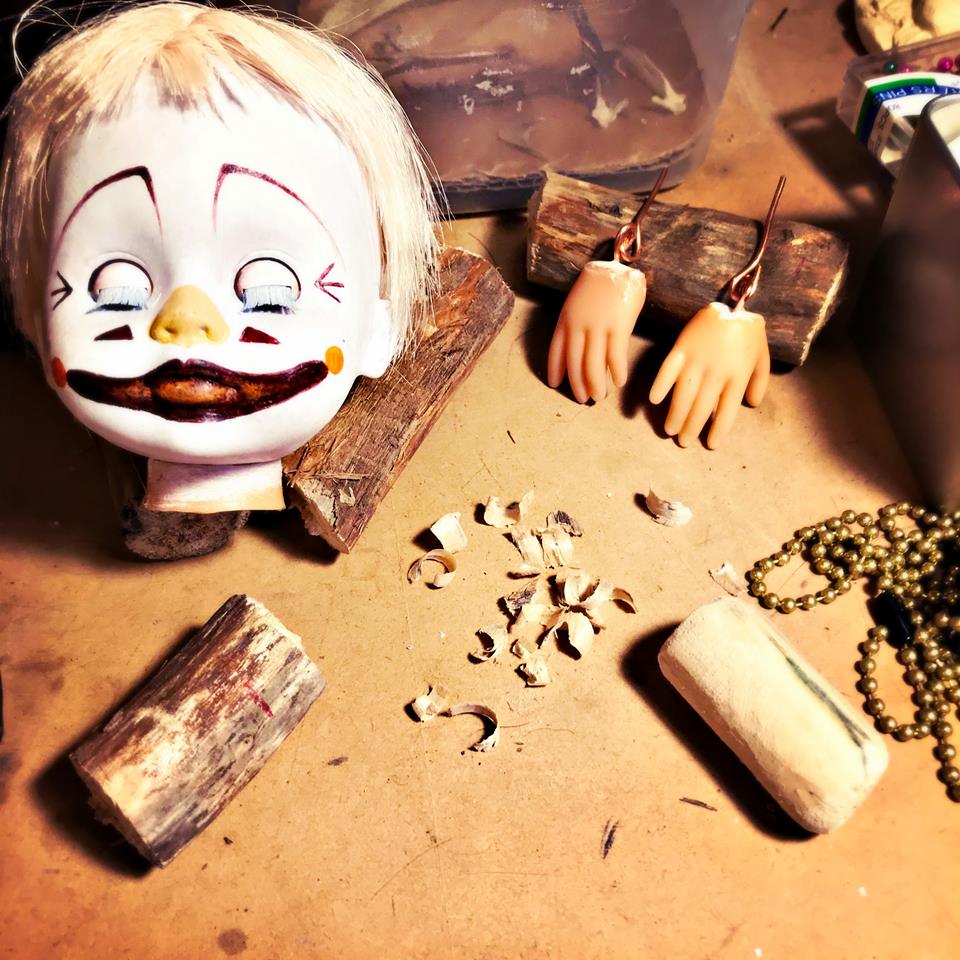
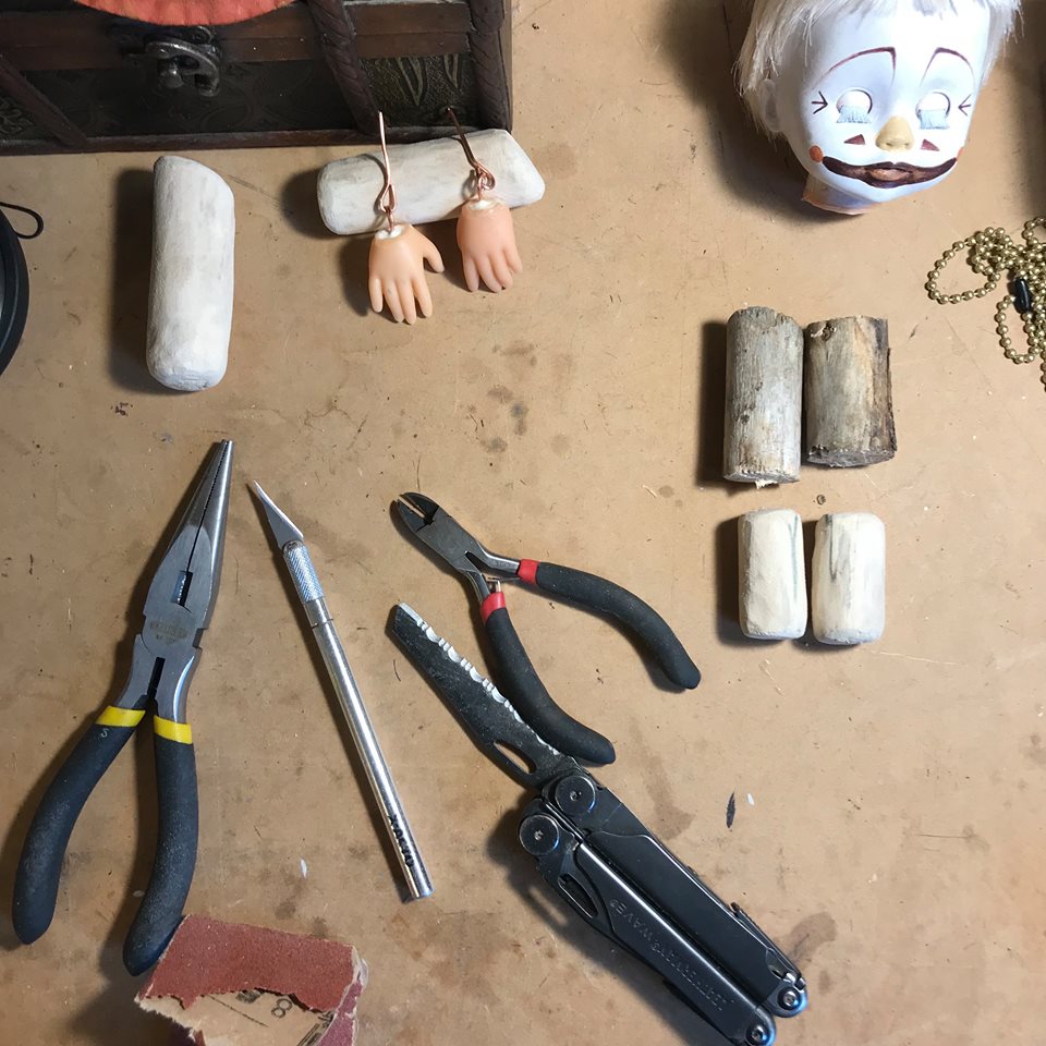
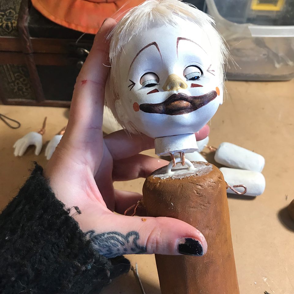
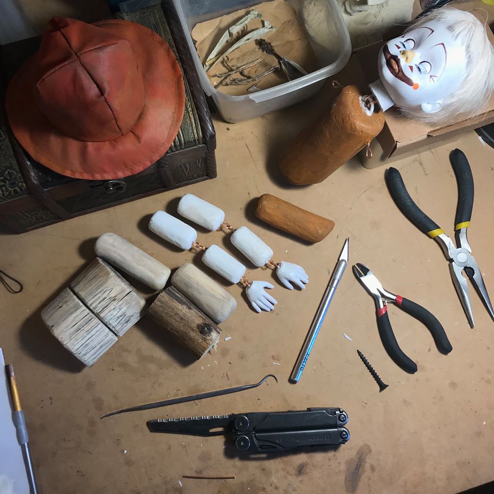
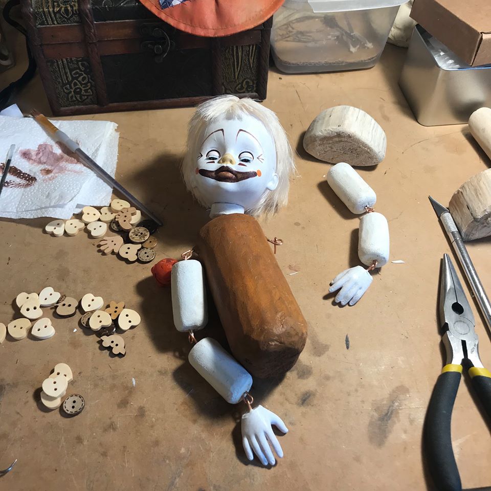
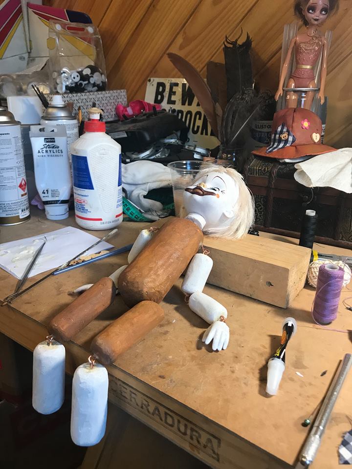
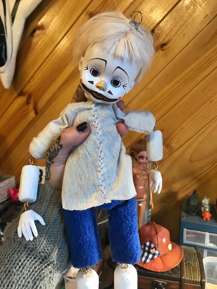
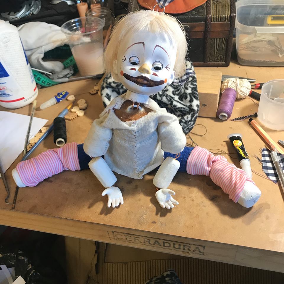
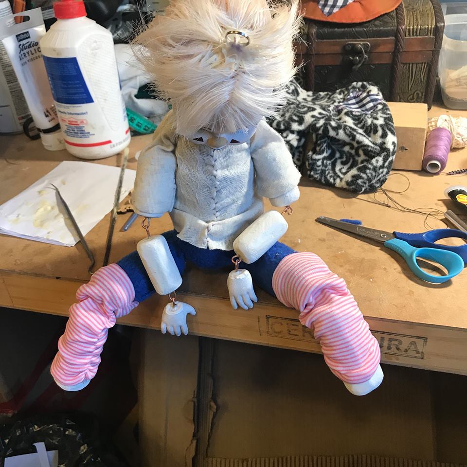
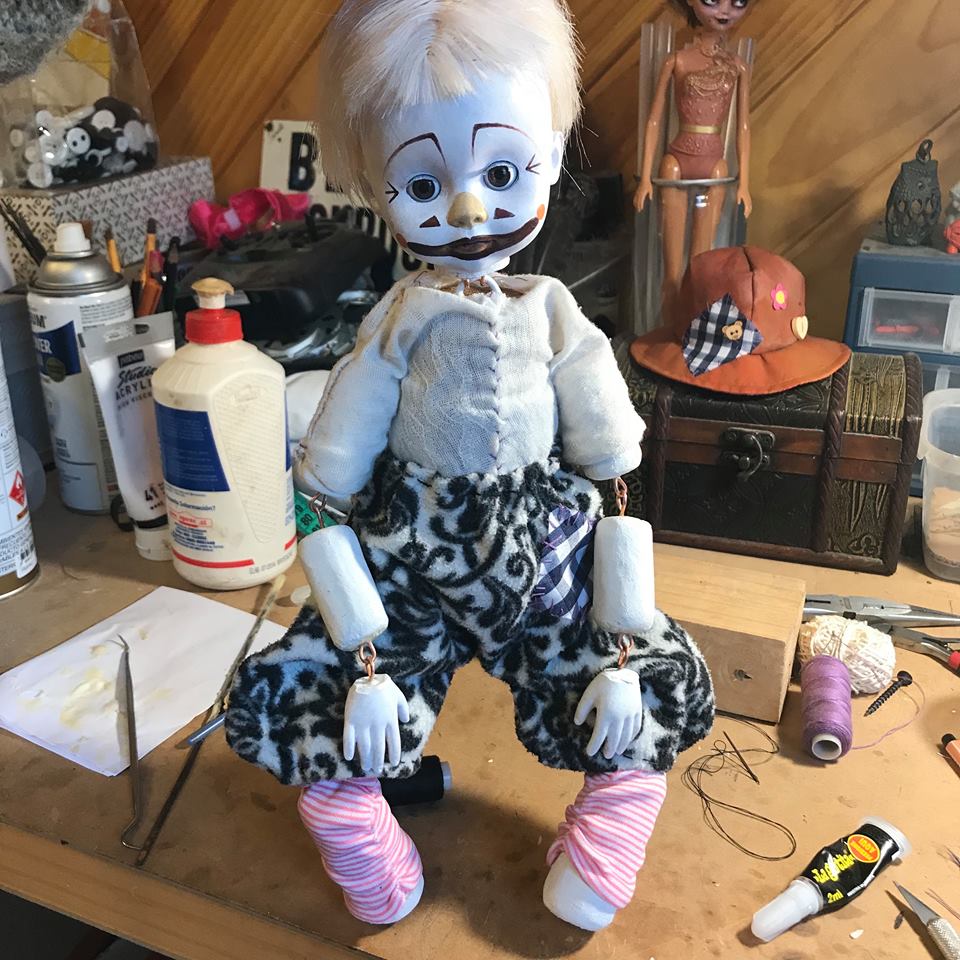
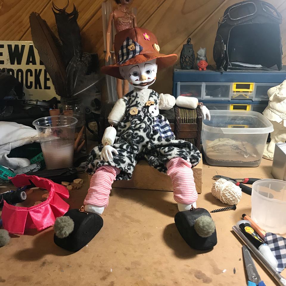
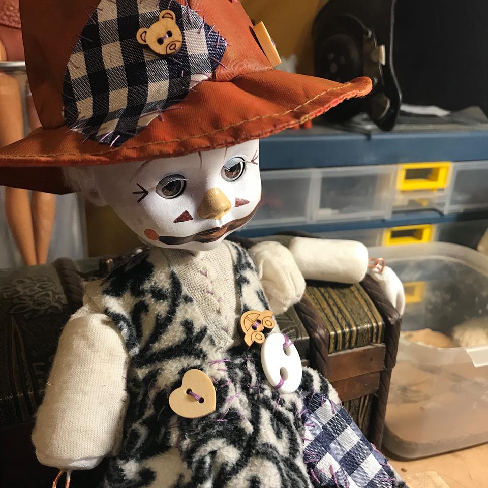
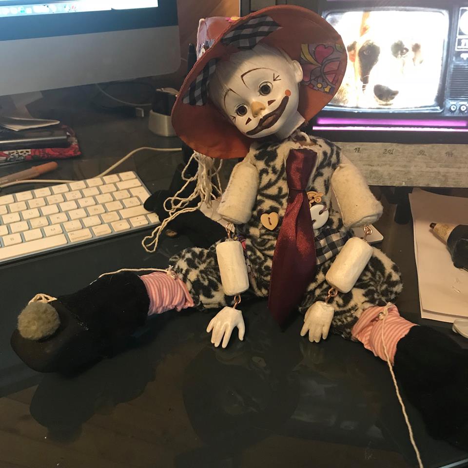
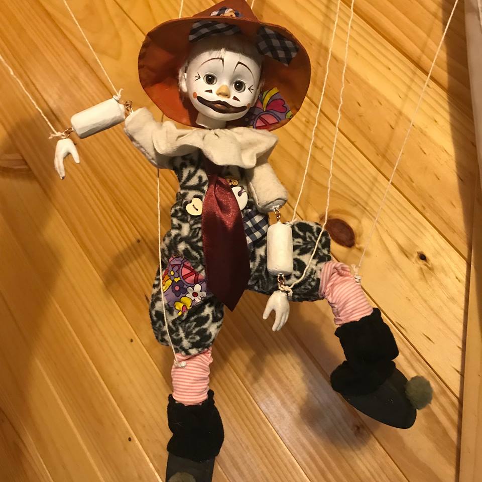
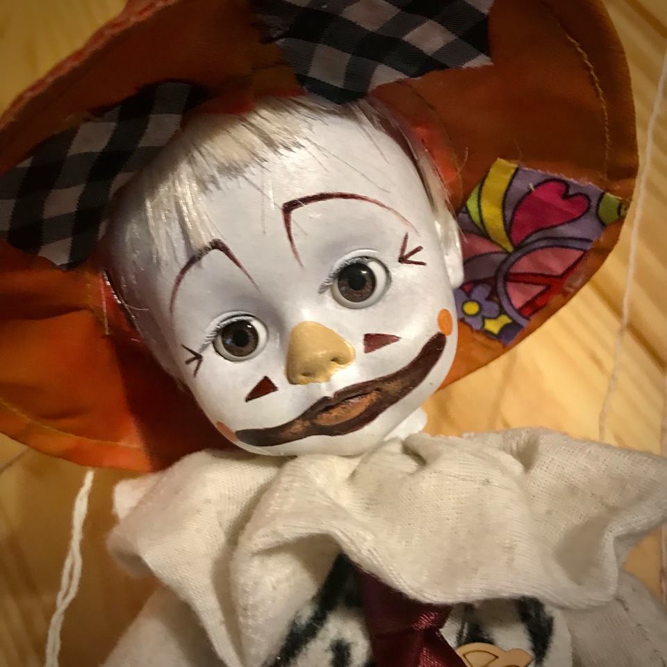
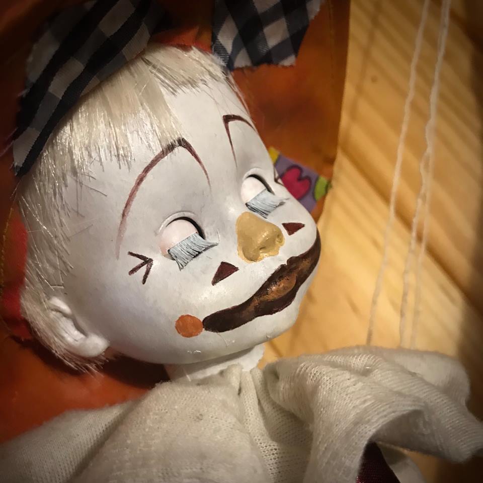
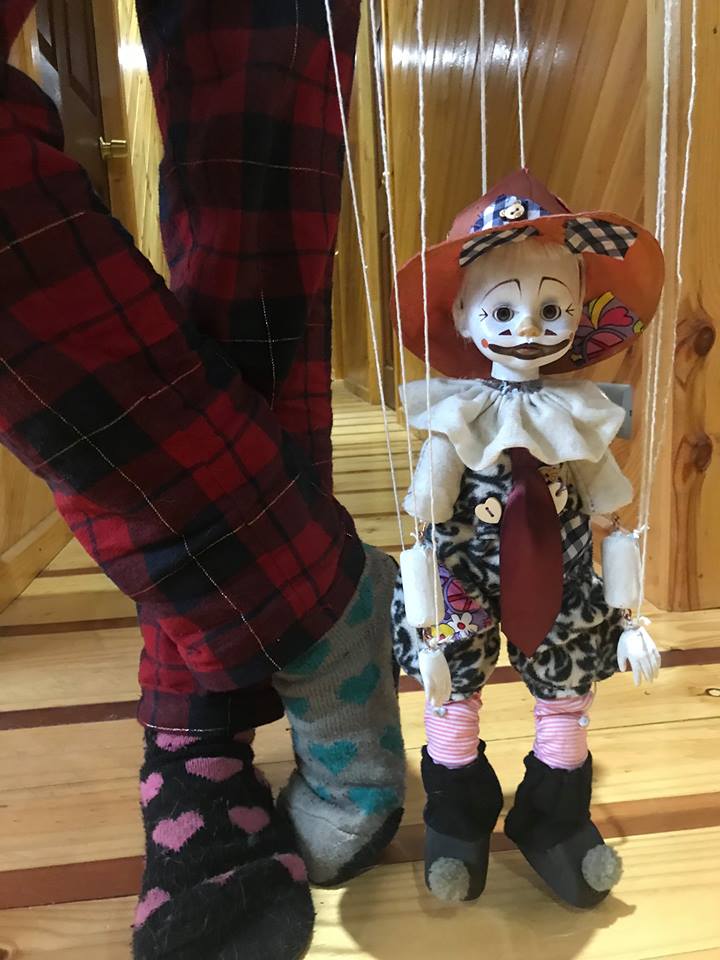
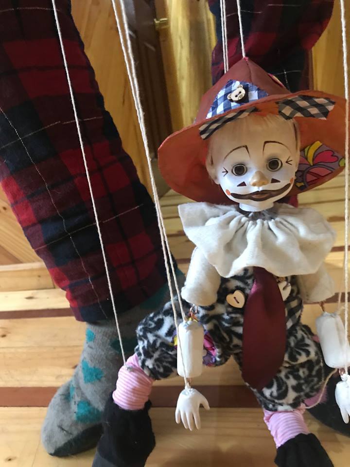
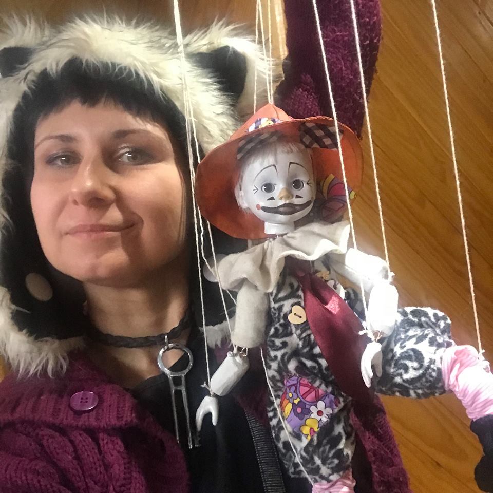
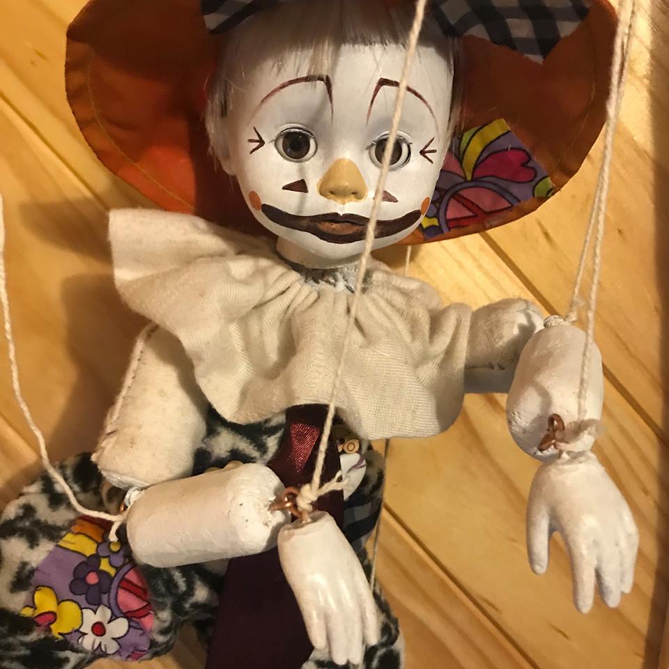
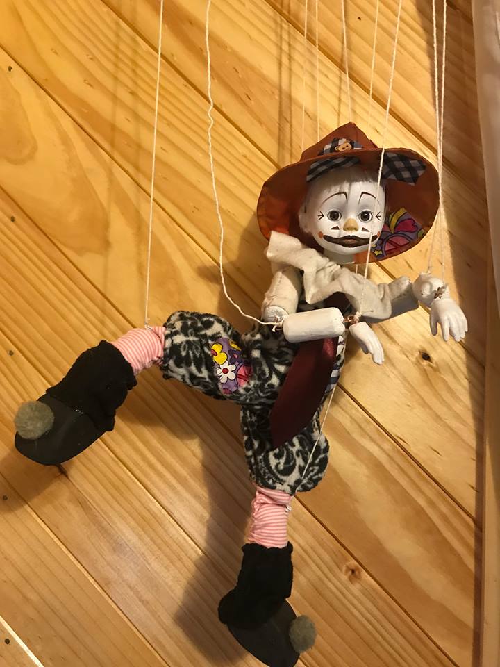
DESCRIPTION: Patches is a commission puppet. I was asked to a create a clown marionette based on a drawing of a clown that I did a while back. I chose to make the boy version of that clown. The name was selected by the client. I had a name a personality to work with. Everything else was up to me.
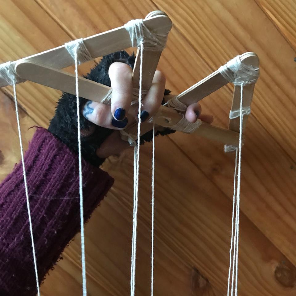
Patches is made almost entirely out of hand-carved wood. His creation took two weeks and a lot of patience. You can read the full story of his creation here.
He is one of my largest dolls. When standing on the ground he comes almost up to my knee, which makes him roughly 35 cm (measurements get tricky when hats are involved)
CURRENT HOME: USA
Harebrained Jane
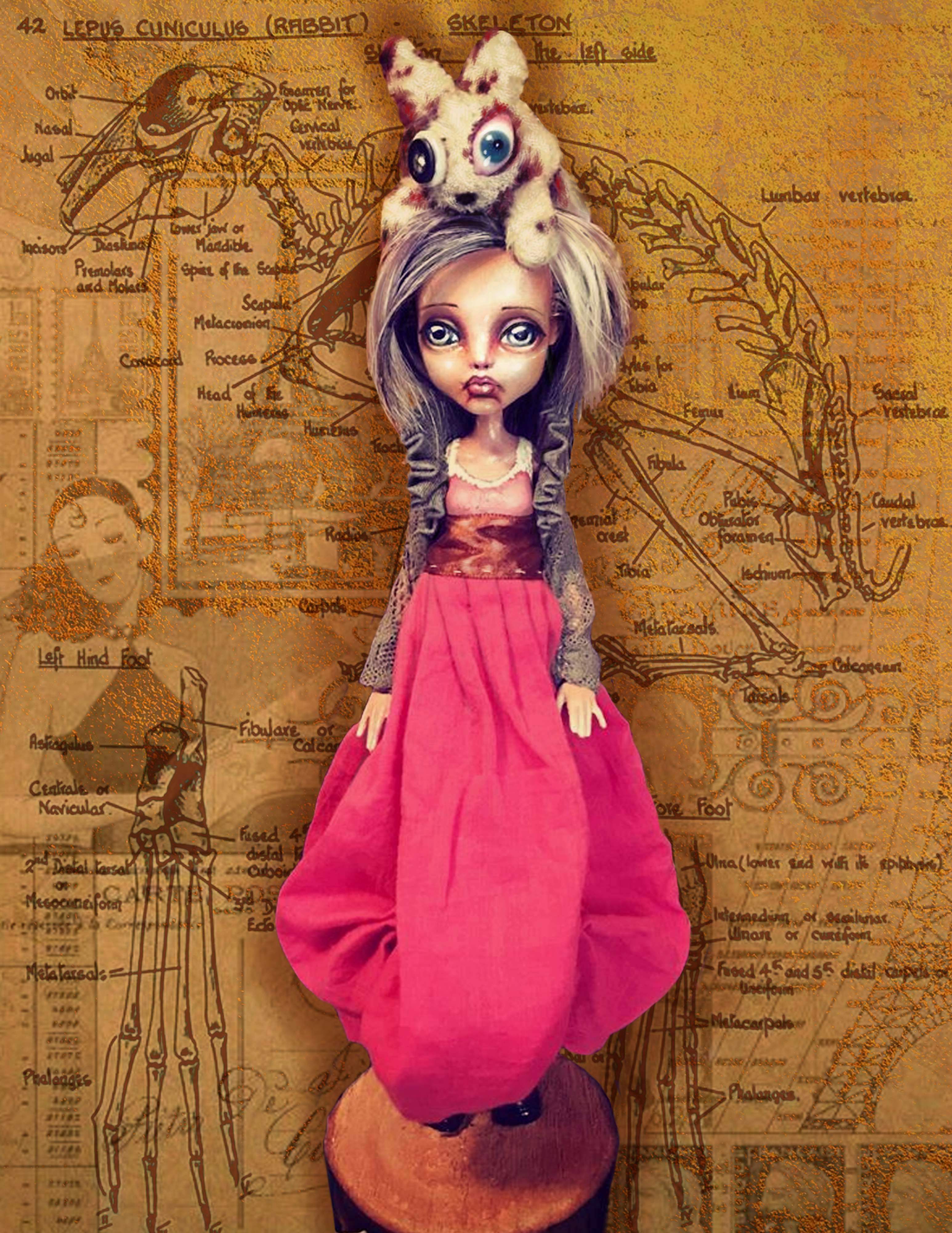
PERSONALITY: Jane is an enigma. She is silent and reserved, but not shy. Better to leave her to her own thoughts, and no matter what happens, DON’S ASK ABOUT THE RABBIT.
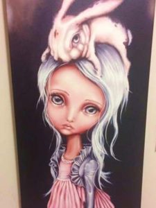
The original painting inspiration
DESCRIPTION: Jane was a commission. I was asked to create a doll based on a very odd painting of a girl with a rabbit on her head. The painting was childish and charming, and as strange and unrevealing as Jane herself. It was not at all obvious from the painting whether the rabbit was real or not, dead or alive, or if the girl was even aware of him. I replicated the face and the costume as accurately as was humanly possible, while also making Jane a bit older and more elegant as was requested, and making the rabbit more toy like as requested. I think the tiny silver jacket with the fringe collar was the most challenging part to make. It was quite a rewarding experience all the way to the end.
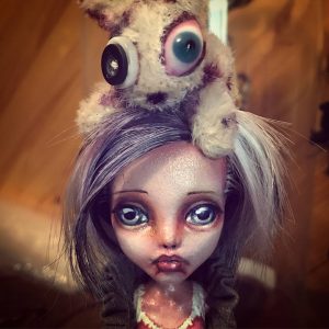
My older version of Jane with a toy rabbit for a hat.
When I was ready to present the photos of my creation to the client, who has been very eager to chat but who still hadn’t paid me even a deposit on the piece, I was suddenly unable to reach him. When at last he replied with some awkward excuses and explanations, it became obvious that he was just a tourist client. Tourists happen in my profession. They are people who like the experience of being served. They enjoy ordering the commission and seeing it come to life at their bidding. They go through all of the emotions and the actions of a client purchasing an art piece, but they never intend to pay for the work and when the job is done they leave. I’ve been burned by tourists before. I did not, however, feel like my time was wasted with this creation. I loved making Jane and was sure that her right owner would come along one day. So she did. Not a month later, Jane was spoken for.
CURRENT HOME: With her real human owner.
Tooth Fairy (original)
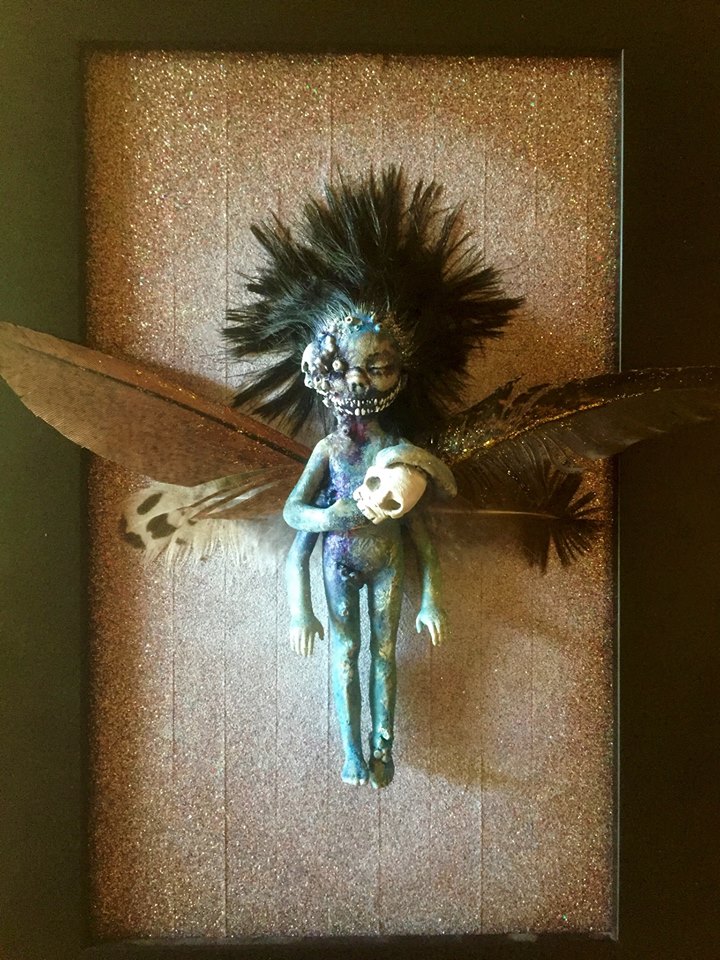
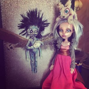 PERSONALITY: Tooth fairies are somewhat of a pest in this neck of the woods, yet a fully preserved specimen is very hard to come by. Apparently they go off to some magical place to die when it’s time. This one is quite fresh and well preserved. She has all of her limbs and wings, and most of her teeth. Found already dead, rigor mortis setting in quickly, she was clutching a tiny fairy skull. I believe that in life she was a prankster, as most tooth fairies tend to be.
DESCRIPTION: The Tooth Fairy was the first doll I made. She is about 14 cm tall and the entire display in a frame is 34 x 24 cm. I sculpted her from discarded doll parts and various adhesives. Her face is entirely reconstructed, new eyes set, teeth added, warts hand planted. Her wings are two peacock wing feathers and two chicken feathers from my own birds. She is a framed, wall mounted display.
CURRENT HOME: I can’t recall if she flew off to Europe or the Netherlands, but she did go in the same box with Harebrained Jane.
Tooth Fairy (copy)
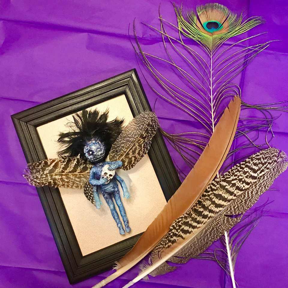
About a year after the creation of the original Tooth Fairy, I was commissioned a look-alike. The second version of the Tooth fairy is identical in size, color, and character, but with minor variation. The most obvious difference is in the wings. This version has fuller, rounder wings. They are two tail feathers from my pet peahen, and two wing feathers from exotic pheasants I met at a local botanical garden.
Tooth Fairy (baby)
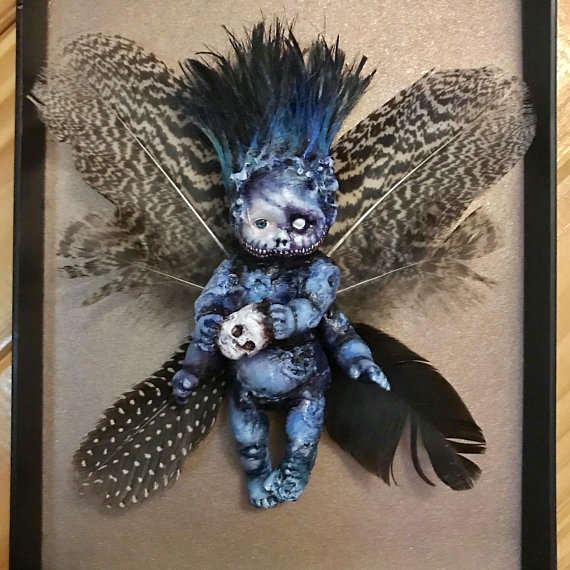
PERSONALITY: As infants, tooth fairies do not yet have a sense of humor or the cunning of adult fairies. Baby fairies, like baby everythings, are innocent, naive, chubby and clumsy.
DESCRIPTION: My tooth fairy is becoming a recognized character among Nights And Mares followers. I have had multiple requests for the four armed, feather winged, small blue creature holding a tiny skull. She has to have spiked black hair and warts on her face, mismatched eyes, and a signature ear to ear smile full of tiny teeth. The tooth fairy is always framed as a wall display. This one meets all the requirements of my blue tooth fairy, but it is a baby.
CURRENT HOME: My home studio. Available here.
Layla
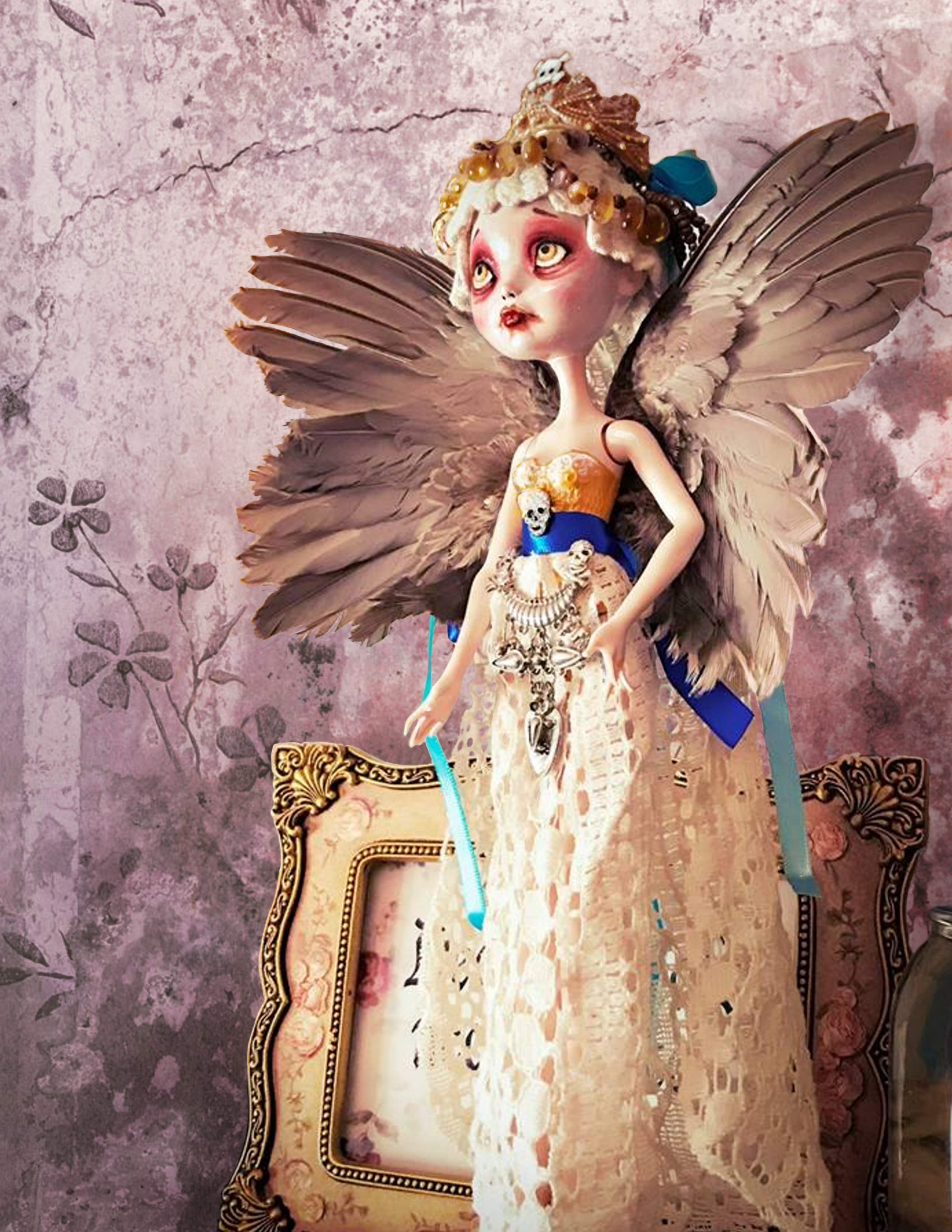
PERSONALITY: Layla is an angel trapped in a doll’s body. She is slightly disoriented by the transformation, but her angelic nature does not allow her to despair. She is gentle and loving, a little bit spaced out most of the time, and always reaching out to the heavens.
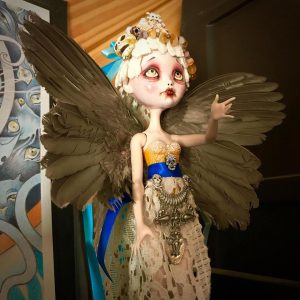 DESCRIPTION: When I began working on this doll, I didn’t know what the result would be. I had to listen to what she was telling me. Laylah wanted to be an angel. An unusual subject matter for me, but the doll has spoken. Laylah’s face took two full days to paint and polish. I tailored and hand stitched her dress and head-dress, and I also hand made most of her jewelry. Her wings are real bird wings, having once belonged to a male quail (native to central Chile) that I found dead several months prior. The wing preservation took about a month.
Laylah is an upright decorative doll. She stands on a small wooden block, finished with a soft felt base, as most my doll bases tend to have. There is slight play to her position, but only slight. Both of her arms move freely and her head tilts just a bit if desired.
She is an exceptionally detailed doll, with much character in her face and eyes. She seems to like to raise her left hand a lot, almost in a blessing manner. Laylah is the name of a angel of conception and childbirth. To me she is the guiding spirit of the birth of inspiration.
CURRENT HOME: Home of a doll collector. Australia.
Rosemary
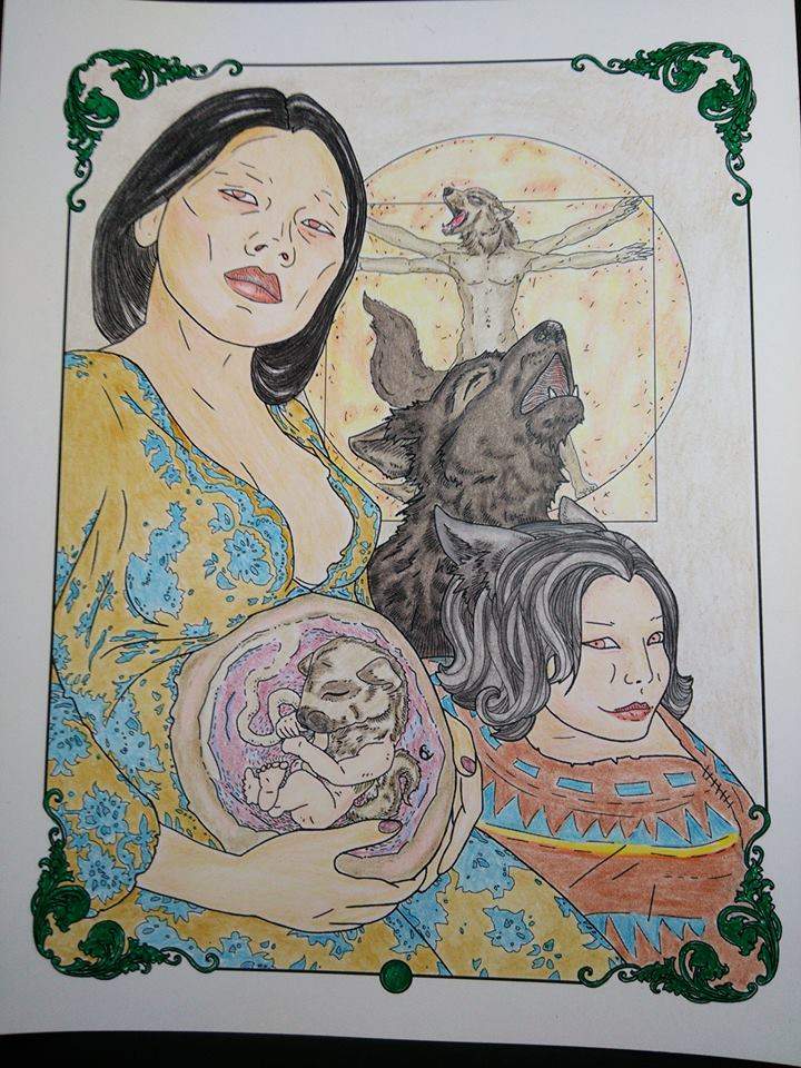
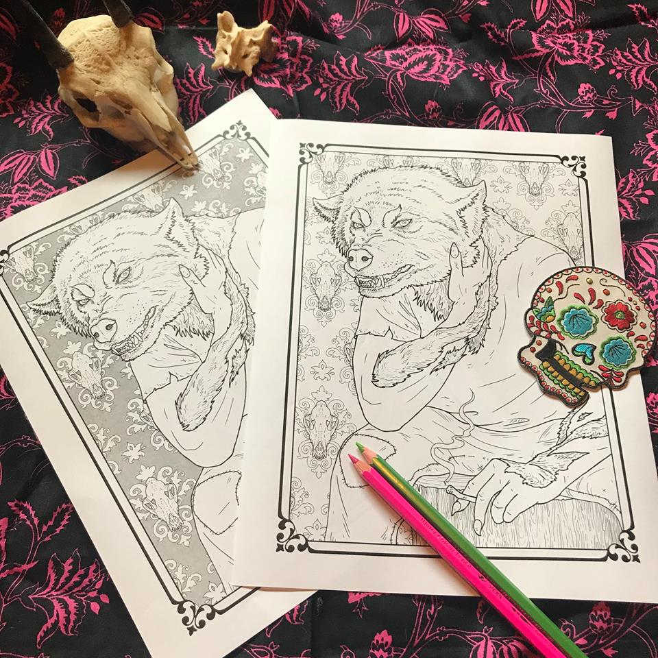
The original drawing of “Human Nature” is an adult coloring page that appears in my book Nights And Mares – Femme Macabre. Rosemary is the one in the womb. This is the page colored by Laurie Gregory, the current owner of Rosemary.
PERSONALITY: Rosemary is a sweetheart of a baby. She is quiet, gentle, and likes to be held.
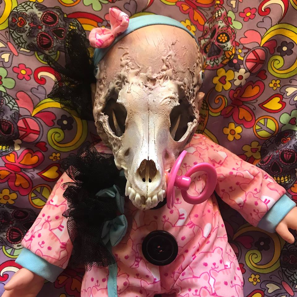
DESCRIPTION: Rosemary is a very unique creation in that she has a canine skull grafted onto her human head. The original concept for this doll was called Human Nature, and it was a human baby with a wolf head. I have a set of illustrated characters who are a human/wolf family. The idea being that part of human nature is a beast – something primordial, simple, honest, logical, but also formidable and impulsive – a wolf.
Since there are no wolfs where I live, but there is no shortage of roadkill feral dog remains, I used a dog skull and a babydoll. I work with skulls a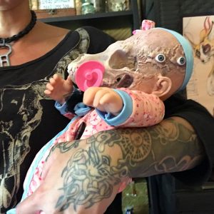 great deal, but this is the first time I combined my skull work with my doll work. The preparation of the skull was pretty standard – a month of water treatment, cleaning, bleaching, removal of all the teeth for a thorough cleaning of the holes, resetting of all the teeth back in their places, gluing of the jaw for immobility, and finally painting and lacquering. Grafting the skull onto a baby doll’s head was tricky. It took several days, a great deal of sculpting of the connection points. I wanted the hollow eye sockets to have very realistic interior, very deep set, but without leaving the entire head hollow. The result was actually quite cool. The elongated dog snout protrudes from a baby-like skull structure and the giant hollow eyes sockets actually look like wide eyes of a very disturbing baby. I was quite pleased, and for the final touch I put a pink pacifier into one of tooth gaps.
Rosemary is a soft stuffed doll, with hard plastic hands and feet. She wears an adorable pink onesie with little cat designs, she has two large black buttons and some black lace ribbons here and there. Around her head, she wears a little pink ribbon to mach her outfit.
CURRENT HOME: With a surgical technician at a labor and delivery unit. USA.
Mab
PERSONALITY: Impulsive, unpredictable, with no insecurities. Being a fairy, Mab is a trickster. She is always looking for a new scheme.
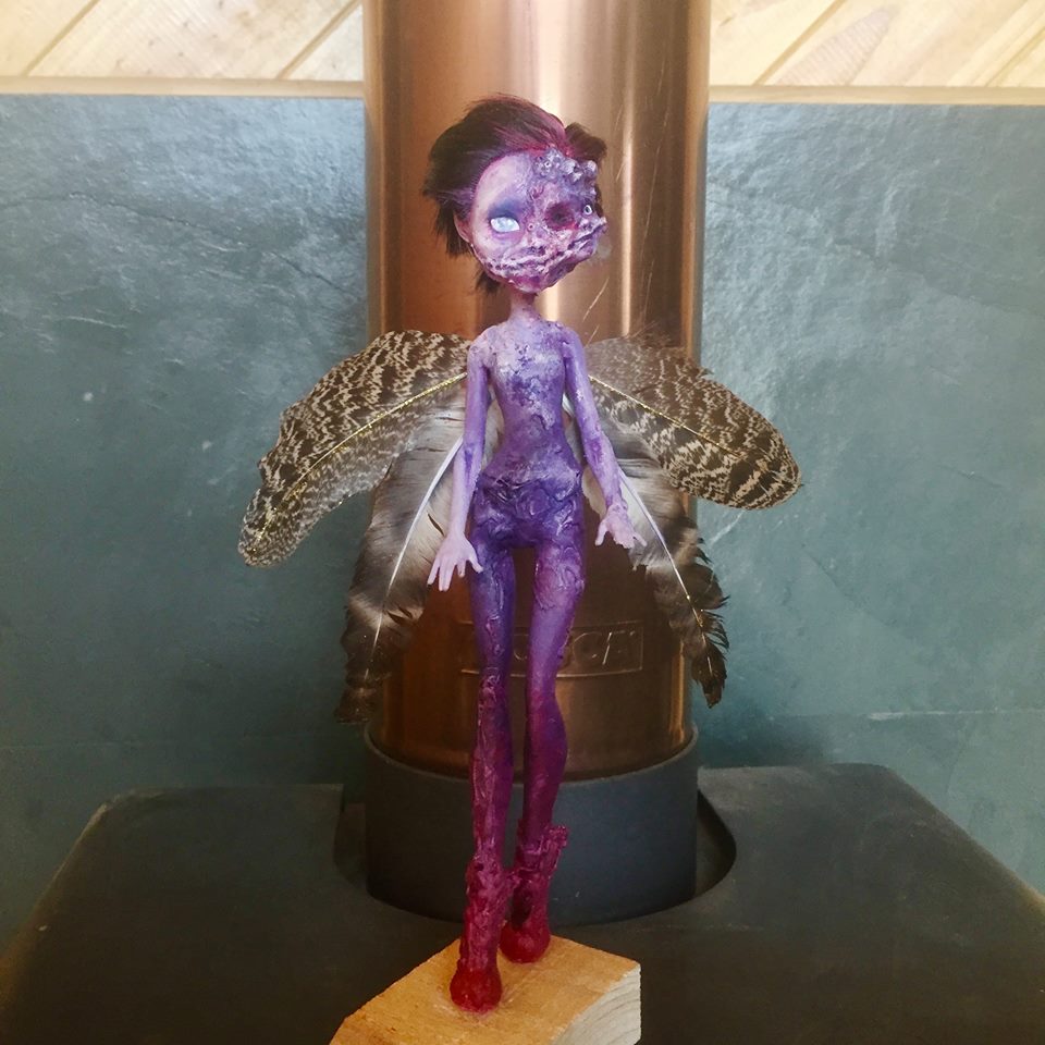
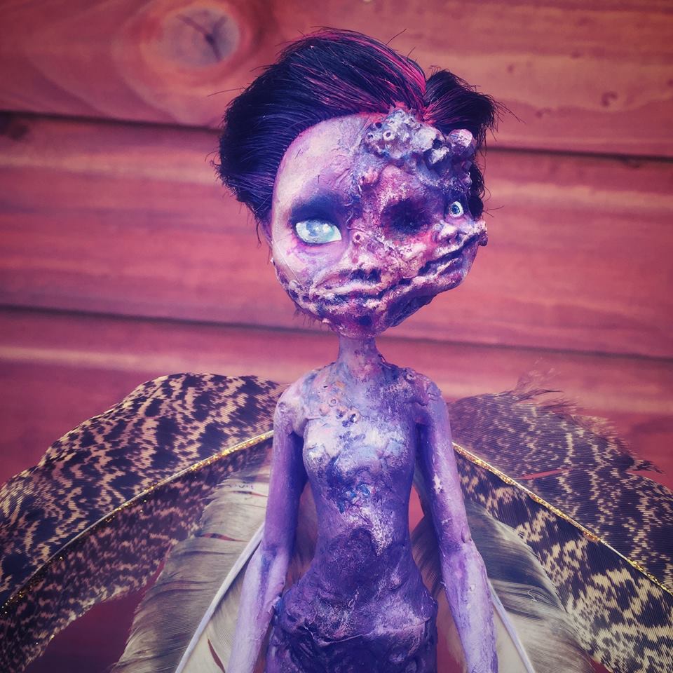 DESCRIPTION: Mab is a mutant color-changing forest fairy. She is a commission doll. My client gave me a personality description and a color scheme, and told me to go crazy. Crazy I went. Mab has a whole other baby face on the side of her main face and a smile that is shared by both. While I couldn’t make her actually change color, I gave her a very pleasant gradient of purples, violets and fucsia. Mab would be fashionable if she wore clothes. She, however, does not. Her feet naturally morph into high heel shapes, and her short hair is styled into something that resembles my own short messy hair. Her wings are peacock wing feathers. She stands locked into a pose, looking like she is just about to do something, possibly crazy. She stands about 28 cm tall.
CURRENT HOME: Wales.
Fay the baby troll
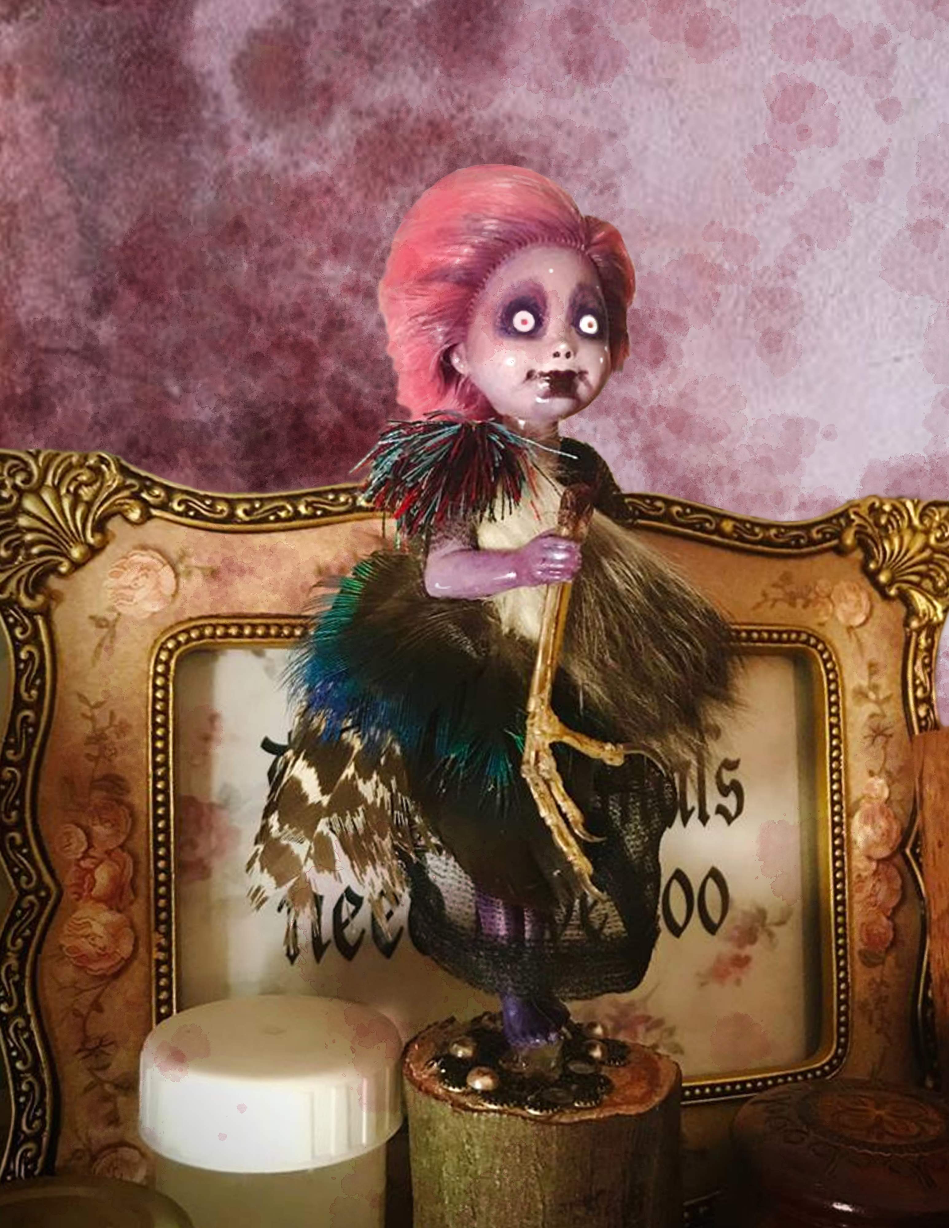
My usual use for this size bird feet – talon amulets.
PERSONALITY: Fay is a bit mischievous. She looks small and sweet, although a bit crazed, but she has the reflexes of a feral cat and the appetite of a full-groun troll. She mainly feeds on birds, but small rodents will do as well.
DESCRIPTION: Fay is one of the smallest dolls I have ever made. She stands only about 10cm tall. Her dress is made of rabbit fur (personally tanned by me), and feathers (collected from my aviary). The blue ones are tiny neck feathers from my pet peacock. In her hand, Fay holds a bird foot – evidently all that remains from her latest meal. The foot once belonged to a local thrush. Usually I collect the dead bird feet to make charms, pendants or earrings, but it seems that Fay needed this one.
Fay was a surprise gift doll that I made for a good friend of mine here in Chile, so I actually get to visit her very once in a while.
CURRENT HOME: Chile
Susie May
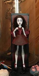 PERSONALITY: Psycho.
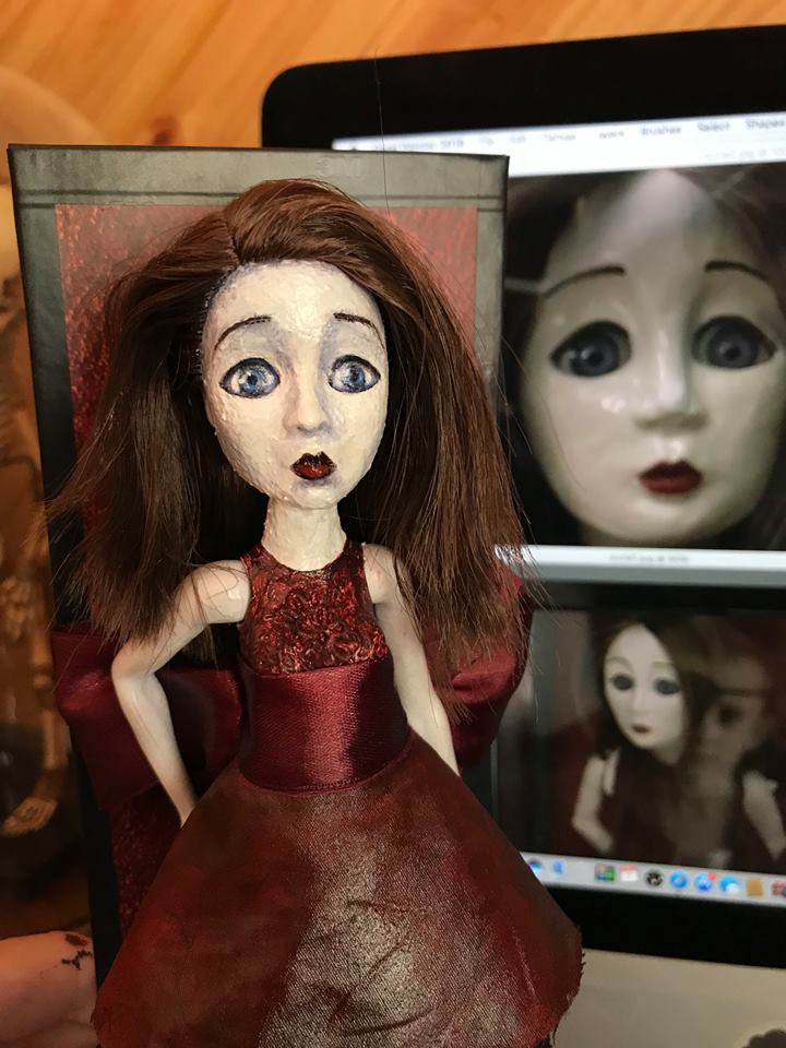
DESCRIPTION: Susie May is a very unusual doll. She doesn’t have the typical wide eyed, smooth skinned face of most of my other dolls. She was a commission with very specific instructions. She was to be made to look like a doll from the 2002 film May. In the movie, the main character, May, has a doll named Susie. This doll has a very distinctive white ceramic face, a burgundy leather dress, straight brown hair, and she holds one arm behind her back. In the movie the doll, Susie, never leaves her glass box. My client didn’t want the glass box, but she did want some kind of a stand or a support. Instead of a box I put my version of the doll on to a hand crafted black wooden stand, equipped with what looks like a red leather back support, framed in black – very reminiscent of the original box.
Sculpting her face and making it look like rough ceramic was tricky. Mainly because my doll was much smaller than the one in the movie. Her very specific dress was also a challenge, but after some trial and error I finally achieved the leather look and feel as well the identical shade of burgundy.
The doll is called Susie May, and not just Susie, because she has attributes of May as well – mainly her long human legs. My doll is a morphing of Susie and May into one creature which, if you have seen the movie, is quite fitting.
CURRENT HOME: USA
Bone Collector
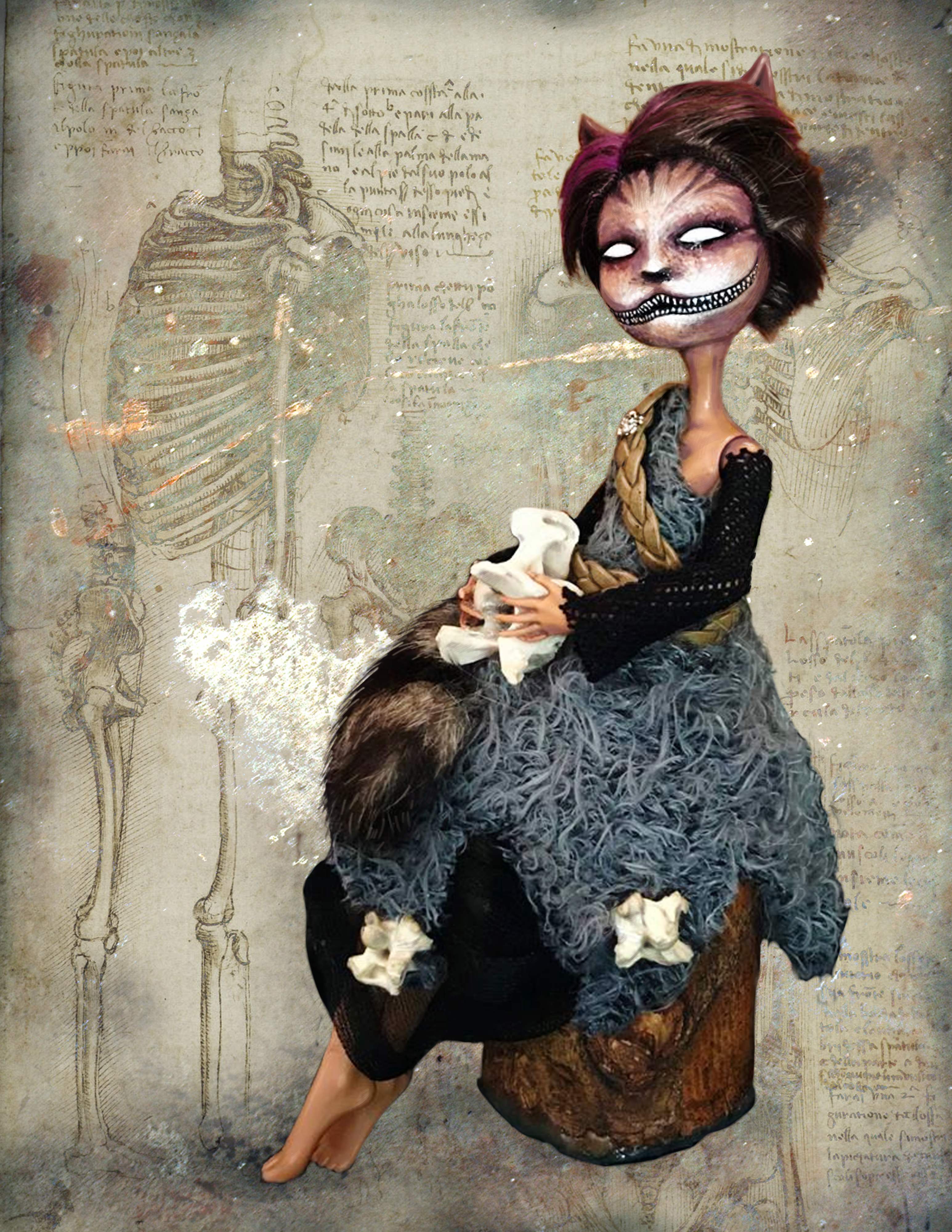
PERSONALITY: For a feline creature BC is surprisingly lacking in stealth. This is why she is not a hunter, but rather a gatherer – a gatherer of bones. Stumbling through the forest, stepping on every possible branch and twig as she goes, the only things left for her to collect are scattered bones. She doesn’t mind though. BC has an exceptional collection of razor sharp teeth. They may be tiny, but there are 200 of them. Eating that canine vertebrae is no big deal for her.
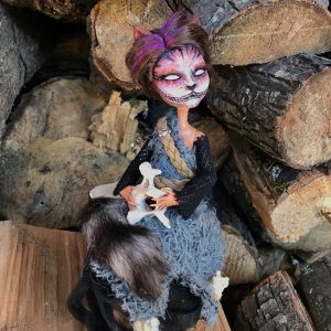 DESCRIPTION: BC has a body of a recycled doll, while her face is constructed from scratch, hand painted and lacquered. She is a feline humanoid, and has a cat-like face with a surreal set of tiny teeth, a pair of cat ears and a cat tail (made form real raccoon fur scraps). Her hair is a deep violet color and so are the stripes on and around her face. Her dress is hand-made from several different fabrics. It is decorated with tiny leather belts and she even has little metallic skull and bones badge. The bones she is holding are real animal bones – two feral dog and two rabbit vertebrae to be exact. She sits on a tree stump. It is dried and lacquered, and finished with a green felt base.
In her sitted position BC is only about 18 cm tall.
CURRENT HOME: In a home of a skull and taxidermy collector. USA
Deathica
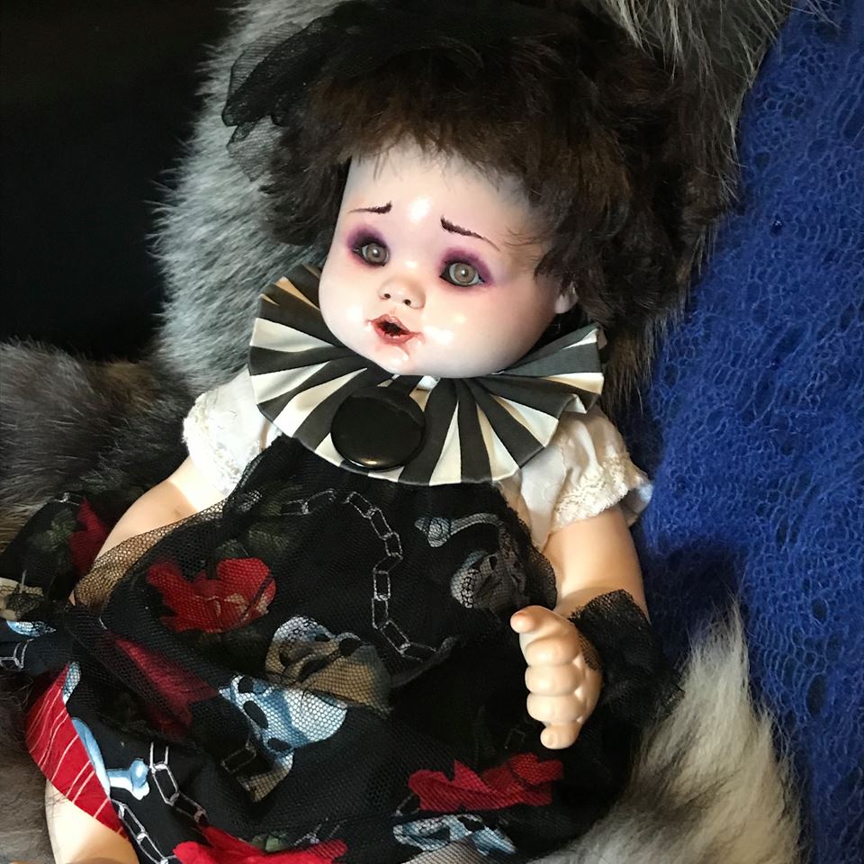
PERSONALITY: A bit timid, but very bright. Deathica is a great workshop companion. I enjoyed her company in my studio very much.
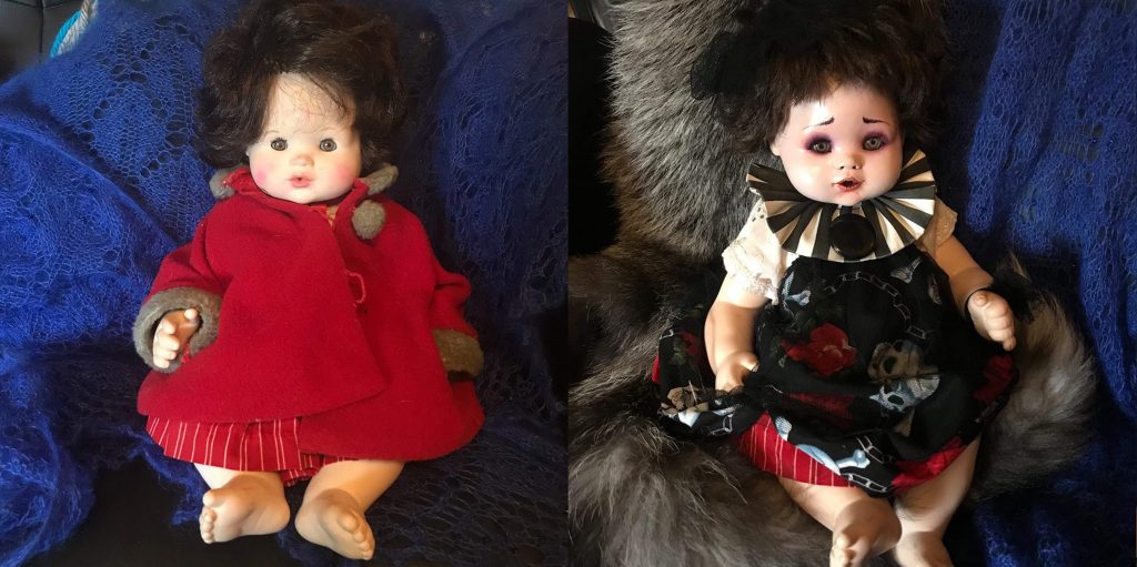
DESCRIPTION: Deathica is not a doll that I made. She was sent to me for a make-over. Not much work was needed. Just a new dress, and new hair and makeup. The client provided me with the name Deathica and asked that the doll be made up to look a bit more gothic, but not scary or gory. A shade paler skin, with my signature shiny lacquer finish, and some deathly purple shadows around the eyes did the trick. New eyebrows for a more engaged expression, and a bit of a licorice tone on the lips that once held a pacifier.
Her hair was cheap synthetic and not very densely filled. You could clearly see her scalp, which made her look like an old lady or a cancer patient. I did some hair magic (artist’s secret) and gave her a full head of fluffy dark hair, and a cute haircut that frames her adorable face.
Her dress is vey simple, using some of my favorite fabric. Hel has a dress from this same fabric, and so do I personally. She has a clown-like Elizabethian collar with a single oversized button.
The new and improved Deathica was very well received, and I am told that she has a much happier doll energy now.
Here are her before and after shots.
CURRENT HOME: USA
I am currently working on a duel marionette commission of a very special famous couple, another elegant glamor girl doll, and a two-headed baby sister to the tooth-fairy. To see my creations as they happen, please visit and follow Nights And Mares Toys. If you wish to purchase any of my current or upcoming creations, my ETSY store is the place to visit. The inventory there is constantly updated with new dolls, toys and curiosities. Please feel free to reach out to me via Facebook or ETSY with commissions or restoration projects. Even though I live and work in Chile, I ship to clients all over the world. My dolls and curiosities have already gone out to many of the States, Canada, Several countries in Europe, the Netherlands, and Australia.
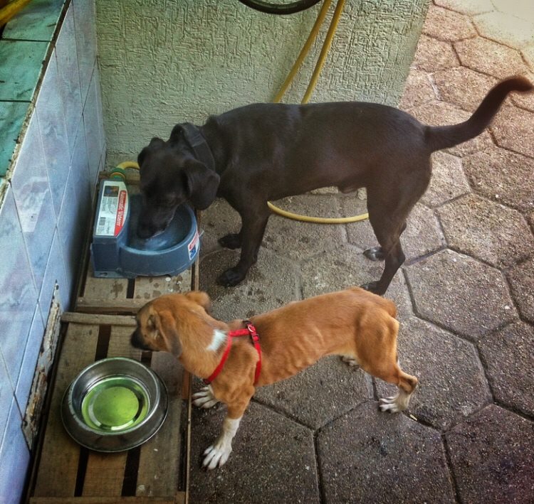
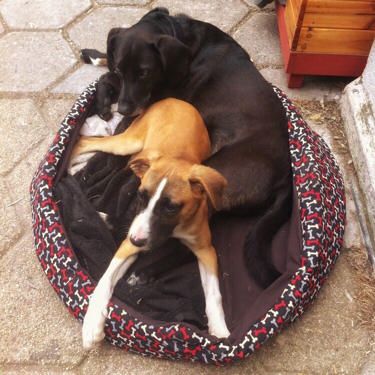
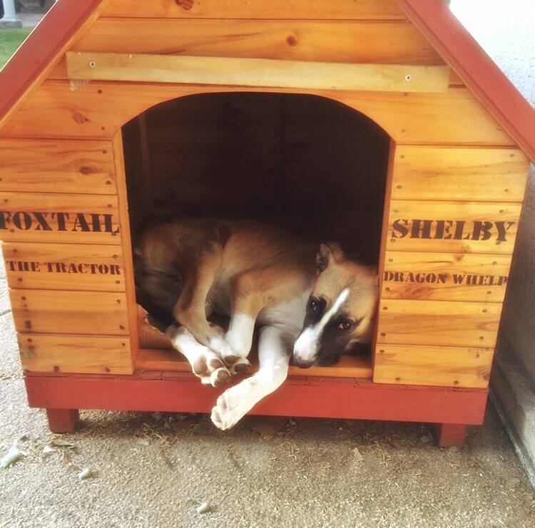
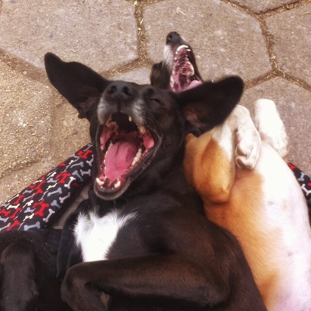
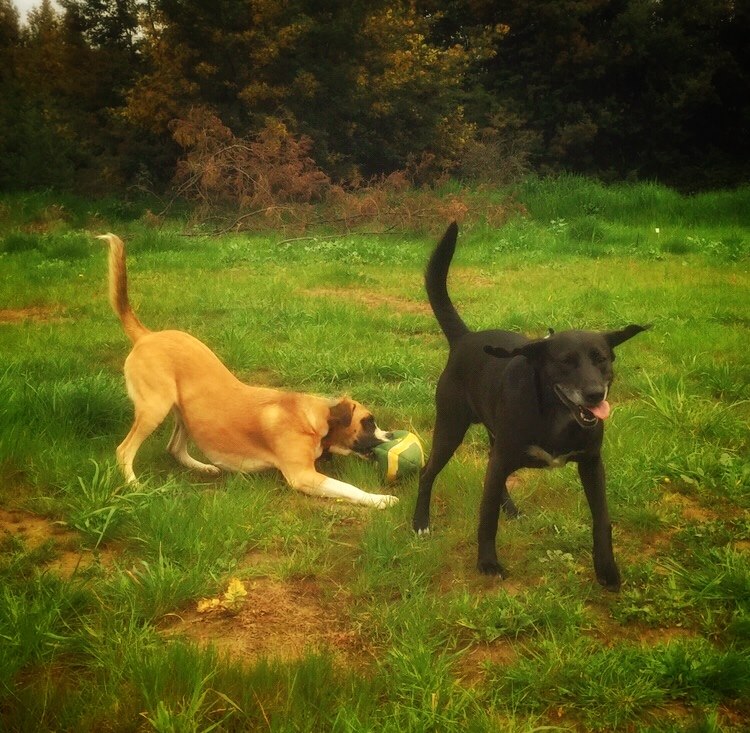
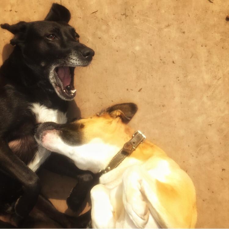
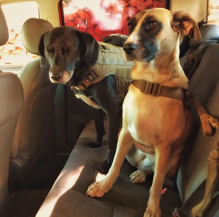
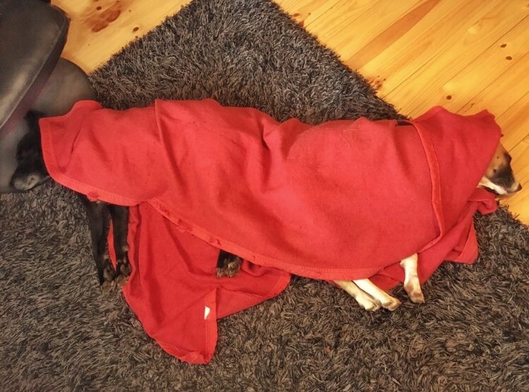
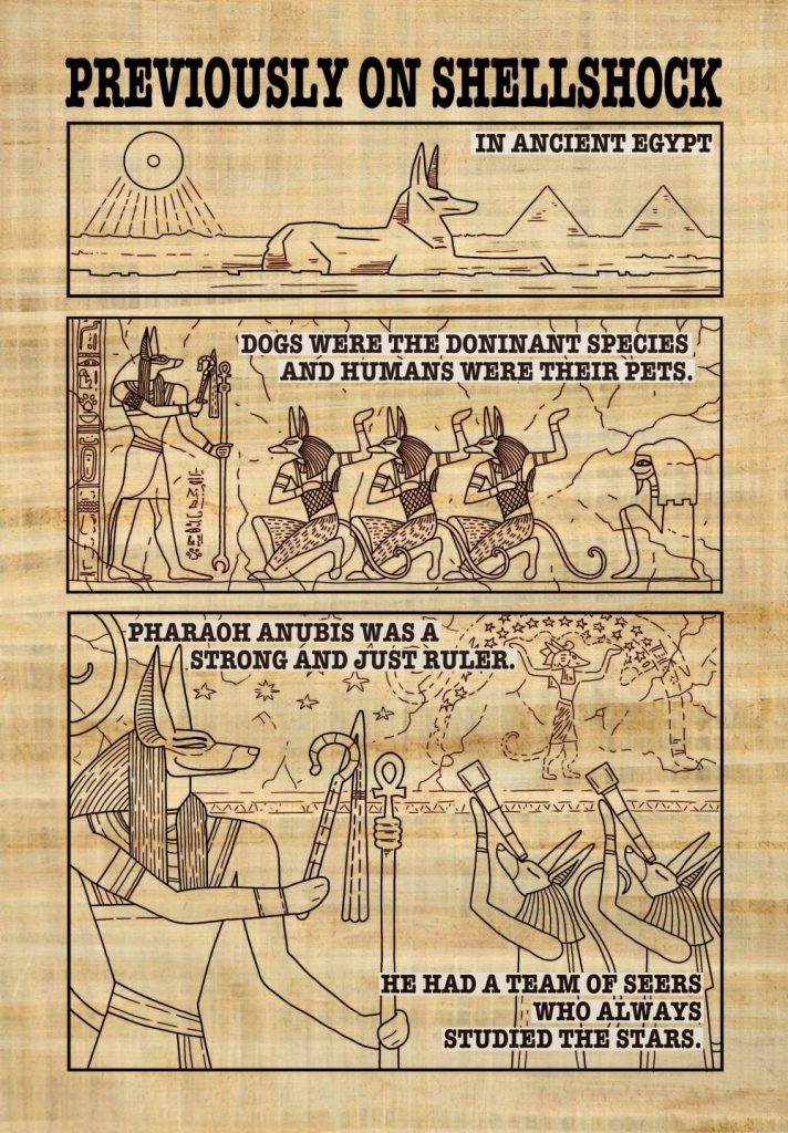
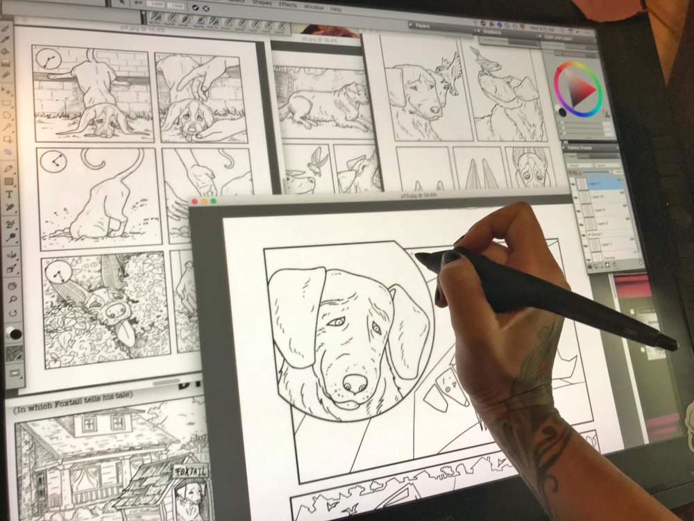
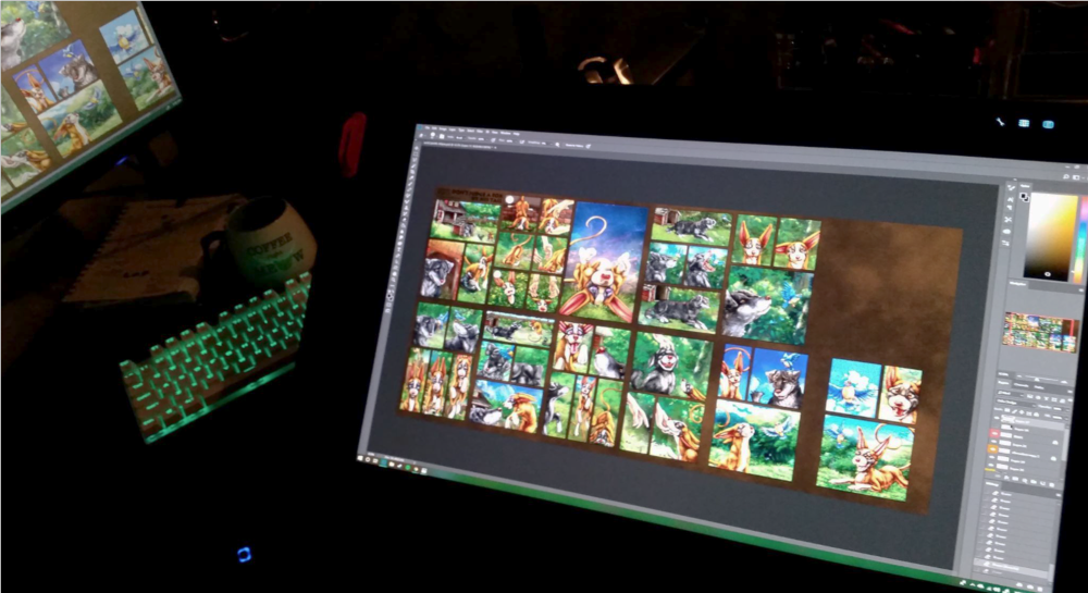
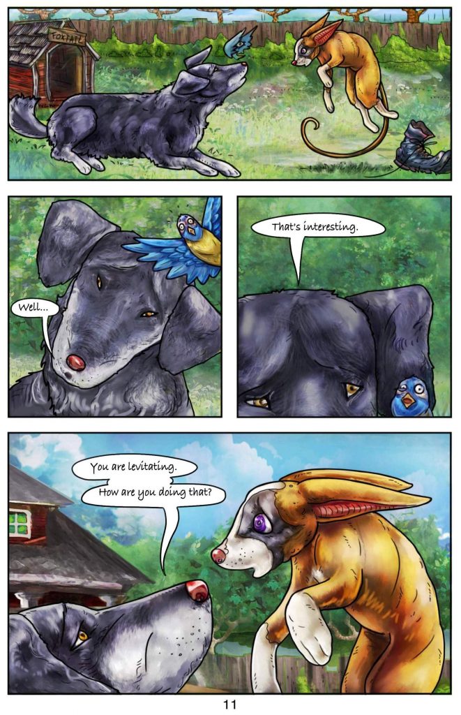
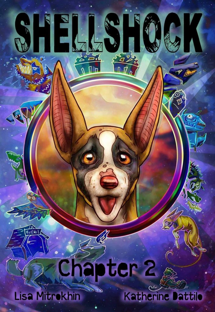


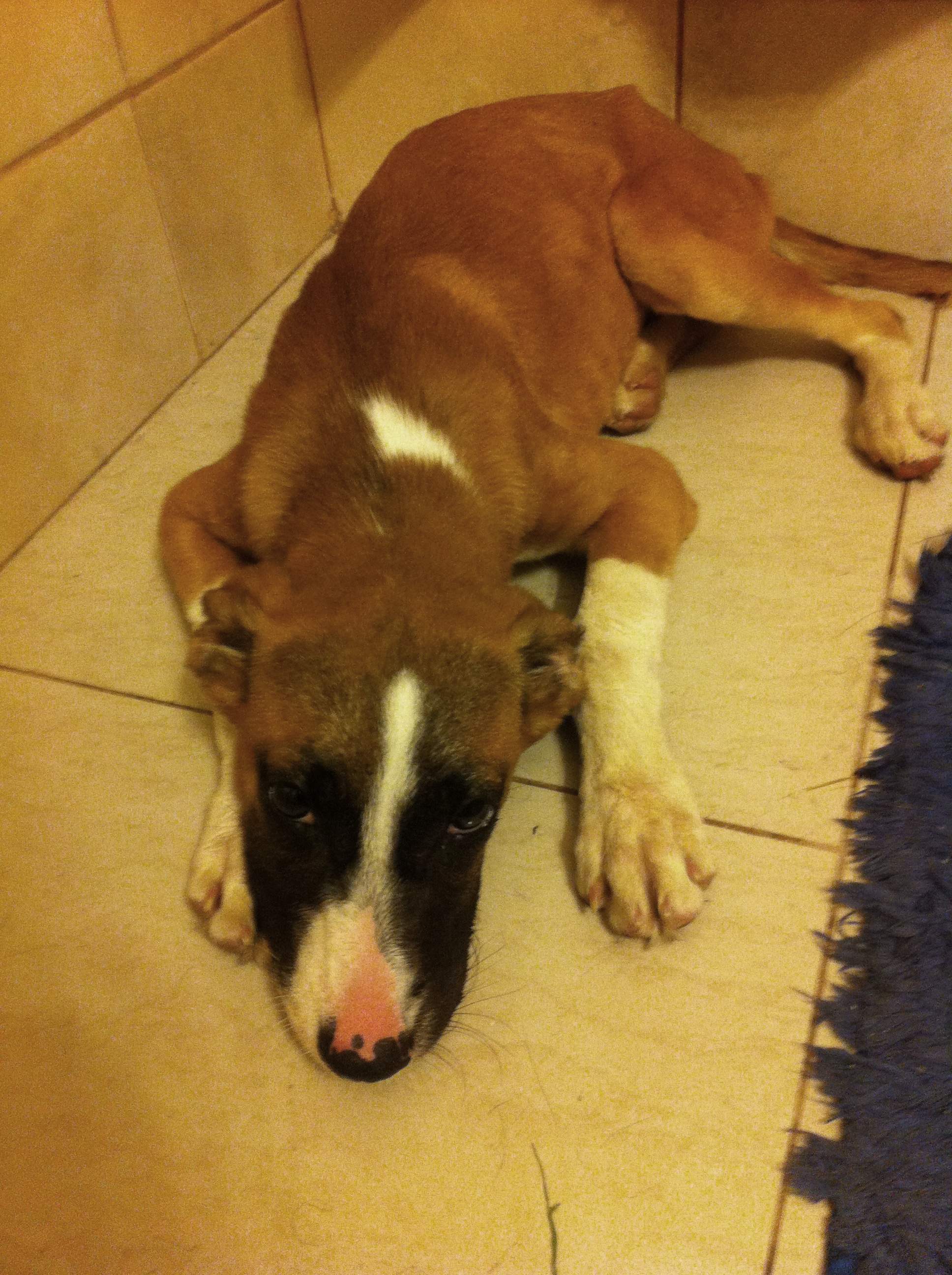
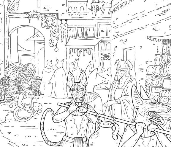
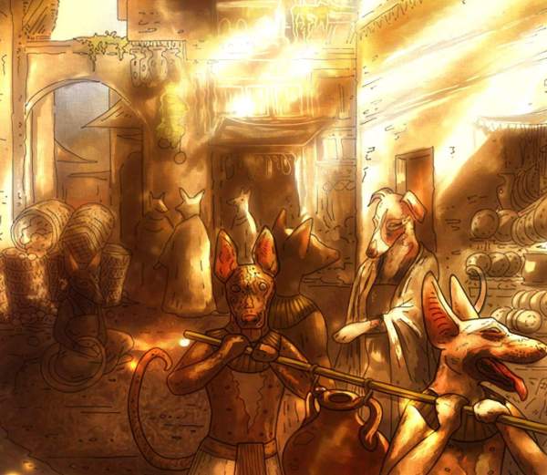
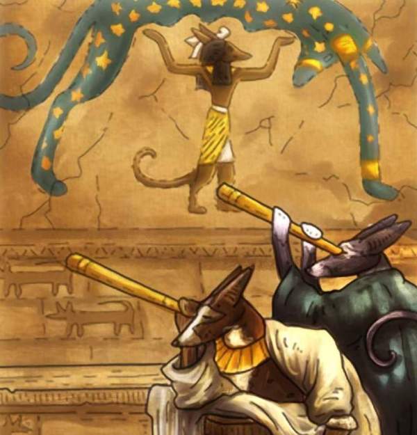
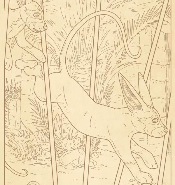
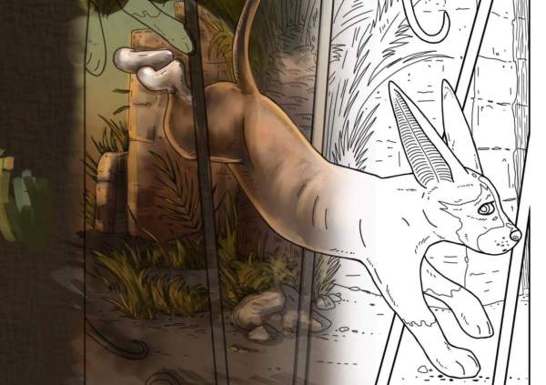
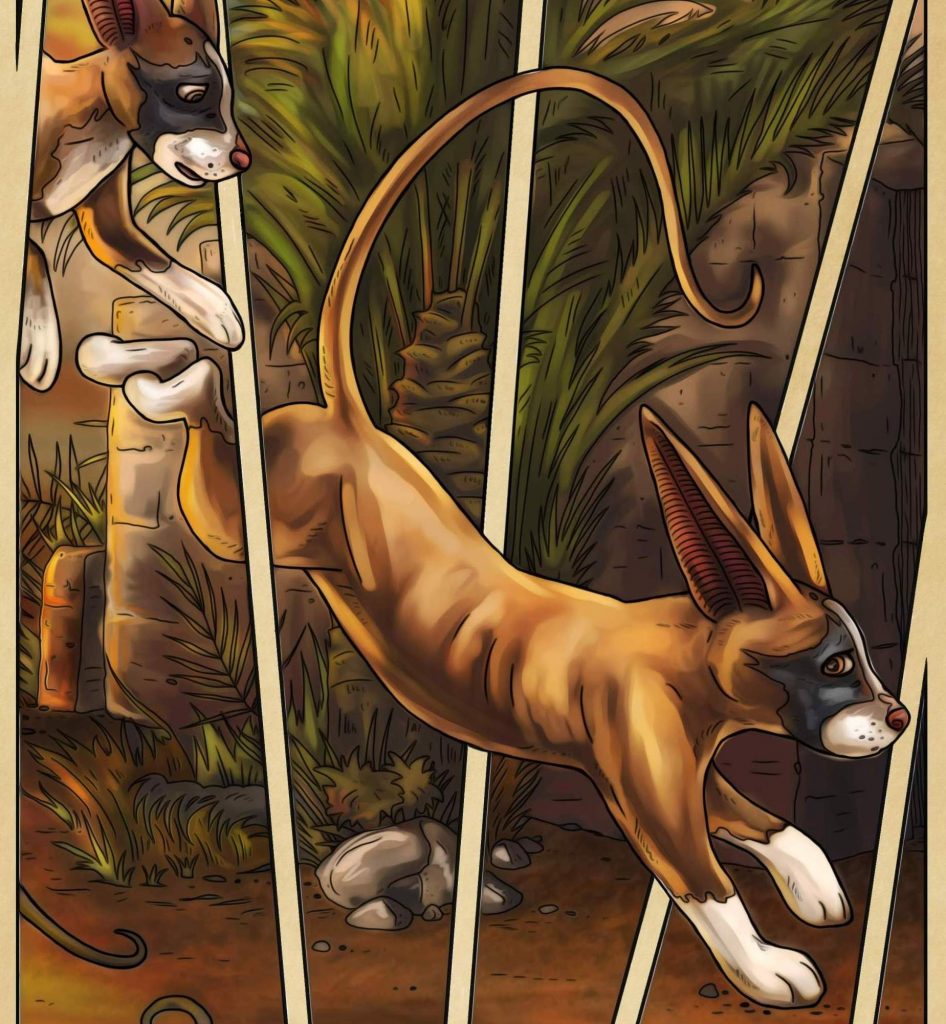
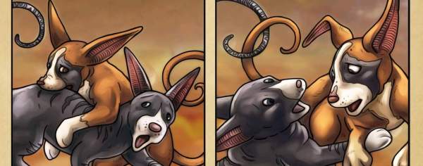
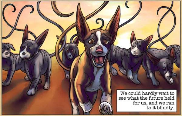
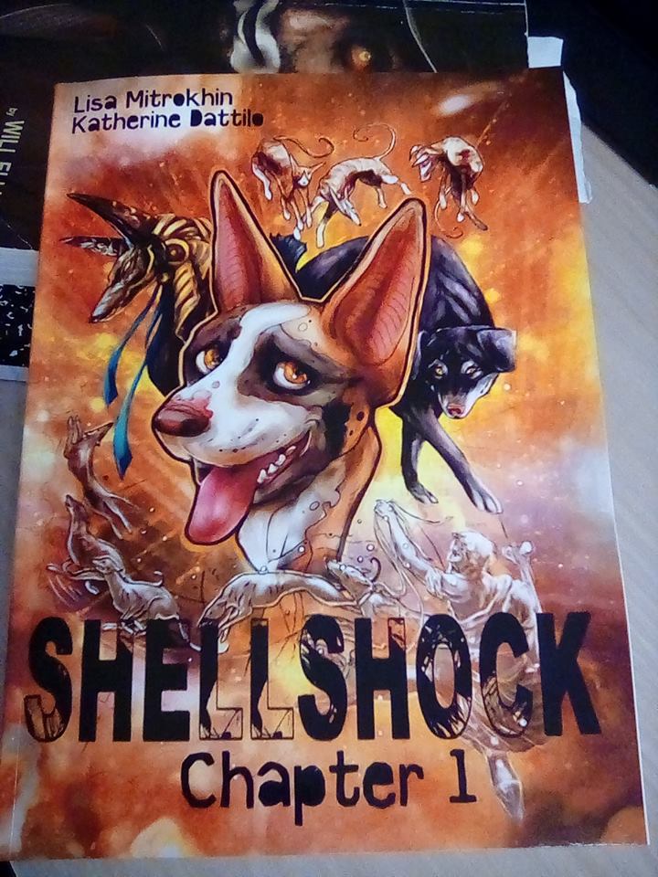
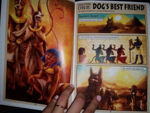 The novel will reveal that in ancient Egypt dogs were the dominant species, and humans were their pets. It was a peaceful world, where pets were loved and cared for. Unlike in the modern world, where dog is supposedly man’s best friend. While some dogs in some parts of the world have very cozy lives, there are millions still who are chained up, beaten, and even forced to race at the track. I wrote this book to illustrate the real problems that dogs today face in South America. I chose South America because this is where I live and these are the problems that are see every day. I didn’t want this book to be heavy and depressing. I didn’t want the readers to feel sad or guilty when reading it. Instead, I wanted each page to be entertaining, funny, witty, and just beautiful. This is why Shelby (or Shellshock as I often call her) is my main character.

 DESCRIPTION: Lenora’s face was an absolute joy to create. It took days of delicate painting with the tiniest of brushes to get her skin tone and expression just right. What took even more time and required even more tiny detail was her dress. Hand made from three types of cotton fabric, chiffon, lace, ribbon and leather, her dress is light weight, elegant and perfectly fitting. Underneath she has black lingerie and red high stockings. She wears long black lace gloves and a matching ribbon on her black and silver hair. For jewelry she wears only a black lace choker and a simple silver cross on her neck. Even her fingernails are individually painted. Her tiny boots are handmade from leather, plastic and adhesives, with hand-painted tiny gold buckles. She is a picture of perfection. She stands perfectly balanced on a wood cut stand, with a soft felt base. Together with the stand she measures about 26 cm tall.
 DESCRIPTION: My Hel is a tiny marionette. As she hangs effortlessly on her strings, she appears weightless and elegant; polite, but a bit of a tease. The half of her face that is alive is innocent and radiant, like that of a gullible child. The side that is dead is void of all expression of life, but it is neither evil nor scary, it is simply dead. Death is a part of every life, and Hel wears that side of her without hesitation or embarrassment. She knows that were are all already dead and she does not judge us for it.
 Hel’s lacquered, black, wooden handle is lightweight and easy to use with one hand or both. The strings are threaded through tiny holes and anchored by shiny black beads. On their other ends, the strings are attached to Hel’s joints. The attachments are easy to remove should the owner chose to replace the strings, lengthen or shorten them, or move them to different joints on the body. As a matter of fact, she does not even have to be a marionette. Many of the strings can be removed and she she can be hung as a display doll, or sat, or laid out, or otherwise posed, should one find the strings unsightly or the movements unnecessary.
 DESCRIPTION: Purslane is a remodeled doll, with a hand painted face, handmade garments and haircut, and a collection of unique accessories picked especially by Lady Purslane herself. In her hair she wears ribbons as well as real animal vertebrae. Her right ear is actually pierced. She is wearing earrings, a chain and a choker around her neck, and bracelets and anklets of stainless steel as well as leather. Her outfit is made of silky fabric, lace, leather, velvet and fishnet. She stands effortlessly on a wooden base, which is lined with black velvet. Her attachment to the base is virtually invisible. She appears to just be casually standing on it on her tiptoes. Purslane’s head, hips, arms, elbows and wrists move in almost all humanly achievable directions, but she prefers this pose the most. Her actual hight is almost 25 cm, but with the base she stands the full 30 cm.
 DESCRIPTION: Aiden is my most unusual OOAK taxidermy doll to date. Her body is constructed out of various plastic doll body parts, hand painted to give her a new face an personality. Her plastic doll’s legs gradually transition into real talons from a roadkill bird that I collected not far from my rural home. Her magnificent wings also come from a road accident avian victim, combined with feathers from my personal chickens and peacocks, and shaped to look like what I imagine angel wings look like, but also predator wings. She wears a tiny pelt dress made of hand-tanned rabbit fur, also roadkill. Her hair is styled and died to reveal several shades of grey, blue and black and well as silvery white. Her face, body and feet are lacquered for protection and for aestheticism. The delicate sheen gives the face a feel of some kind of a sentient porcelain.
 PERSONALITY: Playful, innocent, easily engaged, but also easily bored.


 PERSONALITY: Tooth fairies are somewhat of a pest in this neck of the woods, yet a fully preserved specimen is very hard to come by. Apparently they go off to some magical place to die when it’s time. This one is quite fresh and well preserved. She has all of her limbs and wings, and most of her teeth. Found already dead, rigor mortis setting in quickly, she was clutching a tiny fairy skull. I believe that in life she was a prankster, as most tooth fairies tend to be.


 DESCRIPTION: When I began working on this doll, I didn’t know what the result would be. I had to listen to what she was telling me. Laylah wanted to be an angel. An unusual subject matter for me, but the doll has spoken. Laylah’s face took two full days to paint and polish. I tailored and hand stitched her dress and head-dress, and I also hand made most of her jewelry. Her wings are real bird wings, having once belonged to a male quail (native to central Chile) that I found dead several months prior. The wing preservation took about a month.

 great deal, but this is the first time I combined my skull work with my doll work. The preparation of the skull was pretty standard – a month of water treatment, cleaning, bleaching, removal of all the teeth for a thorough cleaning of the holes, resetting of all the teeth back in their places, gluing of the jaw for immobility, and finally painting and lacquering. Grafting the skull onto a baby doll’s head was tricky. It took several days, a great deal of sculpting of the connection points. I wanted the hollow eye sockets to have very realistic interior, very deep set, but without leaving the entire head hollow. The result was actually quite cool. The elongated dog snout protrudes from a baby-like skull structure and the giant hollow eyes sockets actually look like wide eyes of a very disturbing baby. I was quite pleased, and for the final touch I put a pink pacifier into one of tooth gaps.
 DESCRIPTION: Mab is a mutant color-changing forest fairy. She is a commission doll. My client gave me a personality description and a color scheme, and told me to go crazy. Crazy I went. Mab has a whole other baby face on the side of her main face and a smile that is shared by both. While I couldn’t make her actually change color, I gave her a very pleasant gradient of purples, violets and fucsia. Mab would be fashionable if she wore clothes. She, however, does not. Her feet naturally morph into high heel shapes, and her short hair is styled into something that resembles my own short messy hair. Her wings are peacock wing feathers. She stands locked into a pose, looking like she is just about to do something, possibly crazy. She stands about 28 cm tall.


 PERSONALITY: Psycho.
 DESCRIPTION: BC has a body of a recycled doll, while her face is constructed from scratch, hand painted and lacquered. She is a feline humanoid, and has a cat-like face with a surreal set of tiny teeth, a pair of cat ears and a cat tail (made form real raccoon fur scraps). Her hair is a deep violet color and so are the stripes on and around her face. Her dress is hand-made from several different fabrics. It is decorated with tiny leather belts and she even has little metallic skull and bones badge. The bones she is holding are real animal bones – two feral dog and two rabbit vertebrae to be exact. She sits on a tree stump. It is dried and lacquered, and finished with a green felt base.

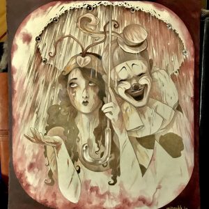 Patches is a commission marionette based on a clown drawing I did some time back. I was a given a name and a style, and asked to create a dancing clown doll with a vintage feel and lots of personality. I decided to make a child Patches. I tried to imagine what the clown from my drawing looked like when he was a little boy. I thought it humorous that he was born with clown face paint.