The flip-through for this book is a video flip-though. Please follow this link and enjoy the show.
Fantastic Familiars Vol2 video flip-through
Get your PDF download here.
Get your paperback here.

The flip-through for this book is a video flip-though. Please follow this link and enjoy the show.
Fantastic Familiars Vol2 video flip-through
Get your PDF download here.
Get your paperback here.
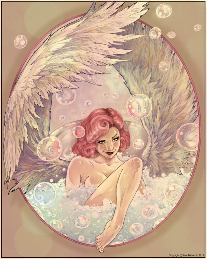
In my art group TALM, I offer monthly coloring events. Each event is unique in subject, theme, and goal, and each always ends with one chosen winner. The winner of the event is rewarded with a unique prize. As a reward for winning my 5 de Mayo event, the winner got to request any tutorial topic from me on either coloring or drawing. She asked me to go over how I color feathers and bubbles. Excited by the unusual topic, I drew a coloring page of a winged angel in a bubble bath. It is this line drawing that we will be coloring today, paying particular attention to feathers and bubbles. Let’s get started.
I will be coloring this image digitally in Corel Painter, but the techniques I am about to apply are specifically tailored for color pencils. As a matter of fact, I will set my drawing tool to be the same types pencils as I would use in real life.
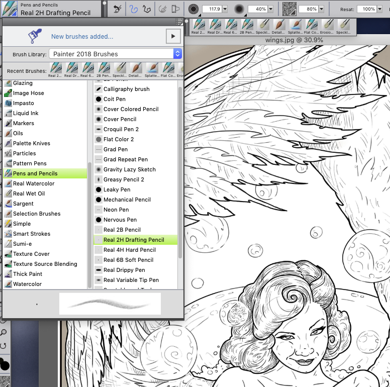
My pencil settings in Corel Painter
Because we are focusing only on feathers and bubbles, I will skip the step by step portion of how I colored the angel’s body. Let’s just jump to the part where her skin and the details of her face are already done.
The order in which you color the subjects of the page is very important. I would not start with the wings and I would most definitely not start with the bubbles. Here’s why. The wings are an accessory to her. We need to know what she looks like first and then decide what kind of wings match her complexion. The bubbles should be the last thing to color because they are opaque and transparent. They reveal and reflect all the colors of the scene. How can you possibly know what color your transparent bubbles should be painted if you didn’t yet paint the scene?
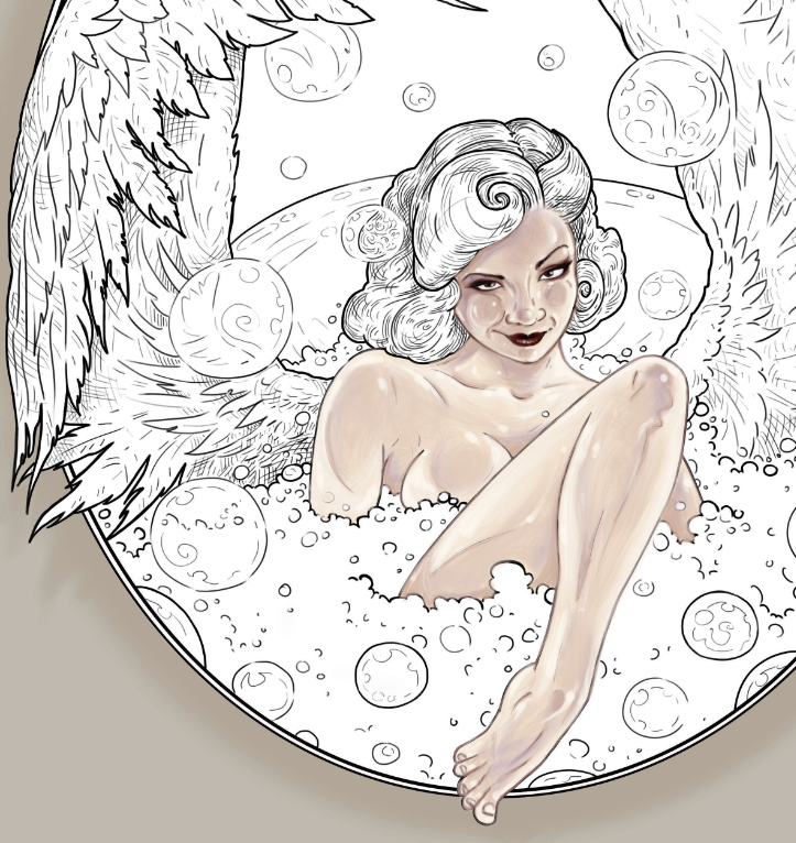
We skip to the part where the body and the face are already colored.
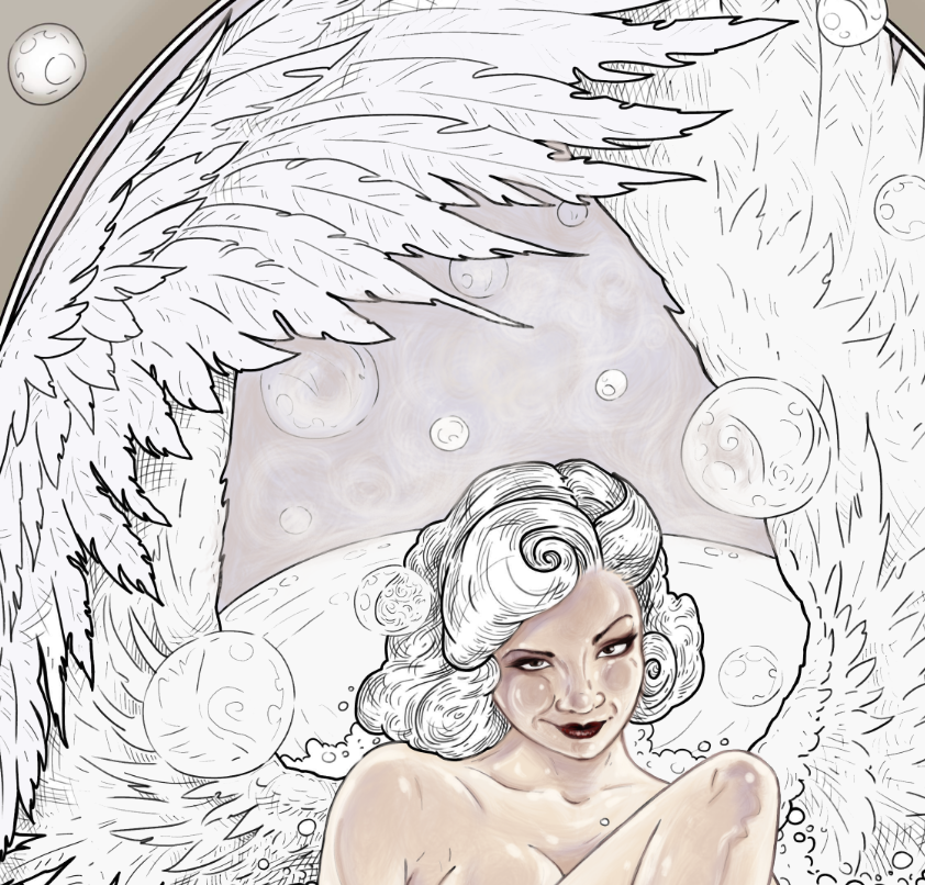
The next part that I like to establish is the background. This will set the mood for my overall color scheme. Many people leave the background for last, but I find that in most instances that is not the best way to go. Establish your settings and your atmospheric conditions first, and then the colors and the lighting of your main subjects will be established for you.
In this case, I want the scene to be soft and dreamy. I pick very delicate pastel tones of lilac. I may adjust them later on, but for now I am happy with this color. Notice how I didn’t just click-and-fill the space. I took the time to actually color it with my pencil tool, giving it some blurry swirl effects. Whether you are working digitally or with physical pencils, try to avoid solid color backgrounds. That makes the backdrop look flat. Instead, try to suggest some atmospheric perspective with blurry effects and using several similar tones instead of one solid color. When working with pencils, blurry effects can be achieved by smearing and smudging your pencil marks with q-tips, soft erasers, cotton balls, and even your finger.
I have a very clear idea in my head of what color scheme my finished drawing will have in the end. I can close my eyes and literally see the finished piece. When I draw, paint or color, I am actually just reproducing what I already see in front of me. Many people don’t approach drawing and coloring this way, and that’s perfectly fine.
If you cannot clearly see the finished colors or have difficulty deciding what color schemes to use, I highly suggest using what I call inspiration pieces. It’s simple, especially now that we have a world of images at our fingertips. Just look through a whole bunch of images until you see ones that speak to you in terms of light and color. A good idea is to search for various types of photography, and just let the image links take you down a rabbit hole until you come across color palettes that you like. Keep in mind, these should be completely unrelated images. They can be paintings, photographs, screensavers, whatever strikes your fancy. As long as you find pictures in color schemes that look beautiful to you. Pick one and use it as a guide when selecting colors for you piece.
Here are some examples of photography that I found online that are interesting to me for some other projects I have roaming around in my head. Remember, we are only looking at colors and their distribution on the page, not the subject matter. There are literally millions of images out there. Take a a few minutes to look through some of them to find the color inspirations that work for you.

Examples of photography that I found online.
Ok. Let’s continue. Now that you, hopefully, have an idea of your color mood, let’s get those wings painted. I want her wings to be almost white. Not quite perfectly white, but kind of cream-colored. I begin with some very basic grey shadows.
The most common mistake that people make when coloring wings is focusing too much on each individual feather, and losing track of the structure of the wings. Don’t start with feather details. Instead look at the wings as at two objects. How are they positioned? Is one closer to you than the other? Are they reaching forward or back? Is there a curve to them? Where is the light coming from? Where would the shadows be?
In my case, the light in the bath-house is very diffused. There isn’t really one strong light source. The light is soft and generally reflected off all the steam that I imagine is in the air. So I don’t have to worry too much about harsh shadows, but I do have to give my wings structure. I use a regular grey pencil to start adding shadows to the parts of the wings that are the furthers from us, and little bit here and there to start defining the shape of the wings.
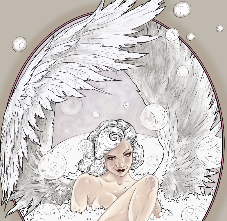
I place my shadows here. I am working very lightly, because every new layer of color that I will add will go on top of this grey. I don’t want to compete with it, but I do want to establish my shadows.
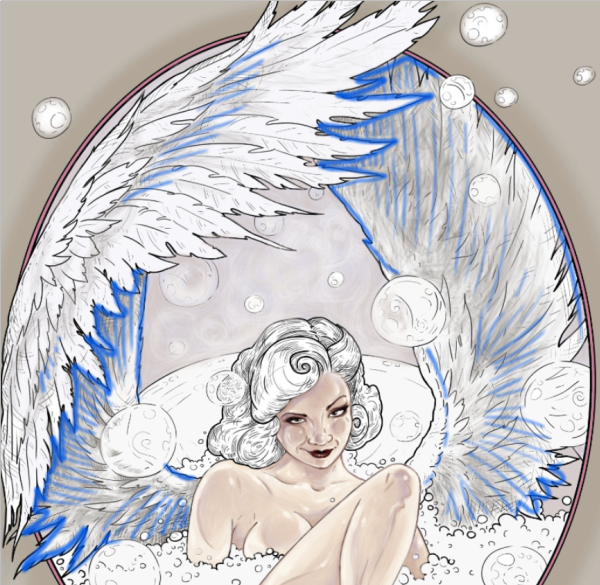
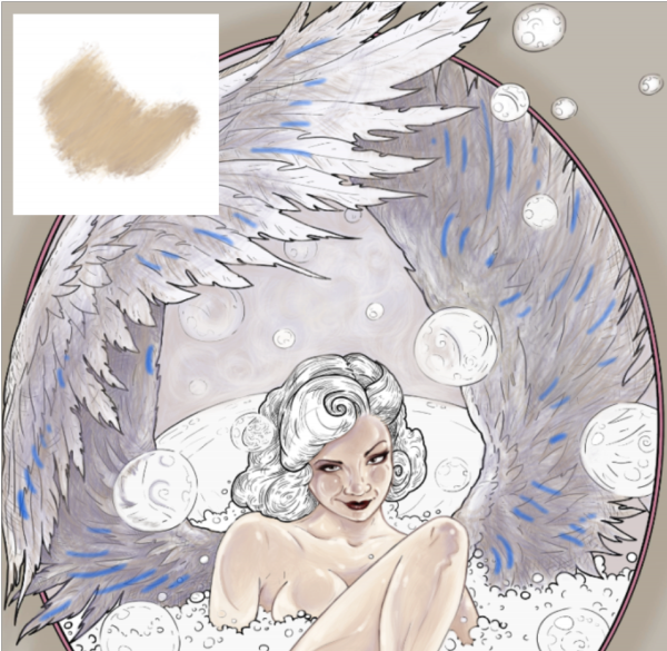
The blue lines indicate the areas where I placed the shadows.
Now I move on to my first color – a soft grayish-purple tone. I add it to the parts of the wings where I’ve already indicated some shadows. This time, I take more care to add more pigment and to make my pencil marks with the direction of the feathers. Feathers are very textured. Part of what will define your texture is your pencils marks.
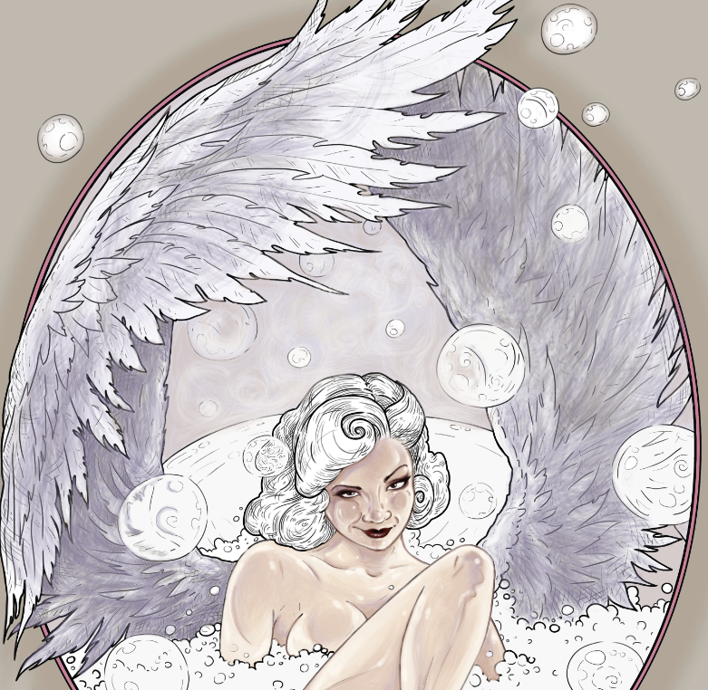
Notice that my pencil marks are still very rough, but they are starting to give the wings shape. Aways work with the shape of your object and don’t just color blocks of color between the lines. This will give your piece more dimension.
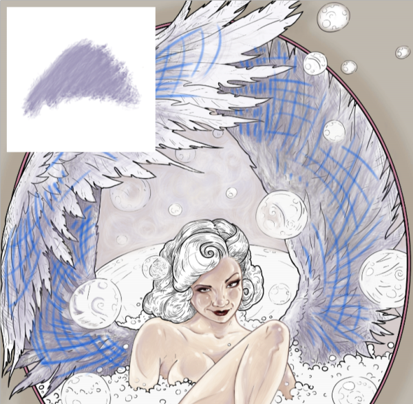
My first color on the wings and the direction of pencil marks.
The other way to add more dimension and depth to your subjects is using several colors to build one color effect. Even though I’ve decided that my wings are a solid cream color, I am actually using multiple colors to make the wings look more realistic and 3-dimensional. Granted, we are working in a more cartoony style, but I am going for the semi-realistic coloring of a comic character effect.
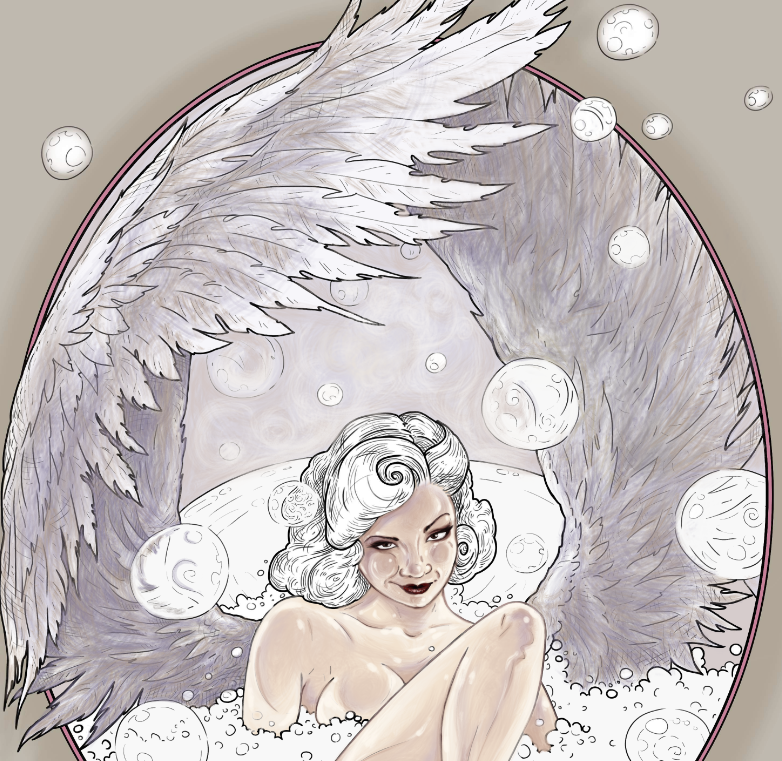
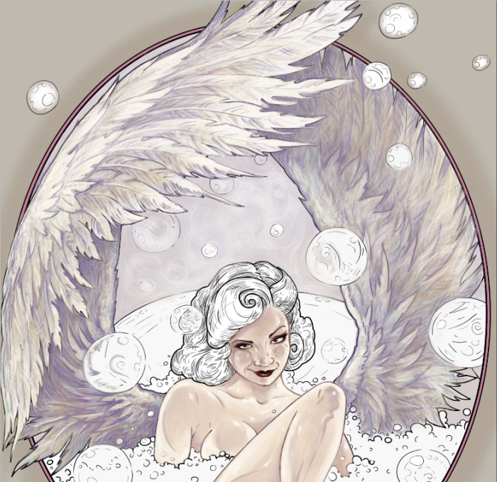
My second color for the wings is an ivory blush tone of light brown. I add it lightly here and there, like makeup powder. If I hadn’t told you that I added it, you probably wouldn’t even notice. But compare this screenshot with our previous step where I only added the purple. It’s not a dramatic difference, but somehow there is already a little bit more shape definition to the wings.
The blue lines indicate some locations where I added minor beige highlights.
So far, my wings just look kind of grey and dull. Let’s start working with the actual cream color that I promised. I select a very pale, almost yellow, beige and a complementary pale blue to go with it. I am working very delicately with both pale yellow and pale blue to complete my wing illusion, adding the lightest tones to the parts of the wings the are physically closer to us.
At this point, I actually switch back between all four of my color pencils to balance the coloring. I hide some of the black outlines with my purple pencils, and you can see that I’ve started adding some detail to the individual feathers. Note that I am only adding detail to the feathers that are closest to us. I am barely defining any feather shapes on the wing that is further away. That lack of definition helps create an illusion space. Add more detail to the objects that are closer and less detail to the objects that are further away. You can even use your smudging tool to blur that darker wing a bit.
Notice how I’ve retraced the outlines in these areas with my purple pencil. That gives the coloring a softer feel, which is of course what we want, given the subject matter.
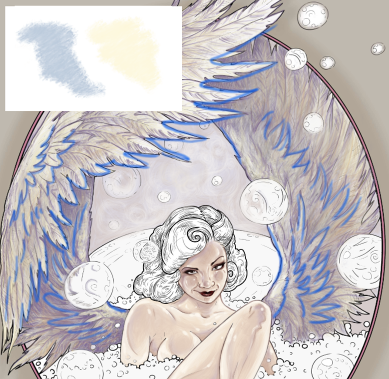
The blue lines indicate places where I retraced black lines with a softer purple.
All in all, these are the only colors that I used to paint the wings. You may finalize your wings with a touch of white highlights here and there.

Remember to always make your pencils marks in the direction of the fur or the hair or the feathers flow. The feathers are growing left to right here. My pencils strokes are also left to right. The eye of the viewer will pick up on that and see it as more natural, even if the brain doesn’t realize why the illusion works.
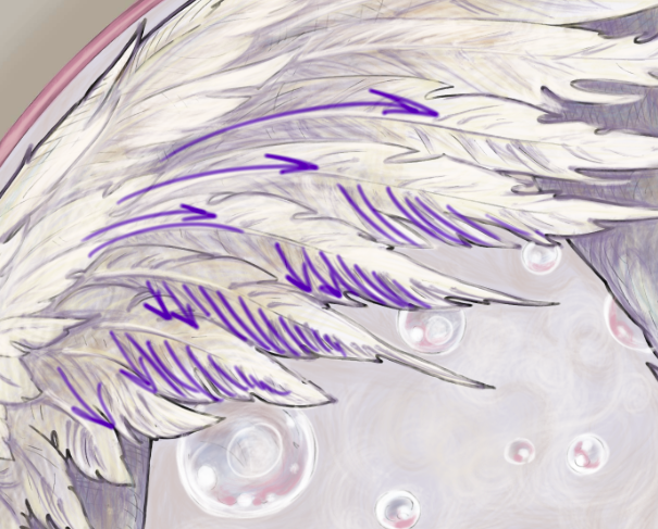
Now, I could take this further and eliminate all of the black lines. Some people take the time to do that. If this was a piece for publication or print, I would invest in that effect, but for the sake of the tutorial, I’m ok with leaving some traces of the original black outlines here and there.
You can also take this further and add really fine hyper-realistic detail to some of the feathers, but take care not to overdo the effect. When we look at objects we see concepts, not full detail. When you look at a bird with open wings, your brain does not register every single feather. It registers two symmetrical wings, the overall feather color, the overall feather texture, the darkest parts, and the lightest parts of the wings. A successful, drawing, coloring or painting is one that delivers the message in a way that our brain already interprets information. So, don’t sweat those tiny details. Sometimes, less is more. Light and shadow are far more important than detail.
All right, let’s move on. Before we can start adding bubbles all over the place, we need to finish coloring everything else that remains uncolored in the scene. In this case it’s the tub, the soapy water and her hair. I chose to paint her hair in a color that will stand out. This color will be the centerpiece of my drawing. A little burst of visual emotion in an otherwise pale and subdued scene. Plus, with a vibrant color, I can clearly demonstrate the color selection for the bubble painting.
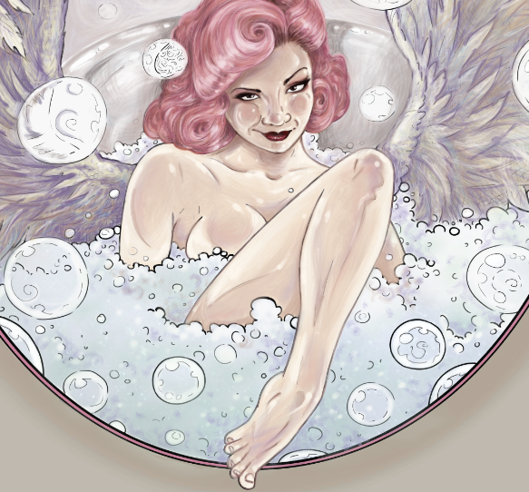
Let’s start on our first bubble. There is one floating in front of her hair.
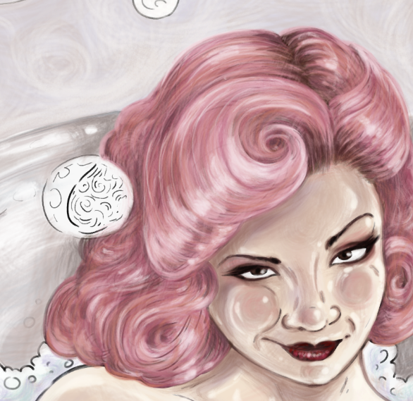
I start by working with the same pencils that I used for the tub and for the hair, and very lightly adding those tones to my bubble. I am not going for detail here at all. In fact, on the contrary, I want the effect to be blurry. In real life I would use a q-tip to smudge the color all over the bubble.
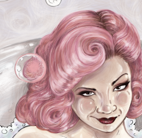
Keep in mind that soap bubbles are not just 100% clear. They are opaque, and they kind of distort everything that you can see through them. In this case, the line drawing already suggests where the colors should go. (The line drawing, of course, being made by me 😀 I like to give my colorists enough suggested information to guide them, but not so much that there is no room for their own artistic decisions).
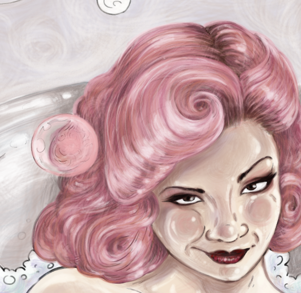
Looking at the overall color scheme of my whole composition, I pick one other color to put into my bubble to make it stand out a bit. I pick purple. I could have picked blue or beige, and they would have worked just as well. There is no one perfect or correct way to draw a soap bubble. All soap bubbles are unique and each has an element of randomness to its swirls and blurry effects.
Experiment. See what works in your composition. For instance, if you paint the rest of your scene with completely different colors from the ones I chose, making her hair green and the tub blue, inserting this soap bubble painted exactly the way that I did, will make absolutely no sense. Your bubble has to work with your color scheme.
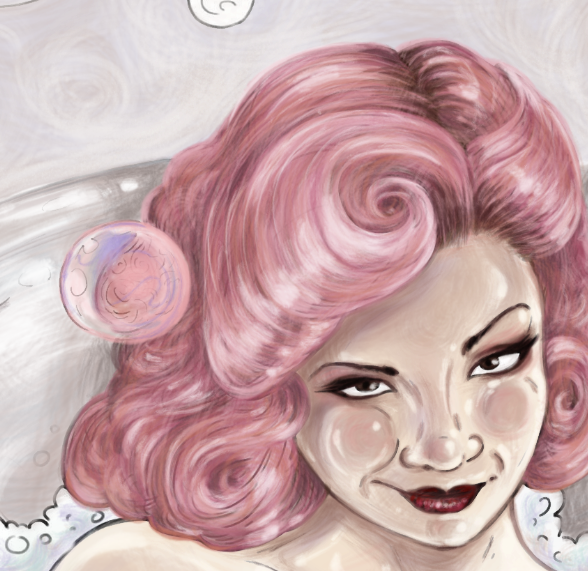
I add some white to the suggested places and also hide the black outline with pink and white. As much you can, try to make the soap bubble outline white. That will really help with the illusion of weightlessness. You can do this with a white marker, a white pen, whiteout, white pencils of certain brands (I like Prismacolors the best), acrylic paint, white charcoal, and many other easily available art tools. Try different things to see what works best for you.

Finally, having observed my new soap bubble, I decided to add a few more little white highlights here and there, to make it a little shiny. If you are not adding white with a separate white pigment tool, take care to leave the designated areas uncolored, using the white of the paper as your lightest sections.
Remember the element of randomness. There is no one formula for where the white dots and circles should go. It’s all about what feels right to your eye. I tend to keep the center of the bubble a little darker and the edges lighter. For me, this is the perfect effect.
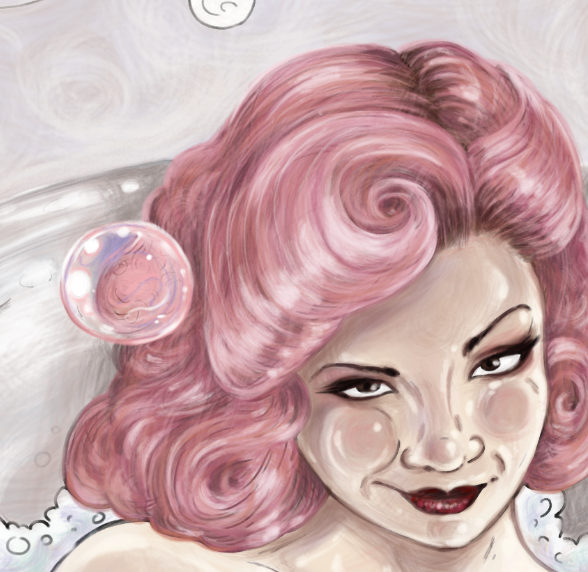
I am happy with how this bubble turned out. Let’s move on to the next. How will this bubble be different? Well, the most obvious thing we can see about this one is that it is in a different location, with different colors surrounding it.
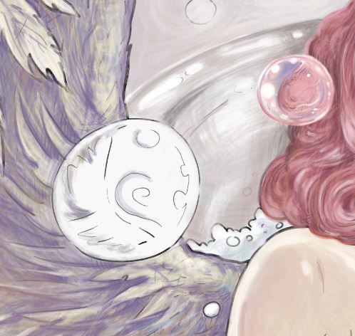
I use all the colors that are around this bubble, but I make them slightly more pale, because bubbles are soapy, and once again I am going for the smudgy effect.
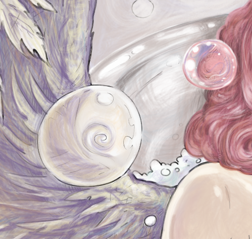
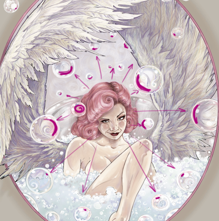
I add some pink glow on the side of the bubble that is closest to the pink hair. This is very import. This will be true for every bubble that we color. I want an obvious pink reflection on every significant bubble, on the side that is closest to her hair. This should be consistent throughout my piece.
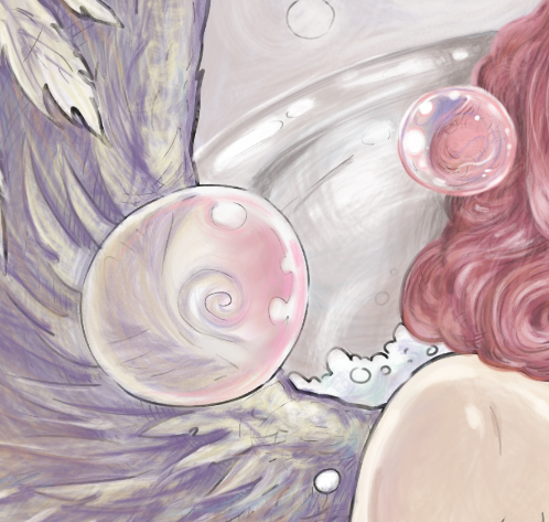
I complete this bubble with some white highlights. Notice that they are different in size and placement from our first bubble. A common mistake that colorists make is coloring every bubble in exact same stencil way. That just doesn’t look natural. The light is playing off of everything in this setting. Bubbles are even reflecting other bubbles. We are not going to get technical and photorealistic here. I want to stick with the cartoony style, but we can imitate a realistic look by staying true to that element of randomness we talked about.
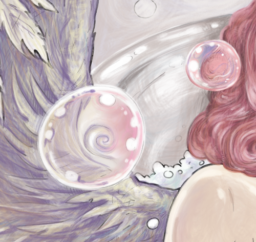
Every bubble should be unique and working with its surroundings. Let’s take a look at a few other examples. Notice that the bubbles are in fact colorless. This is why you cannot “color” a bubble without first coloring the rest of the scene. They are little prisms for other colors around them.
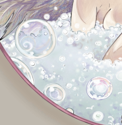
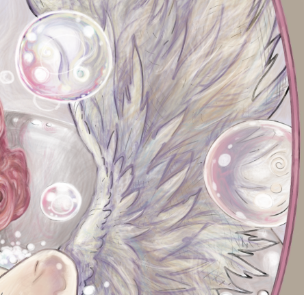
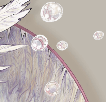
Now that all my bubbles are complete, note how each of them is perfectly unique and random, yet they all have one consistent principle – the reflection of the pink hair color. The pink glow is not just randomly placed here and there. It is very strategically placed on each bubble directly opposite the source of the color.
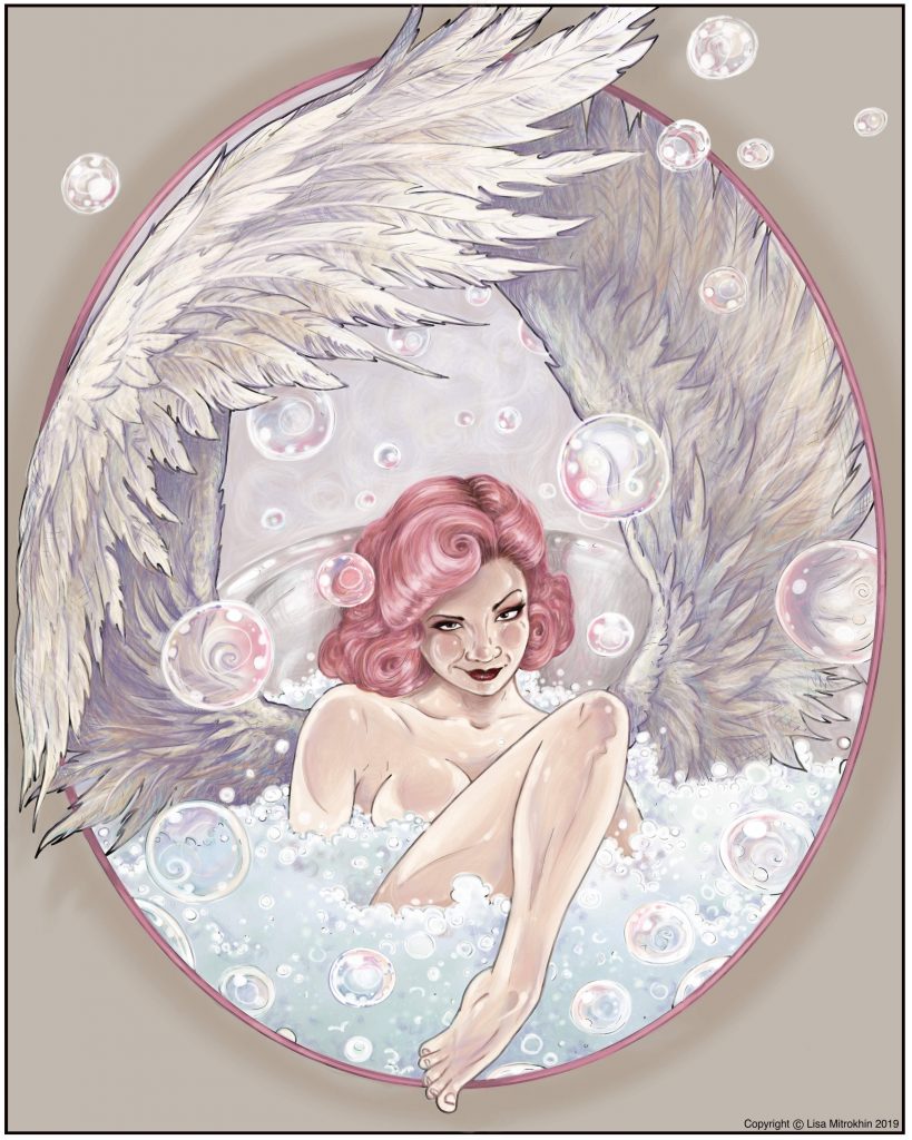
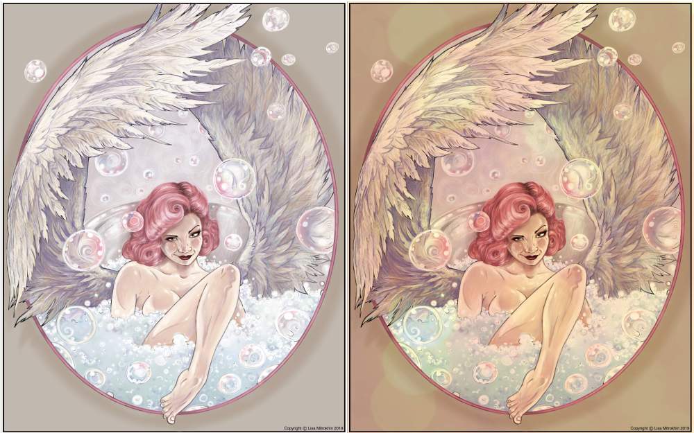
Now that my coloring is complete. I look over the entire composition, and study it. Is anything off balance? Does anything look too dark or too light? Do any of the bubbles stand out in some awkward way? This is the time to tweak little things here and there to bring everything to perfect harmony. I don’t see anything obviously wrong with my coloring, other than my overall tone. Looking at it now, it’s too crisp and there is too much pure white. I would prefer to look at this scene through a yellow or an orange filter. If I were working with real pencils, I would pick a few golden yellow tones and begin to carefully add some highlights here and there. Working digitally, I can skip 15 or 20 minutes of tedium by adding a single layer in the filter color that I like. Sorry, had to cheat at least once during this tutorial. You know me. 😉
Here are the two versions of my finished piece. Honestly I like them both. Both are perfectly fine, and I could have achieved the second effect from the very start. The yellow light effect just didn’t occur to me until I saw the final piece.
So, here she is – a winged angel in a bubble bath.
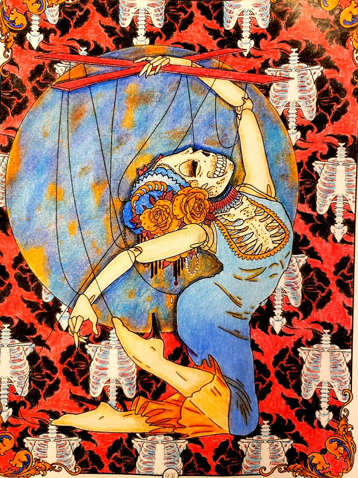
I hope you enjoyed this tutorial. The line drawing version of this page will be offered for a one-time coloring event in TALM, the winner of which will also receive a kick-ass prize, like this one. Remember that this is by no means the one and only way to approach feathers and bubbles. I highly encourage you to experiment and also to remain true to your own style.
If you enjoy my work, and wish to come join us in these fun events for a chance to win cool prizes, I hope to see in my group, TALM. Just click here, and join the fun.
Special thanks and congratulations go to Leatha Loftis, the winner of my 5 de Mayo event. This was the coloring that won her this tutorial.
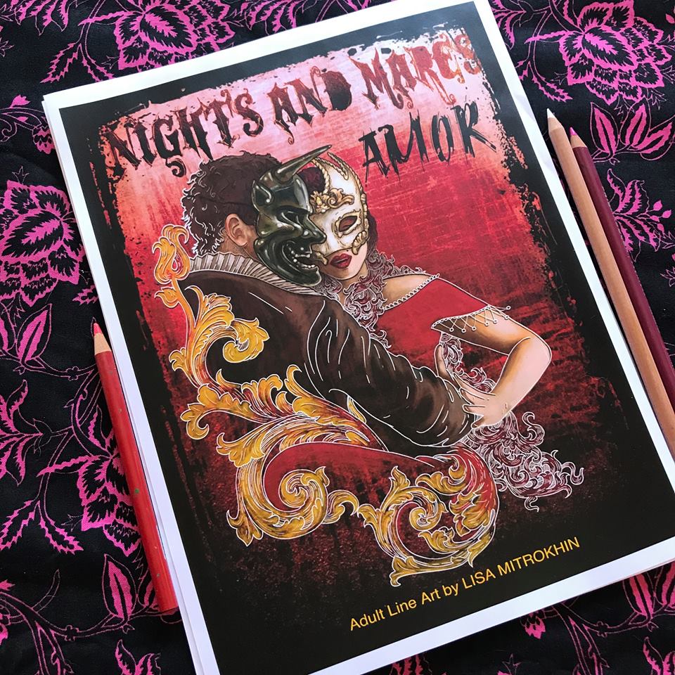
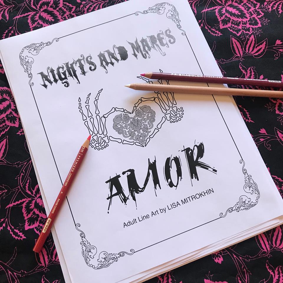
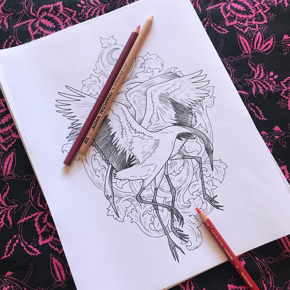
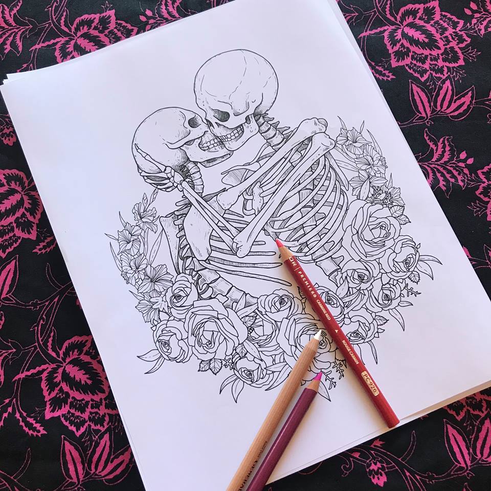
For Valentine’s day 2019 I wanted to bring my fans something special, something different. Nights And Mares AMOR is the latest in the N&M universe and true to its nature it is a union of beauty and oddity. In this volume, you will find classic characters as well as strange mythical creatures. You will discover passion as well as heartbreak, the lust of a lover and the love of a mother alike.
Based on your requests I tailored these illustrations to reflect my personal drawing style over the confines of traditional stark coloring lines. I want you to experiment with different methods of coloring, with considering the light source, with really giving these compositions mood through light and color. These images are not designed for the click-and-fill style digital coloring. They are, however, excellent for the digital painters as well as traditional pen, pencil, and watercolor colorists.
Nights And Mares AMOR is available in a digital (PDF) download form on ETSY and in print on Amazon.
Enjoy and happy coloring!
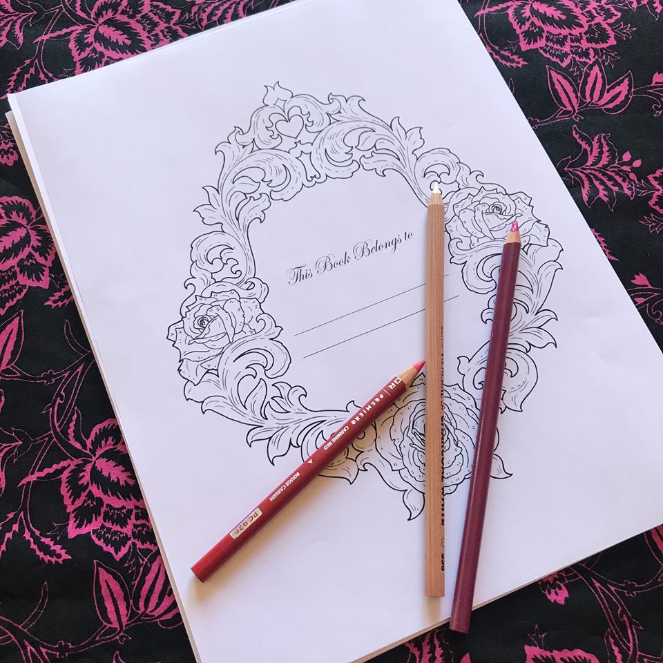
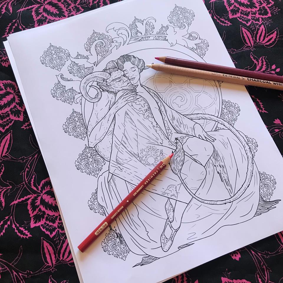
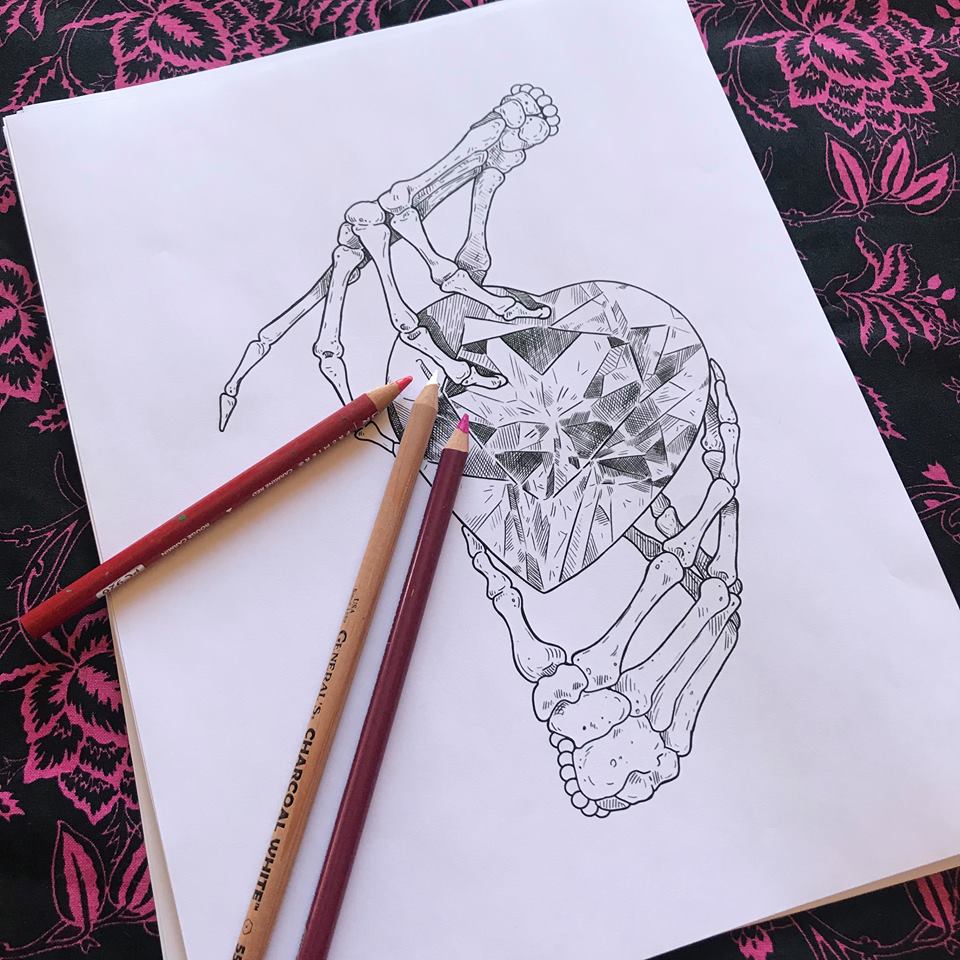
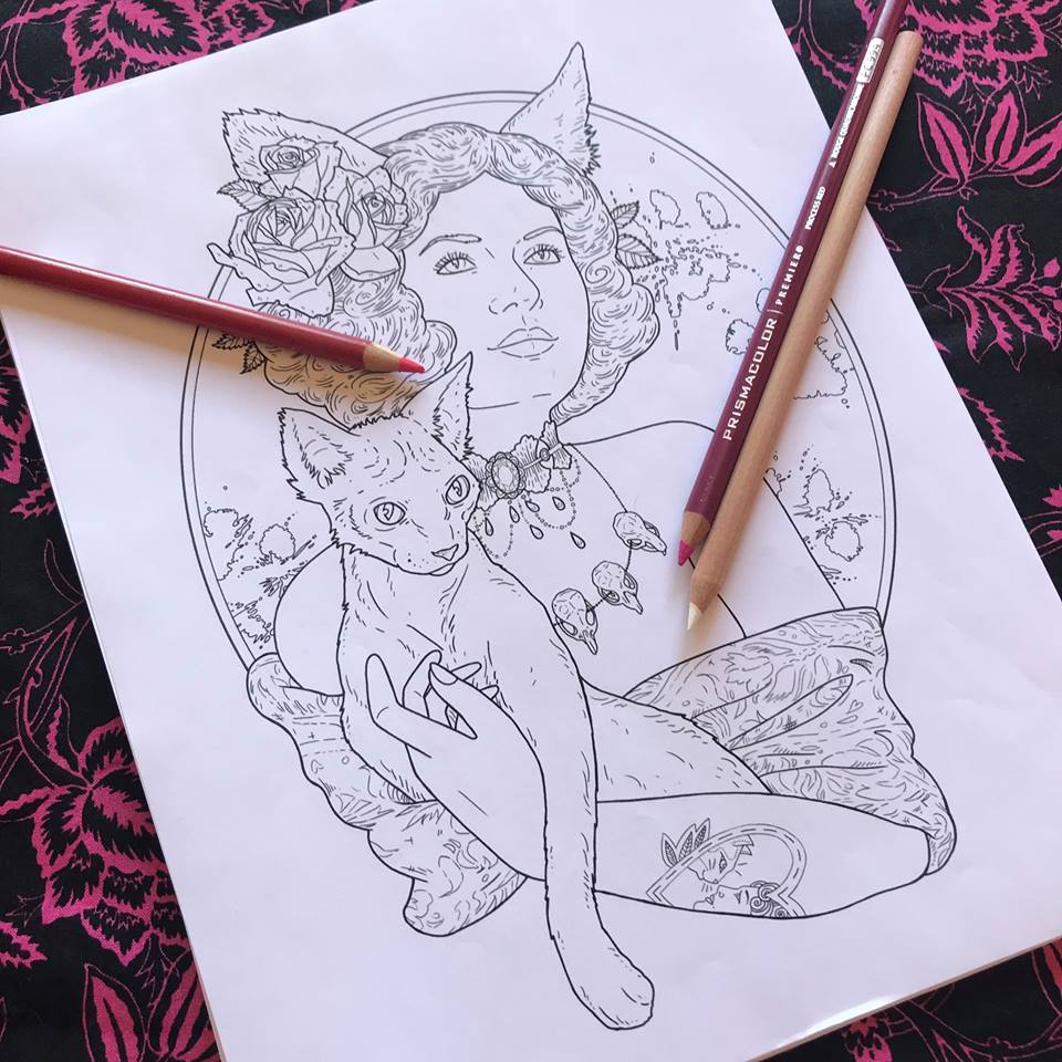
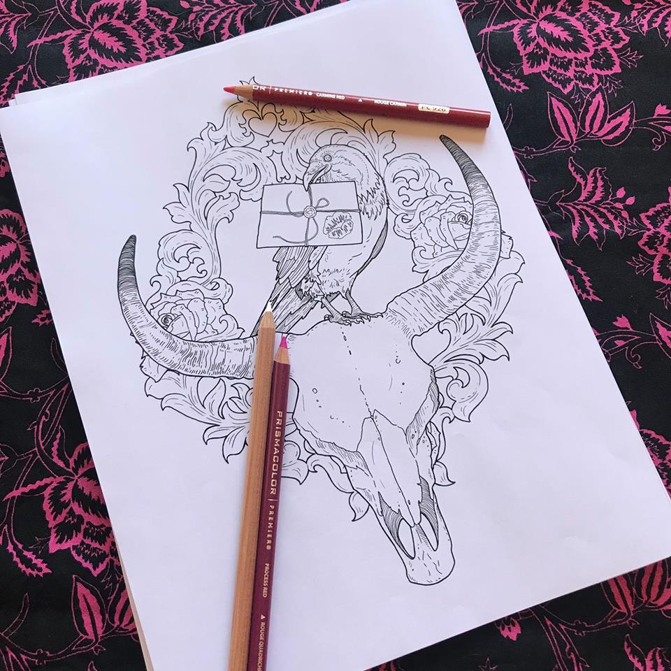
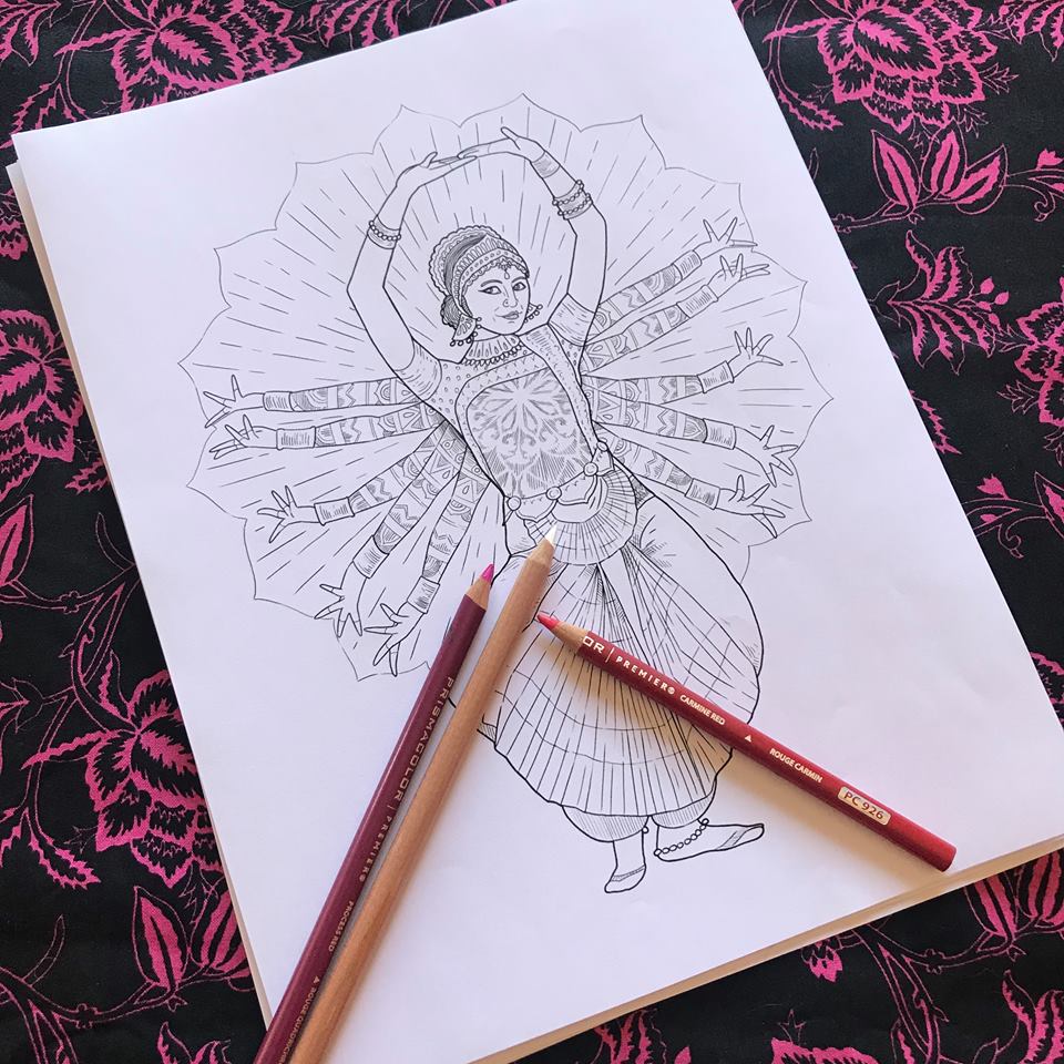
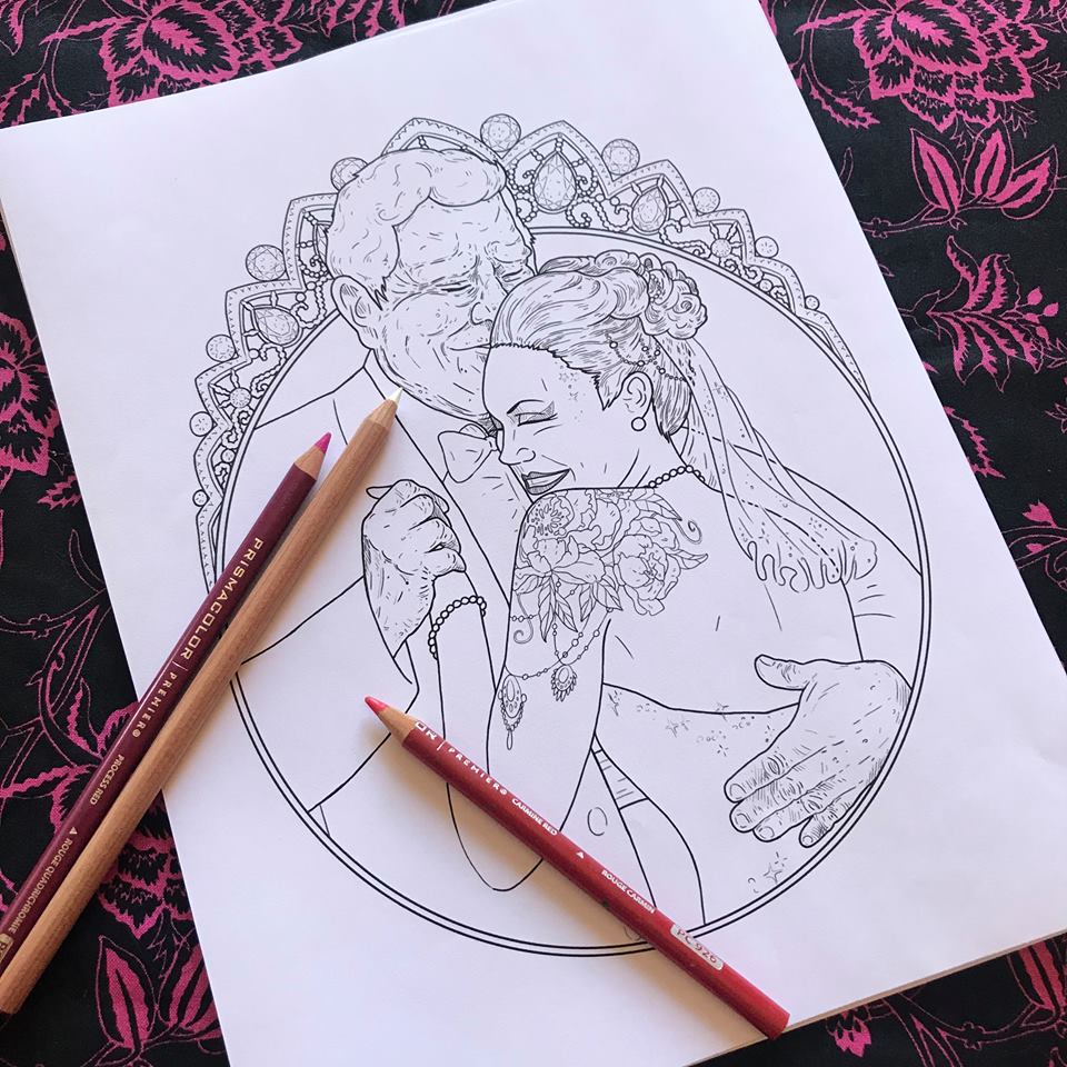
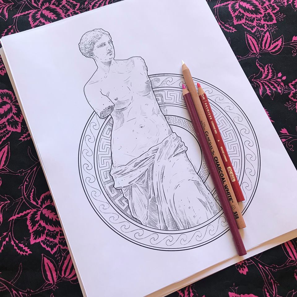
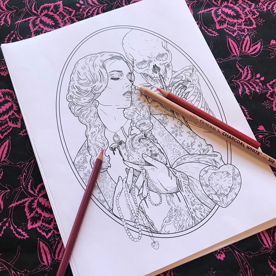
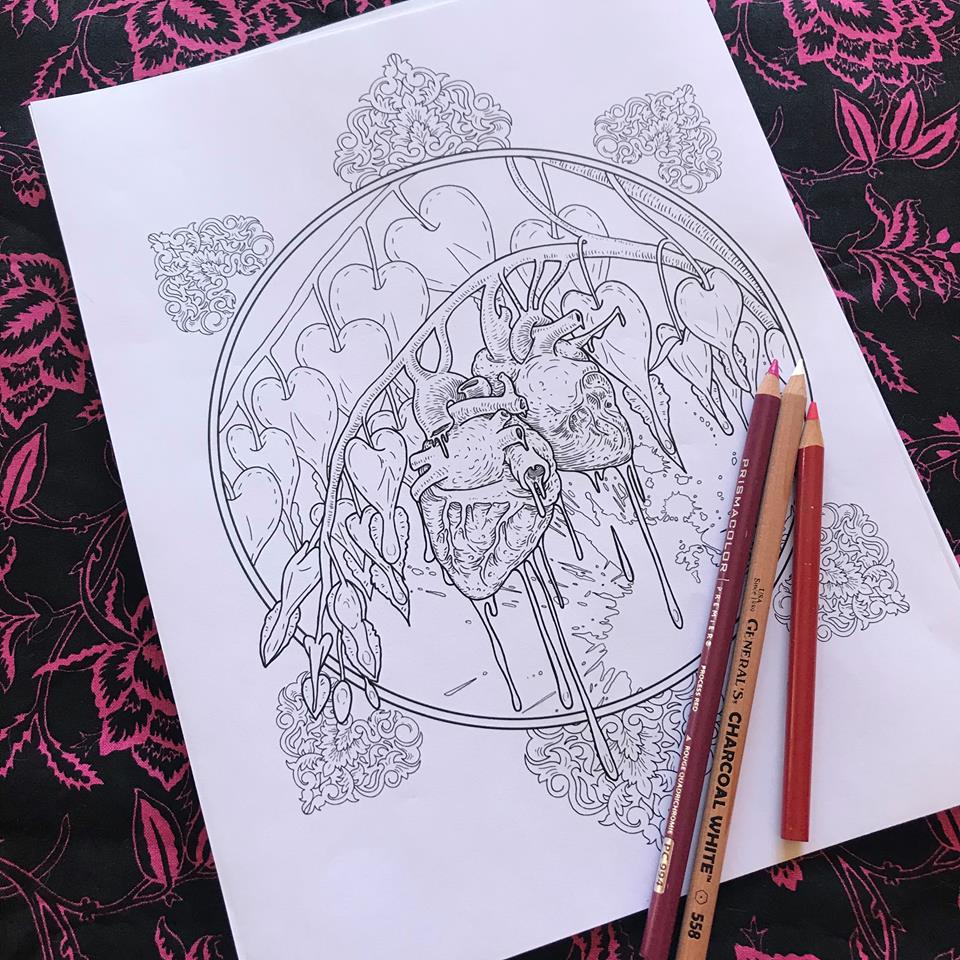
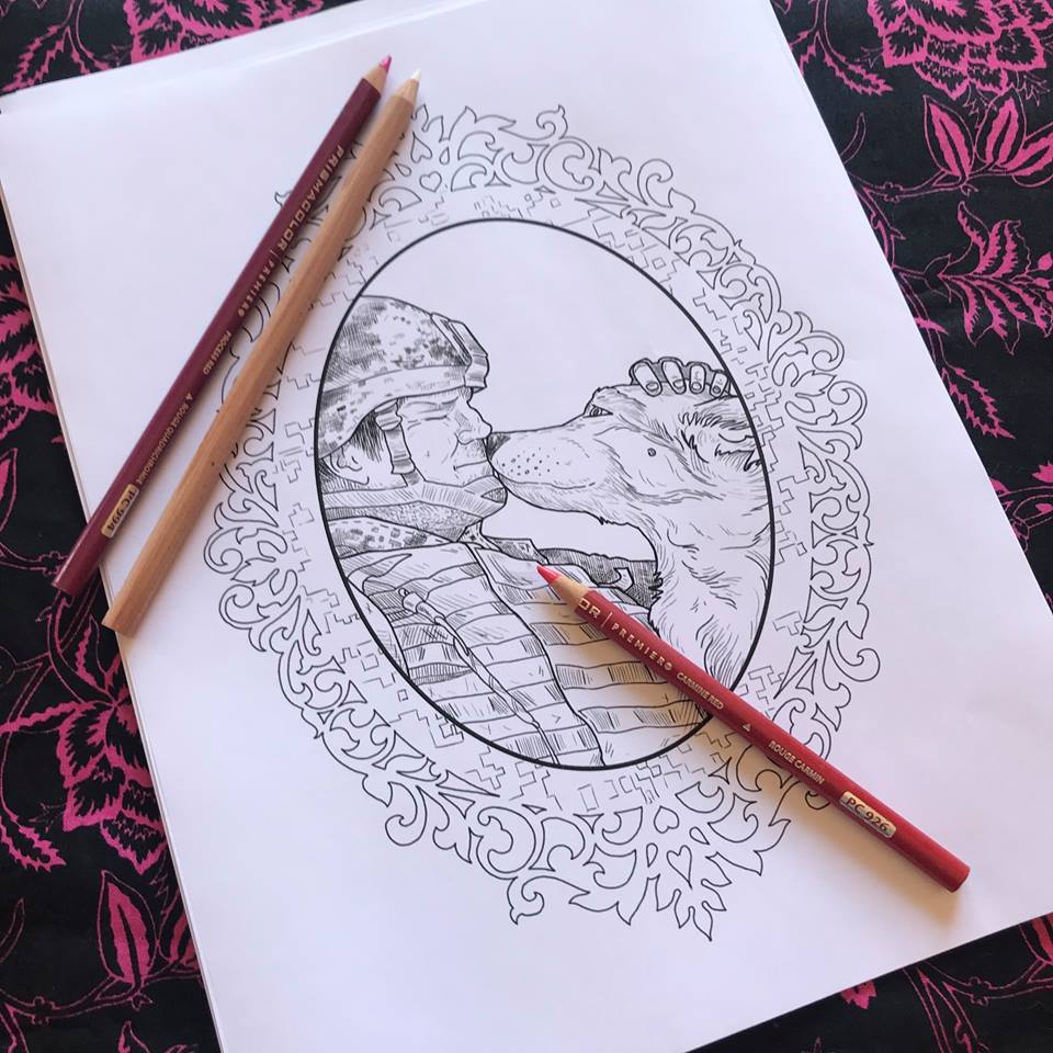
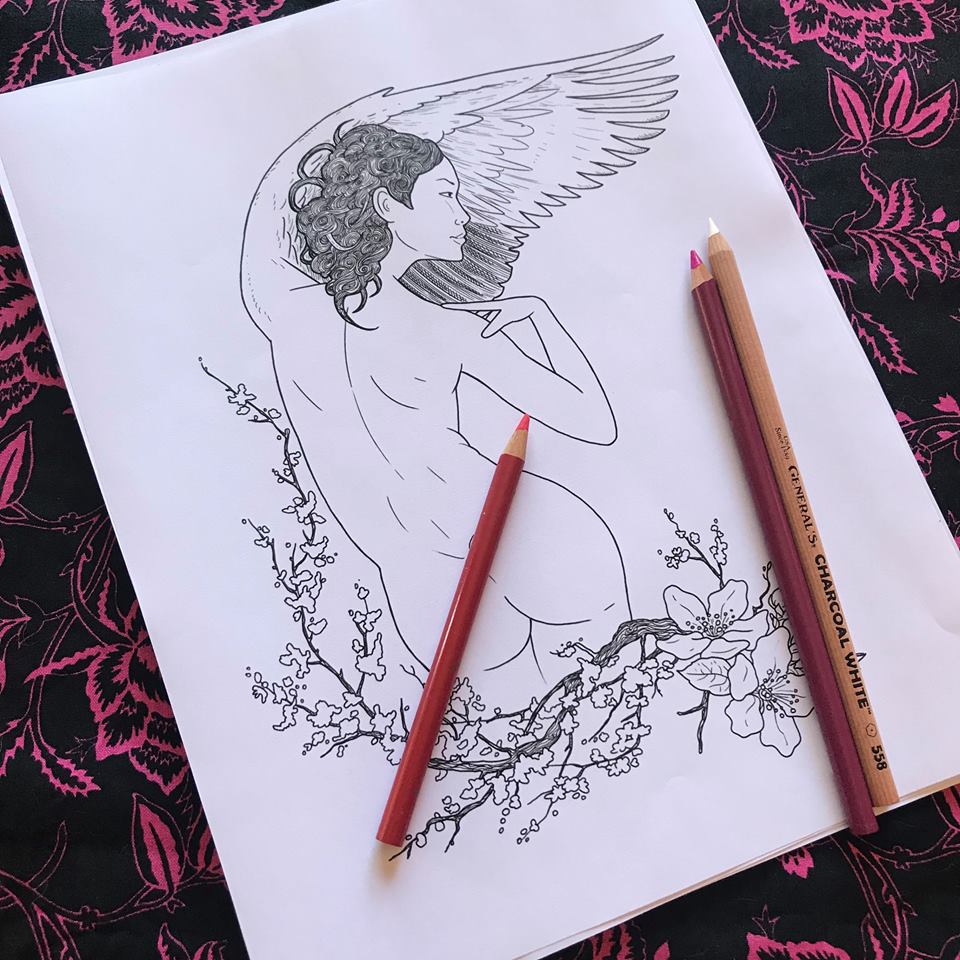
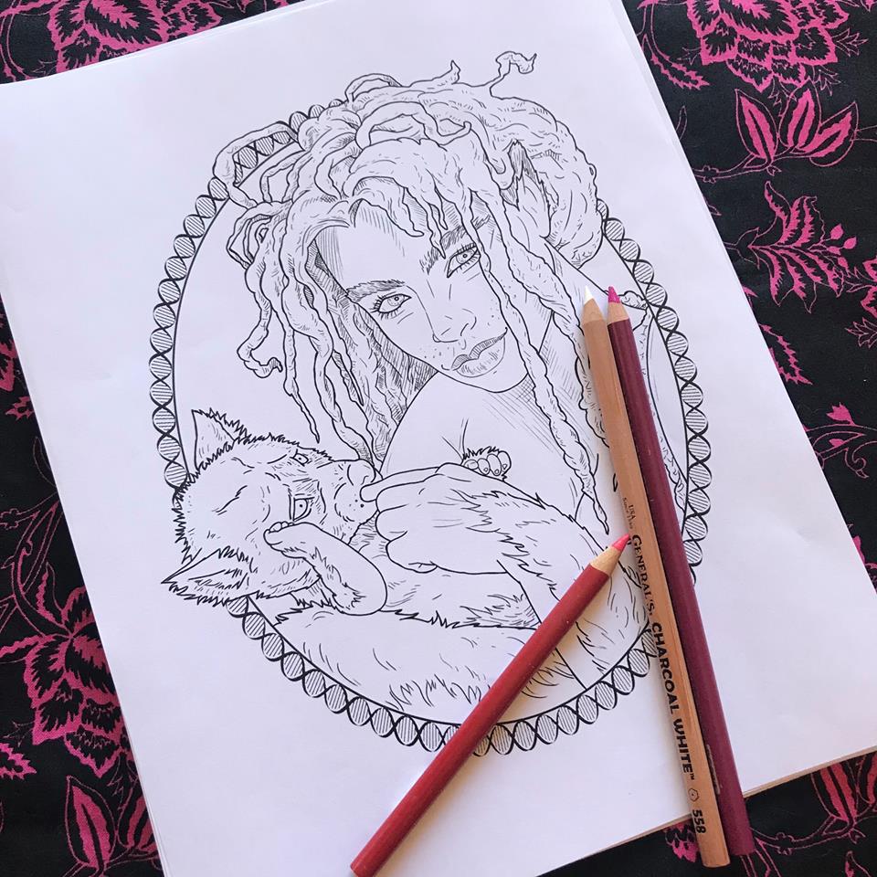
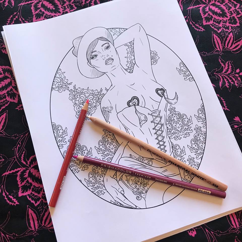
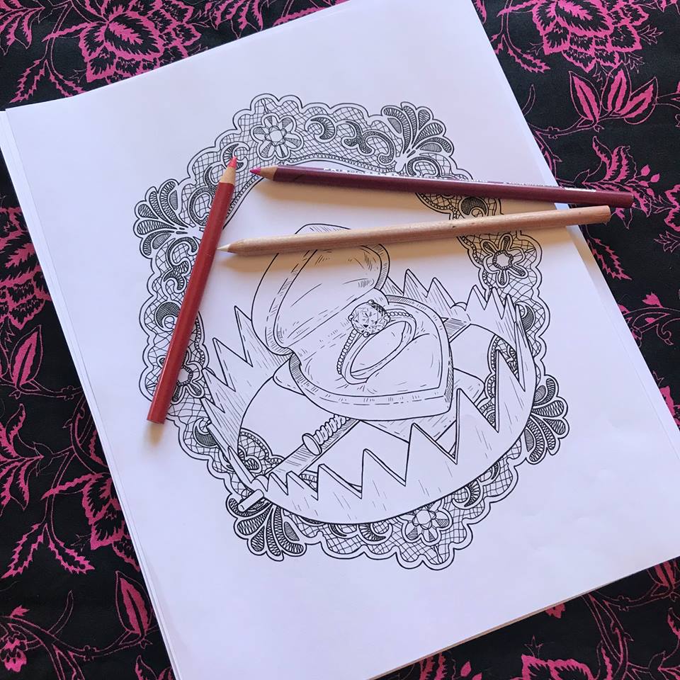
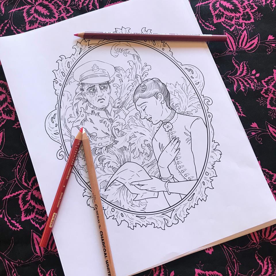
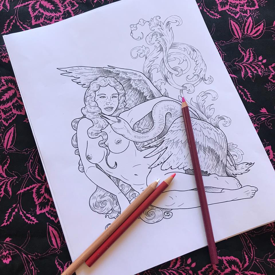
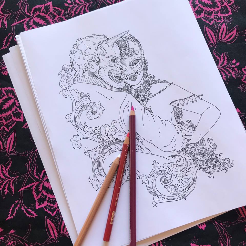
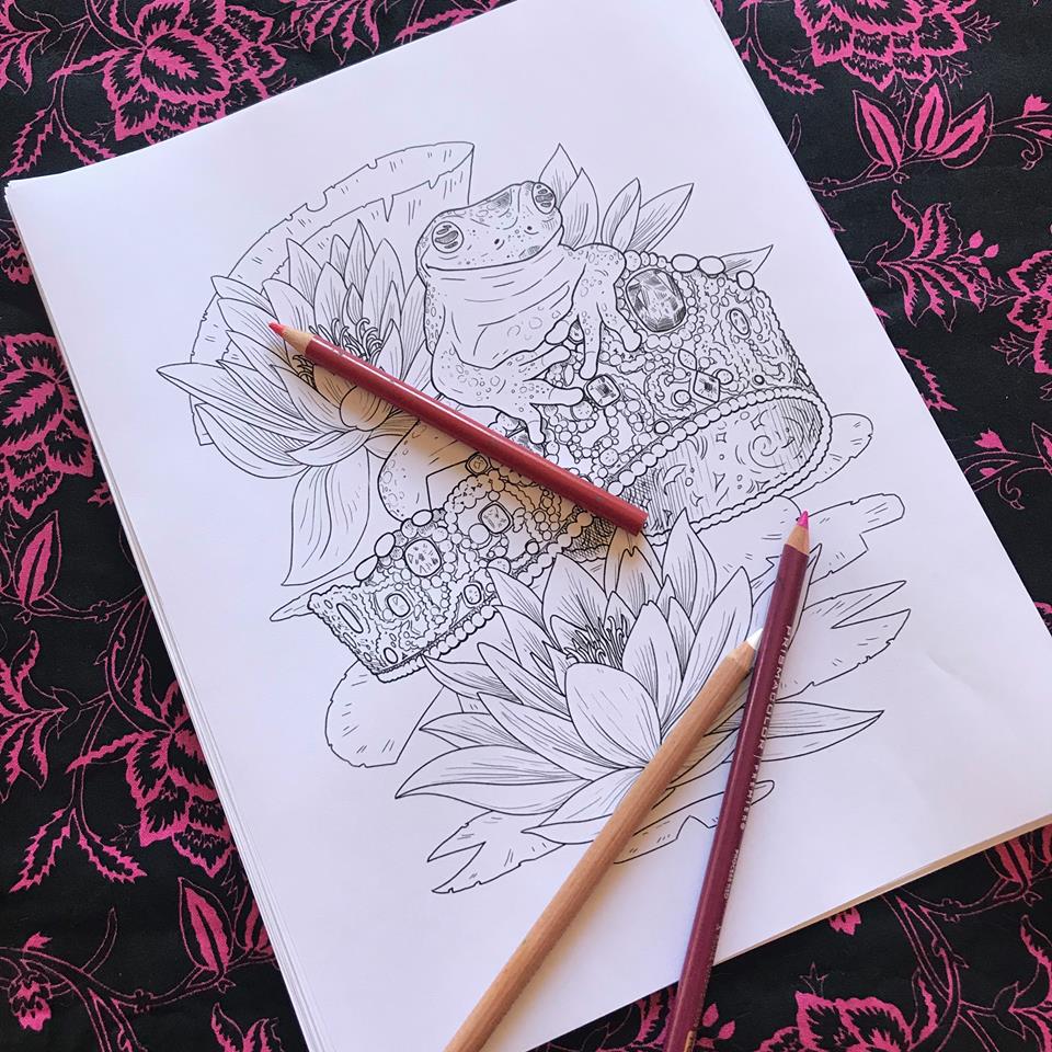
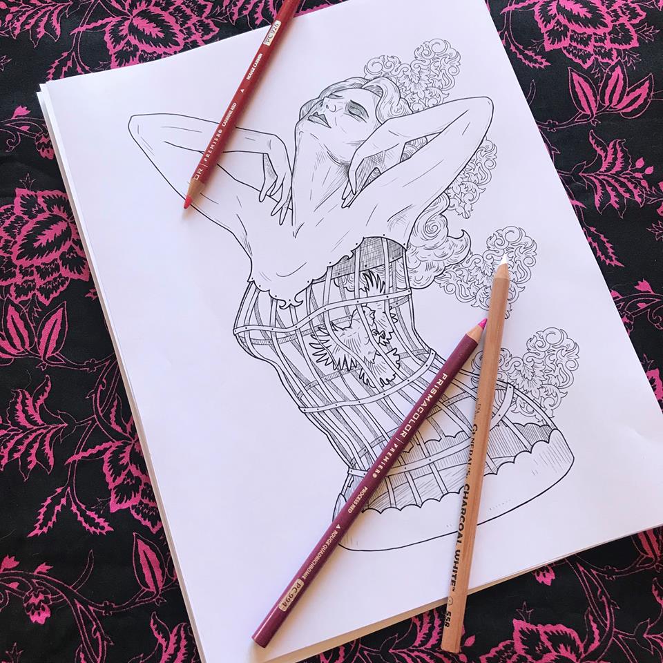
Get your PDF download here.
Get your paperback here.
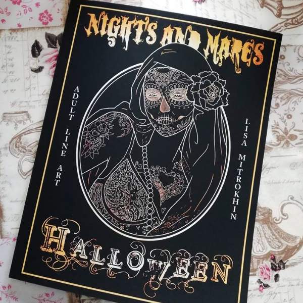
Dear colorist, in this volume I invite you to explore yet another chapter of the Nights And Mares universe. To celebrate my favorite holiday, I created characters that will entertain, intrigue, mesmerize and maybe even scare you on your coloring journey. Each page appears twice in this book: once in its basic line form and once with added greyscale effects. You may choose to use the secondary images as references for color placement, color them as well as the line drawings, or you may simply enjoy them as free-standing illustrations.
If you are already enjoying Nights And Mares – Femme Macbre, and Nights And Mares – Circus, you will find Halloween full of pleasant surprises, new characters, and different patterns, drawn in the familiar, highly detailed style. Staying true to my N&M world, in this book I once again focus on the beauty of the grotesque and the unusual.
So, without further ado, I invite you to jump in and color. Remember, there is no right or wrong way to color. This book is your playground. Go crazy.
This book is available in print on Amazon and as a PDF download on ETSY.
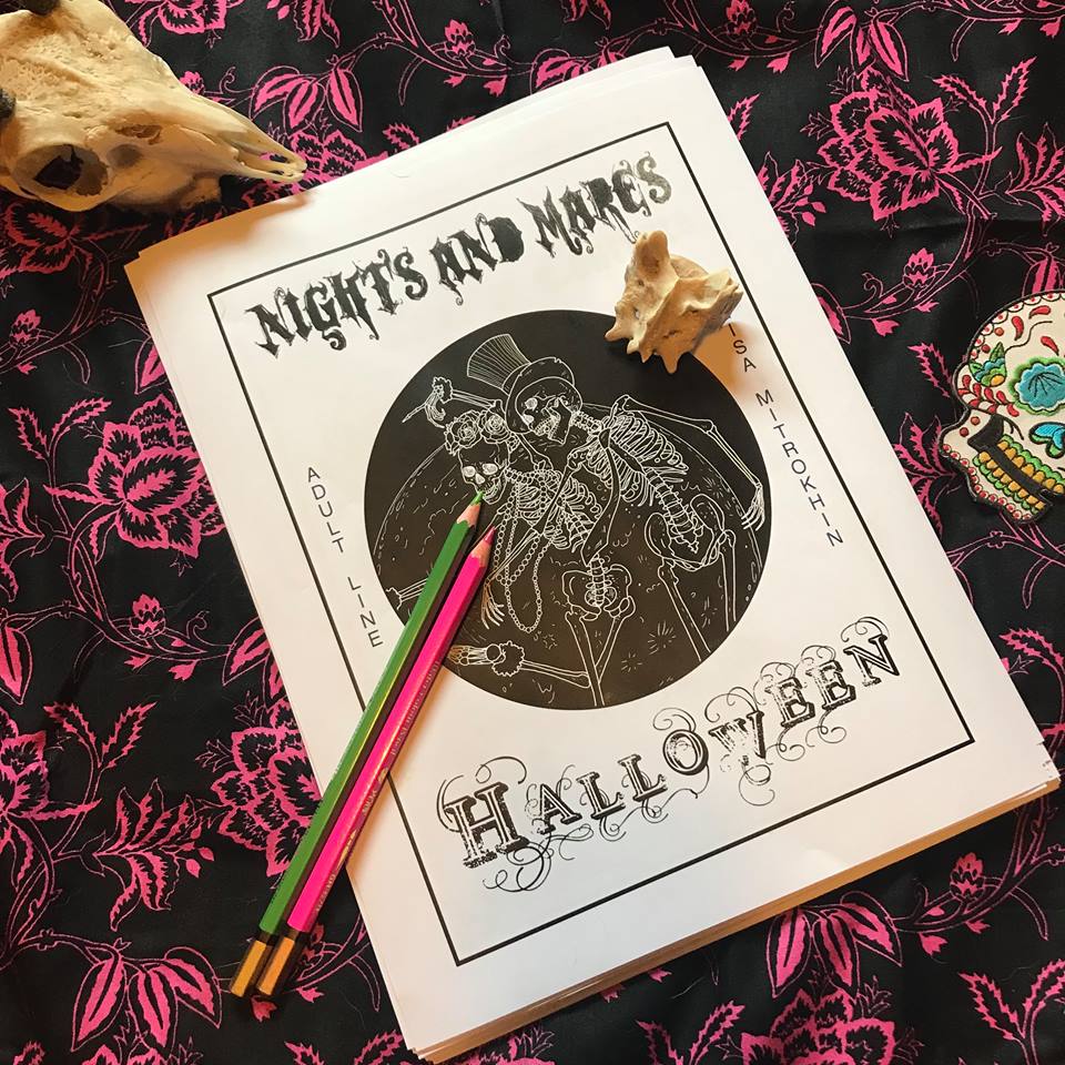
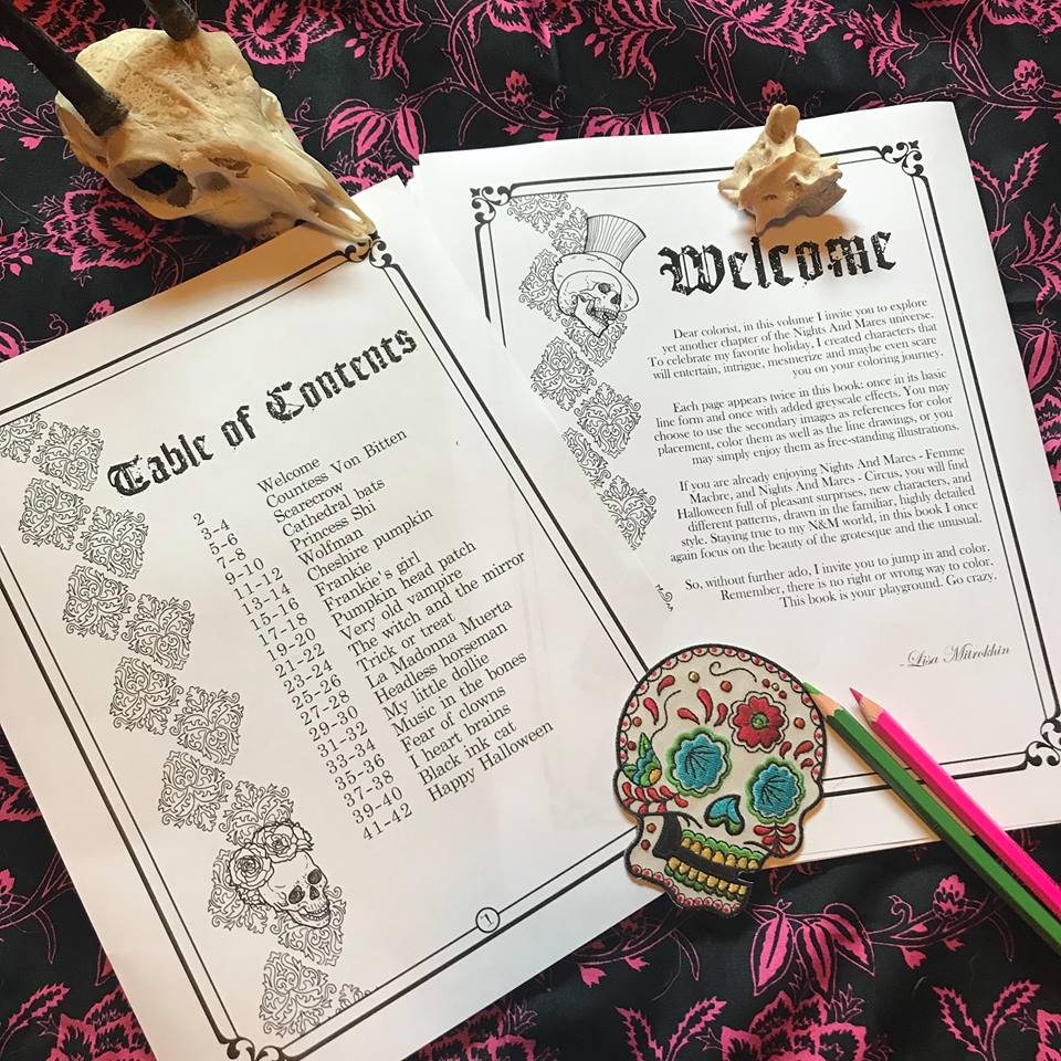
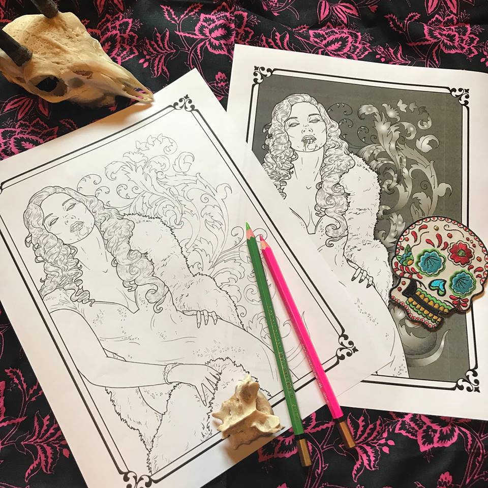
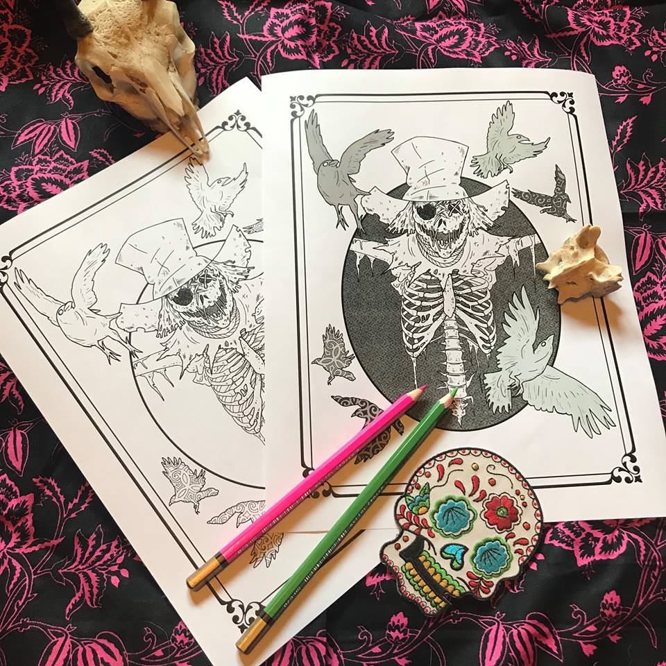
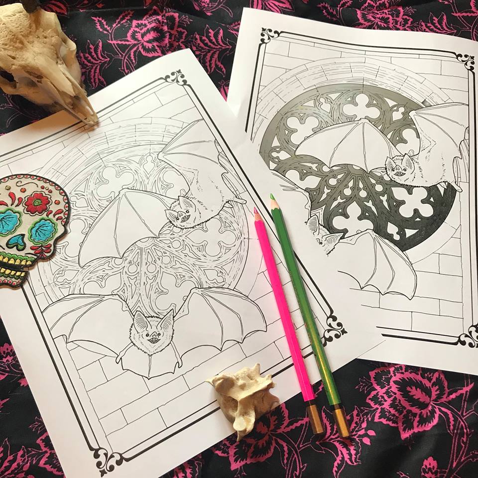
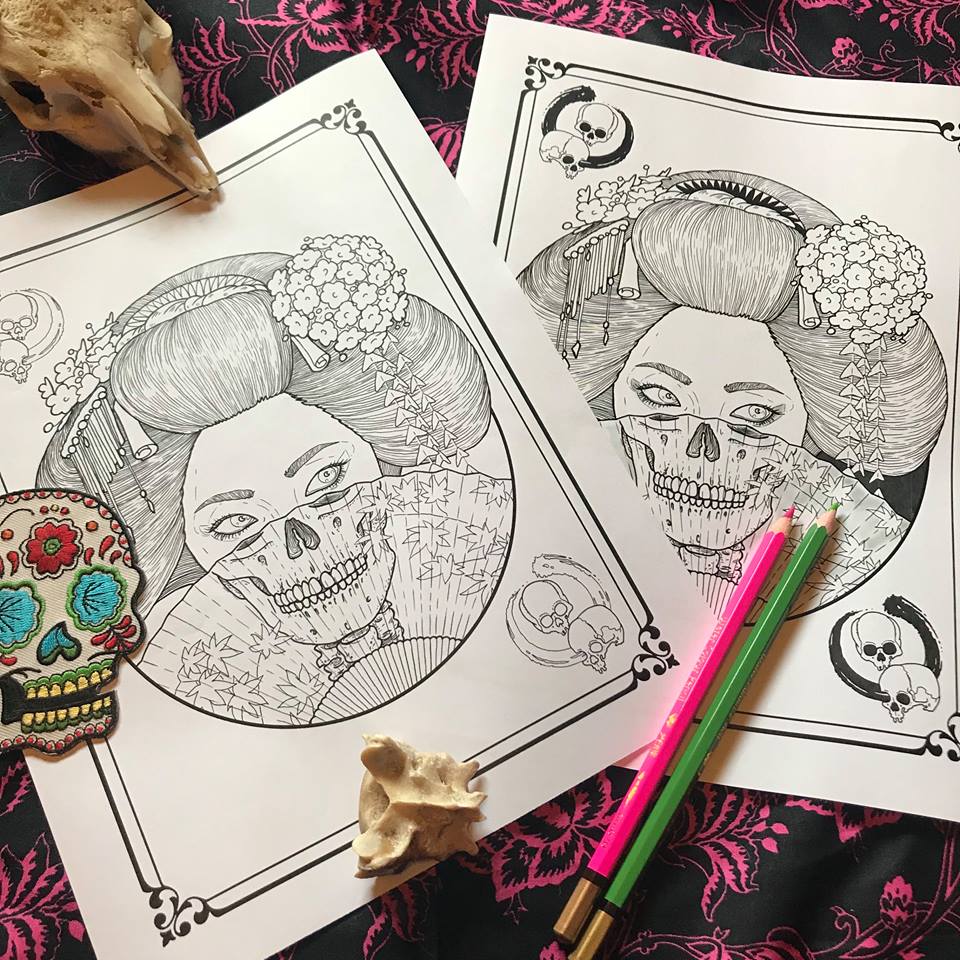
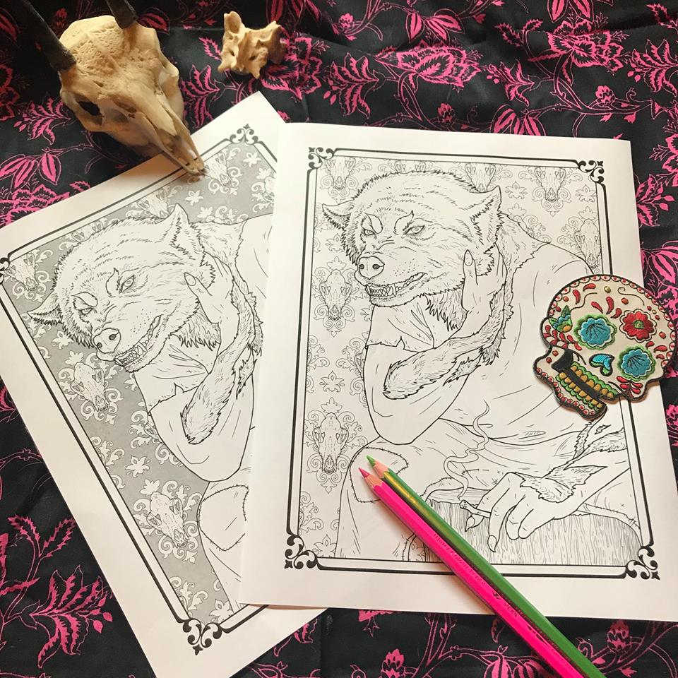
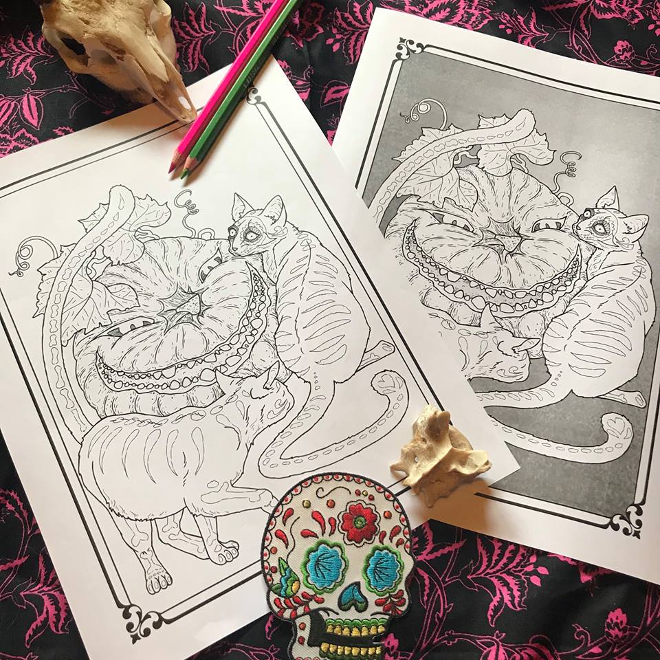
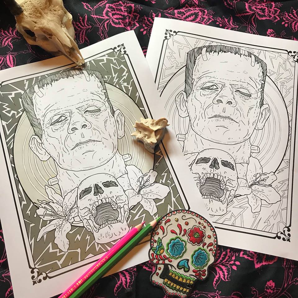
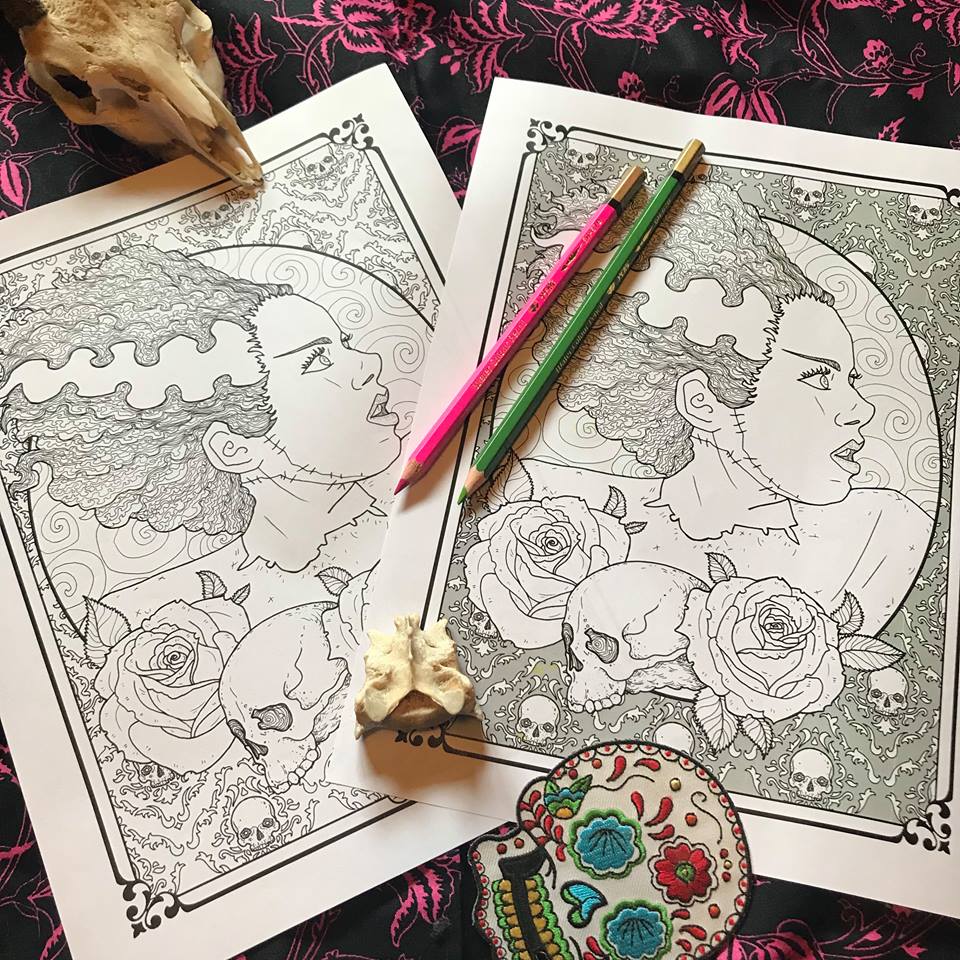
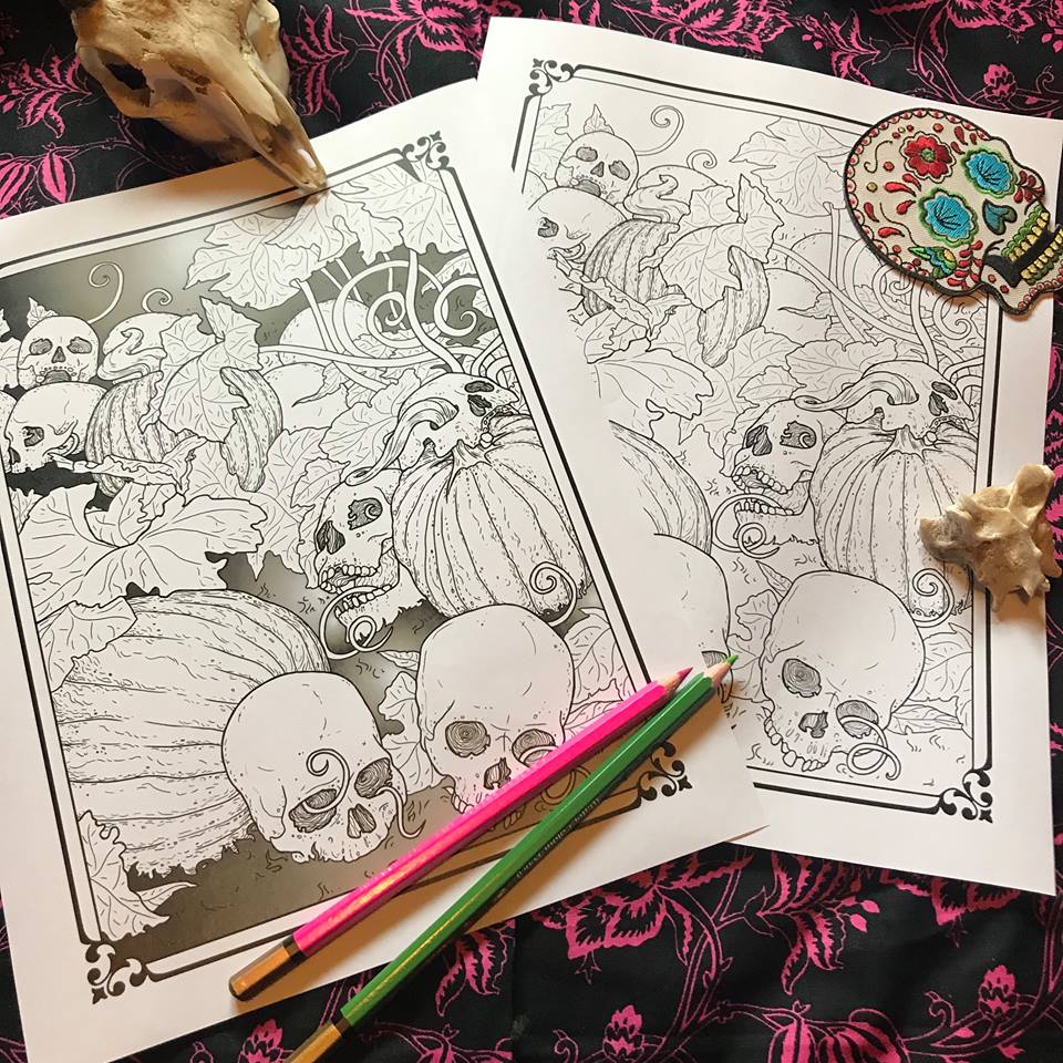
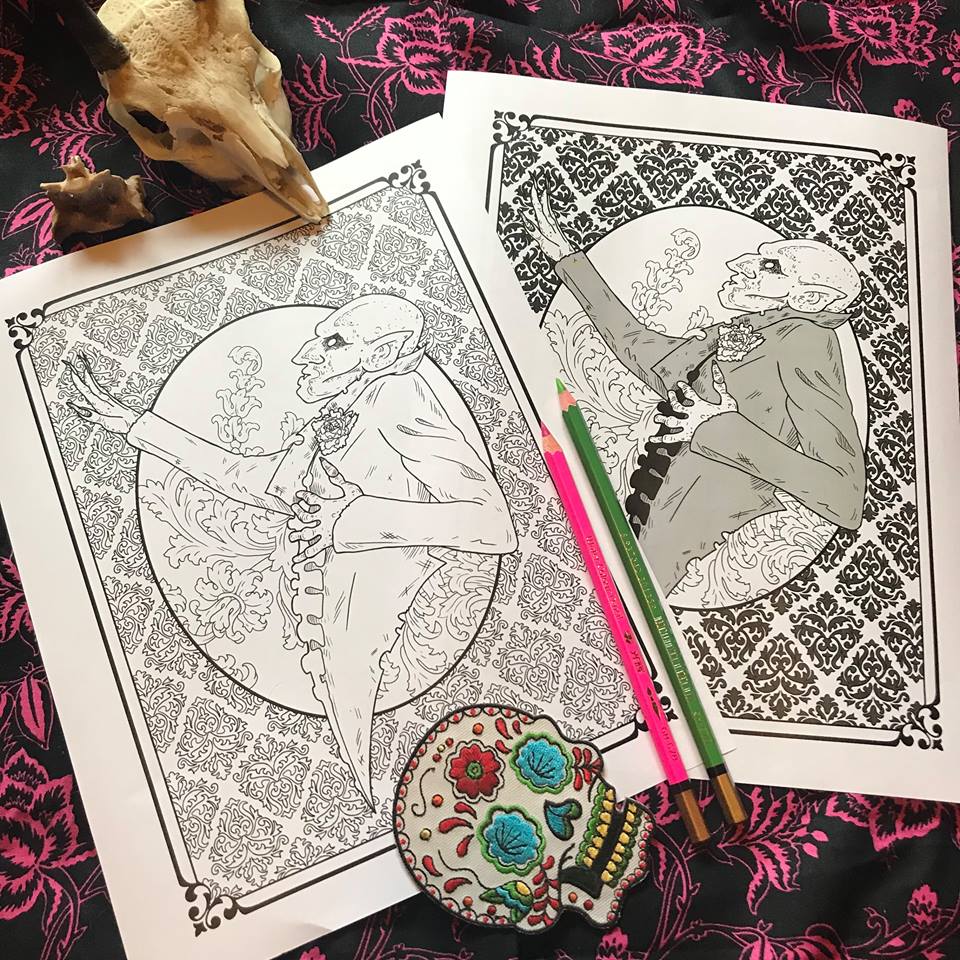
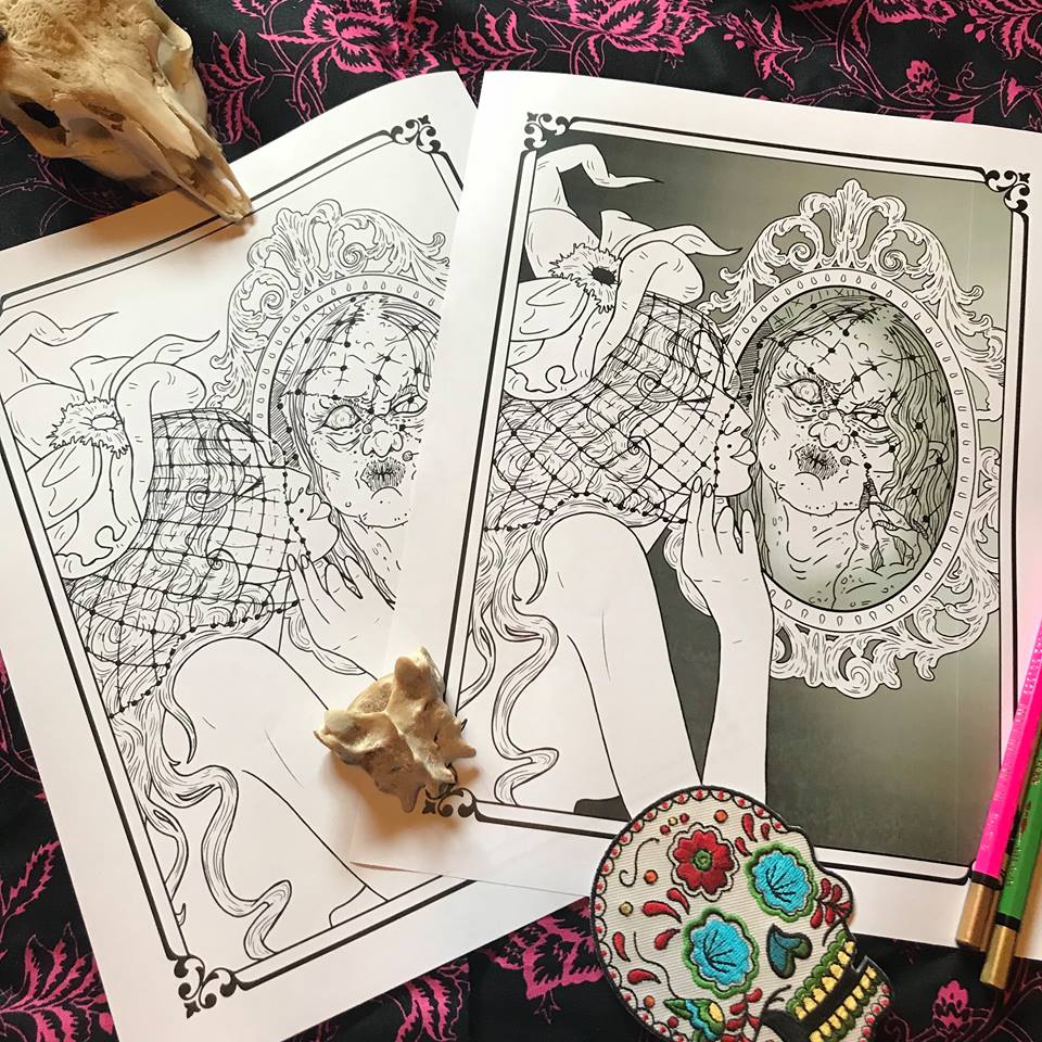
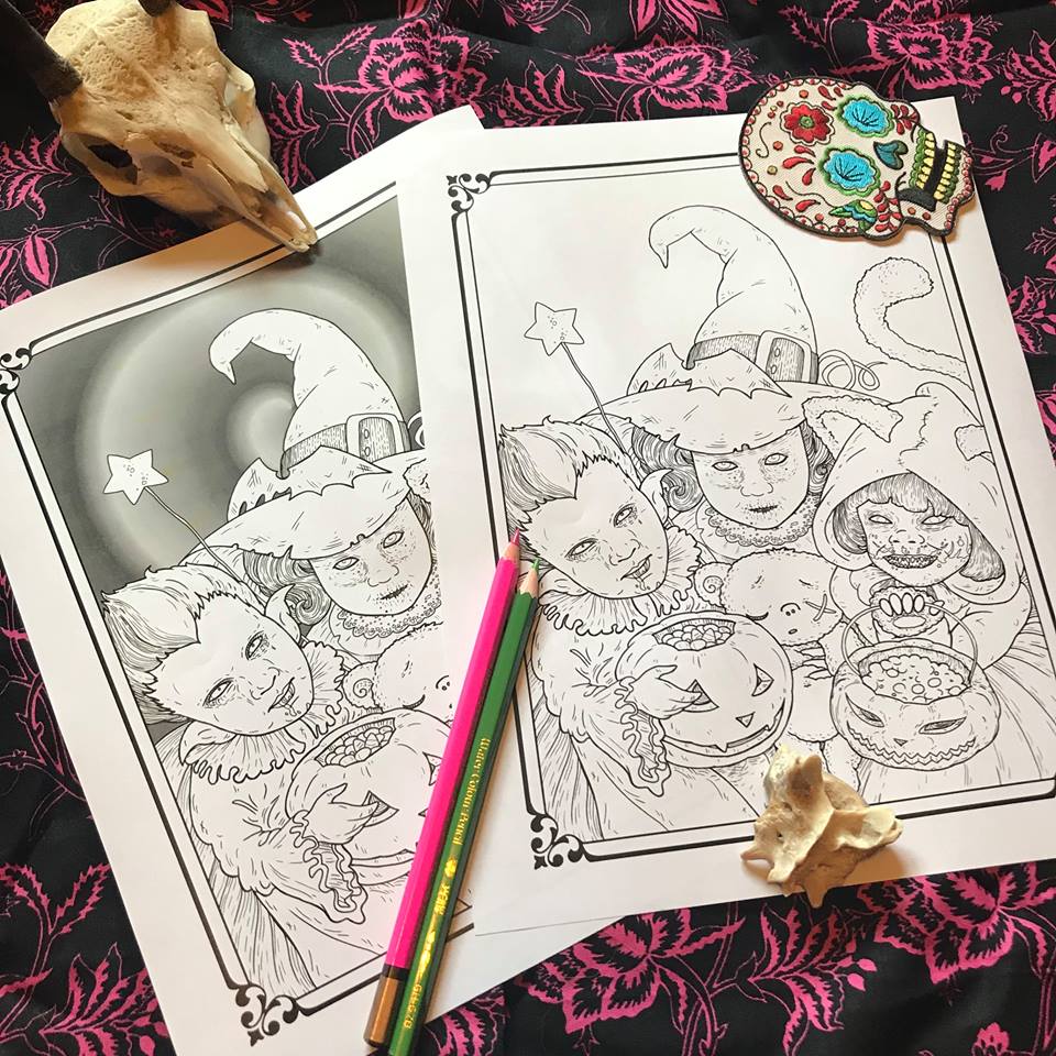
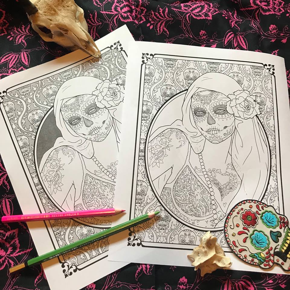
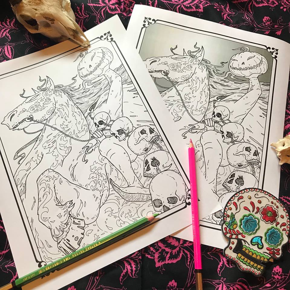
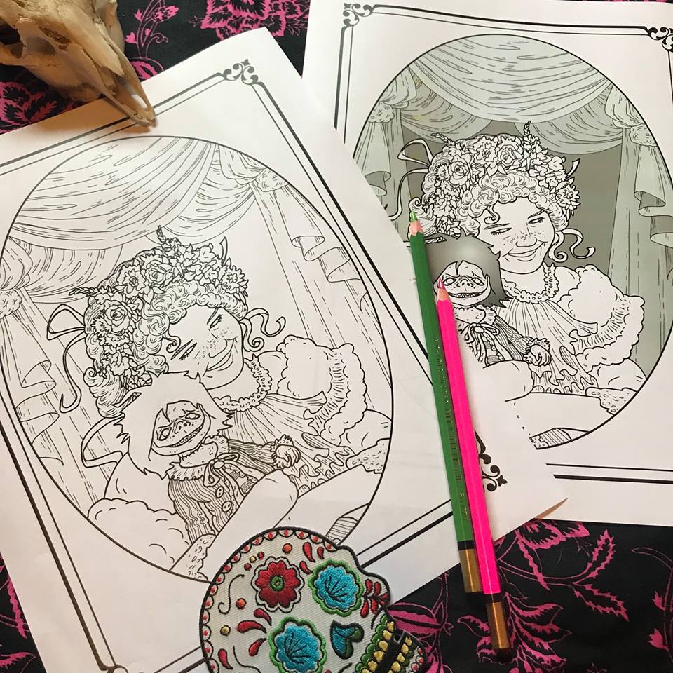
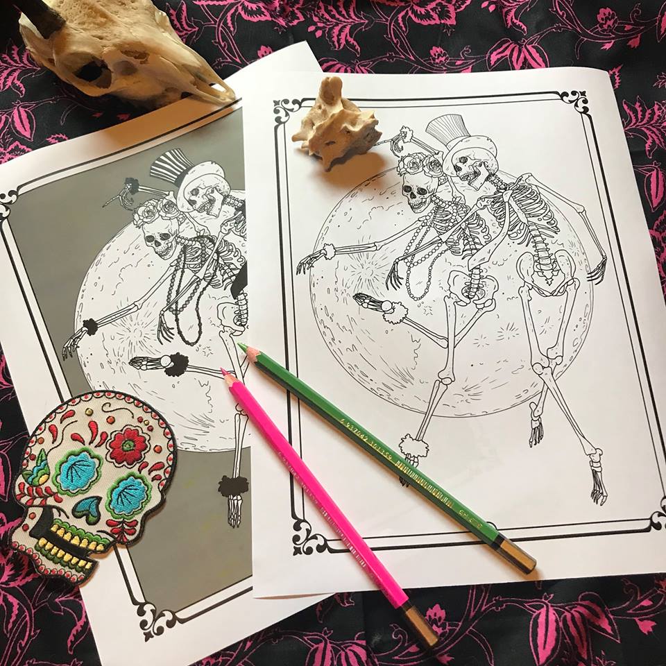
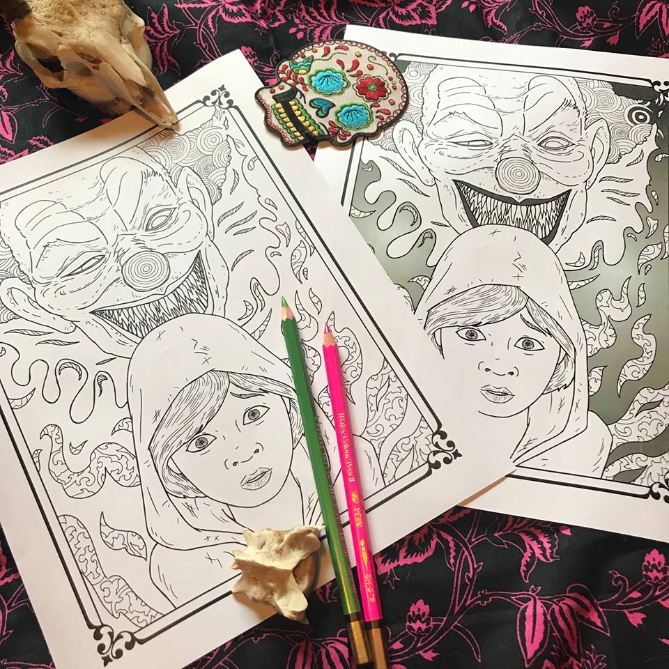
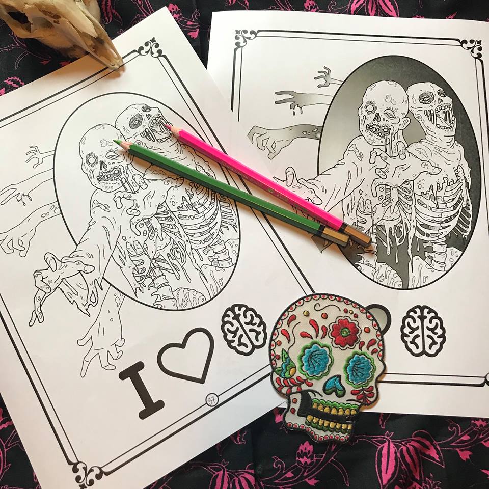
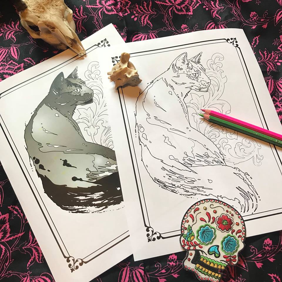
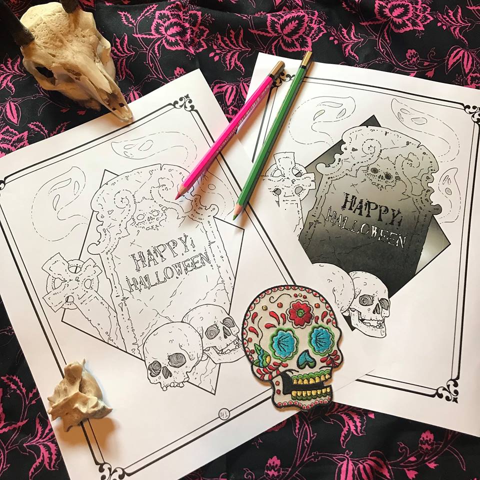
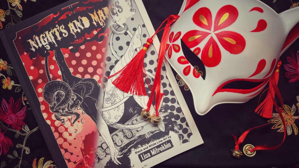
This is the first book that I have available in two edition – the standard black and white version, and the special color edition, where each page with shading actually comes with bright and colorful backgrounds for the colorist that wants to focus on the characters only.
Get the PDF download of this book here.
Get it in print here.
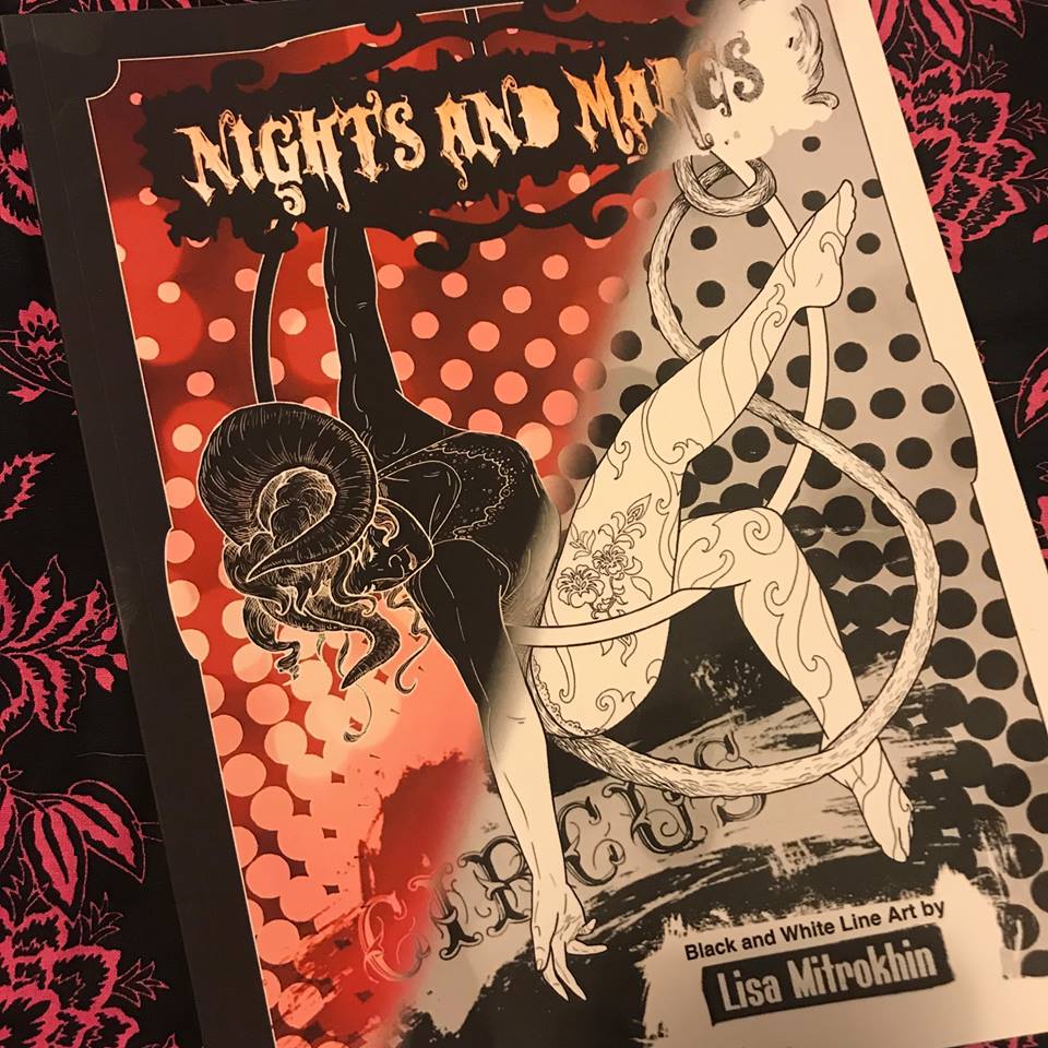
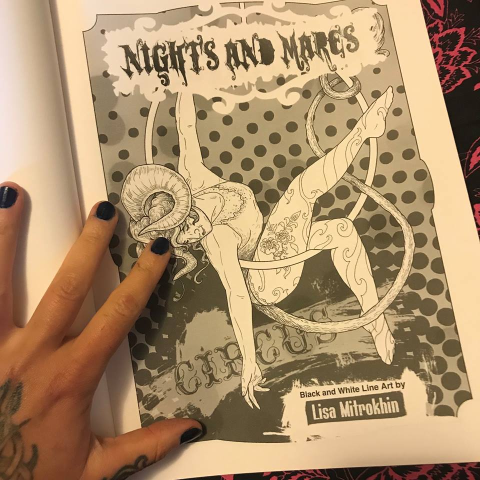
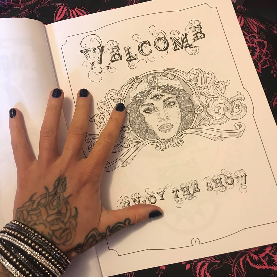
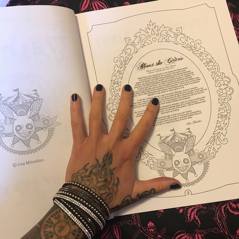
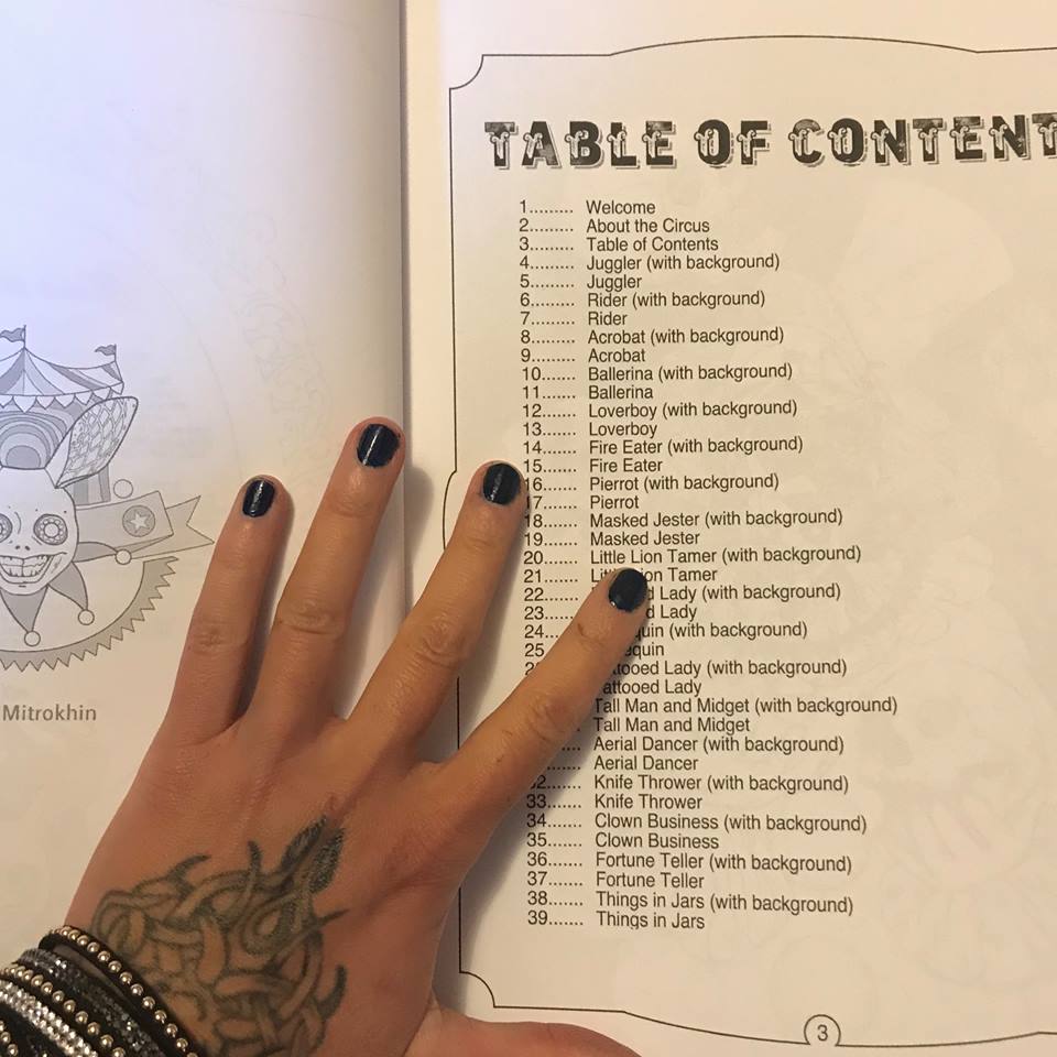
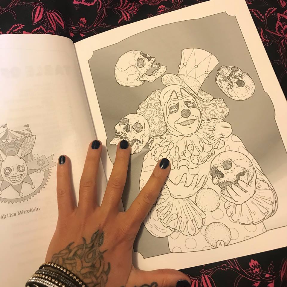
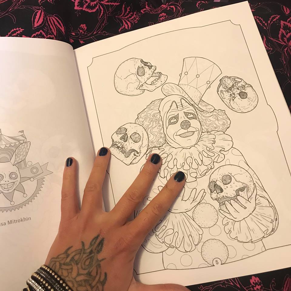
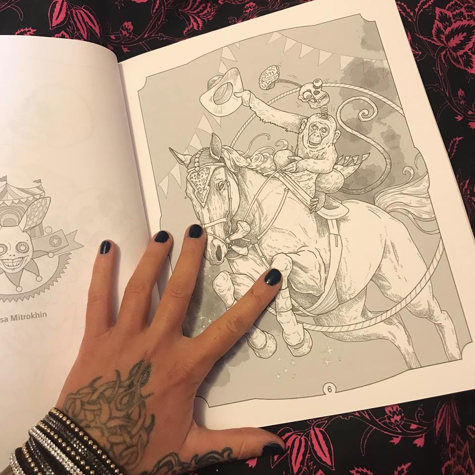
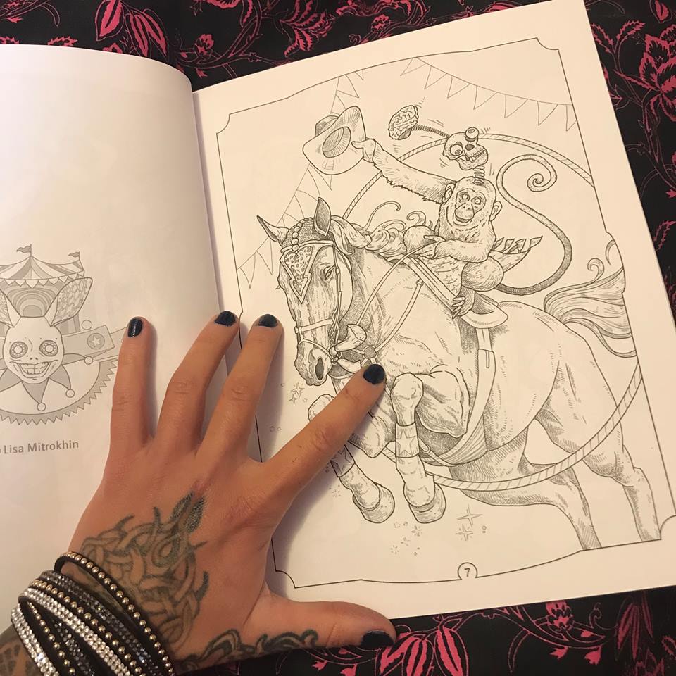
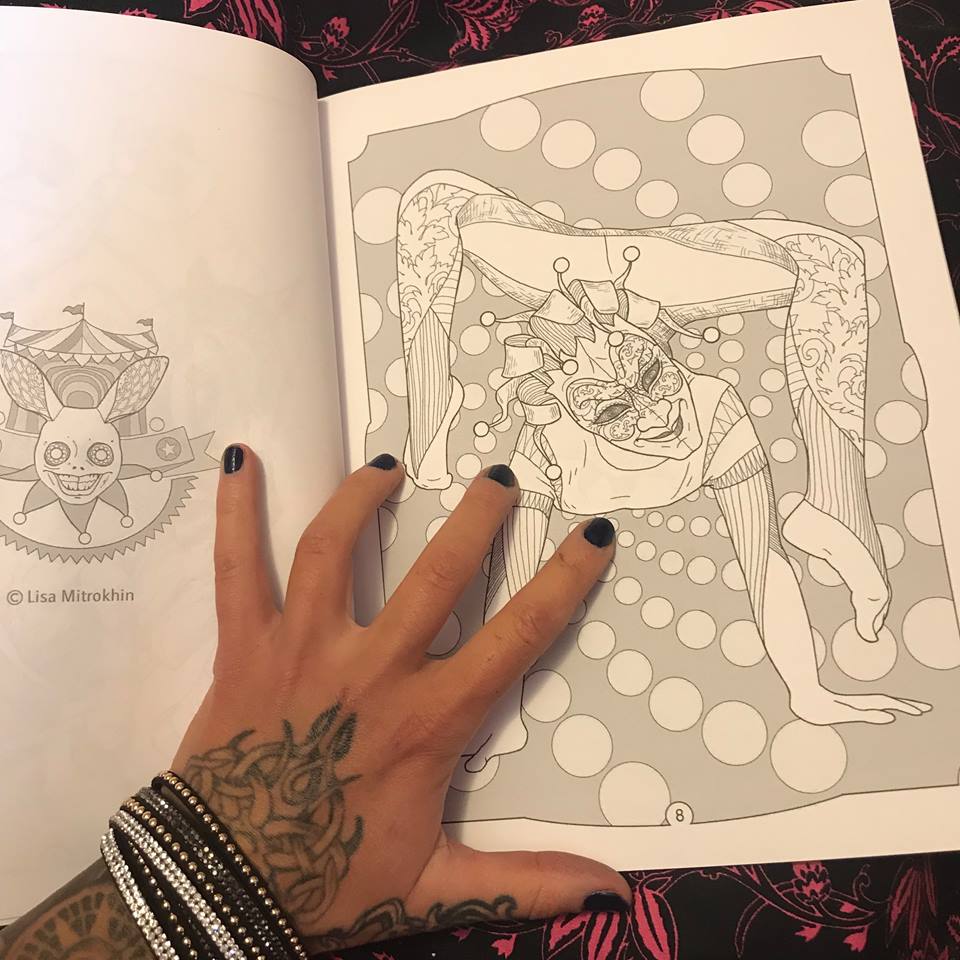
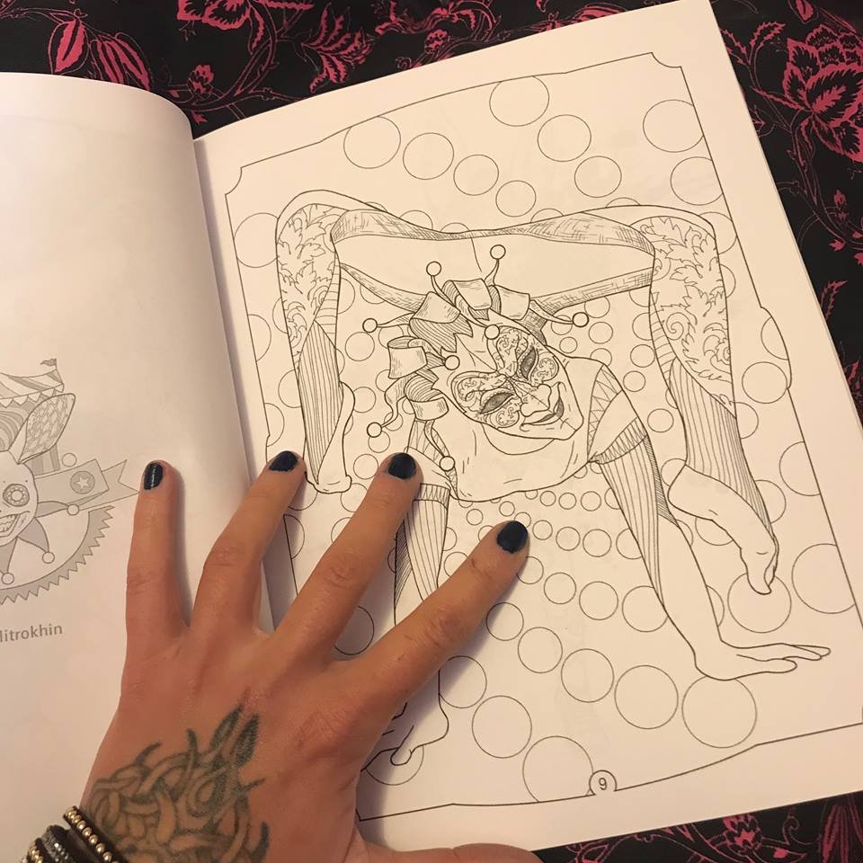
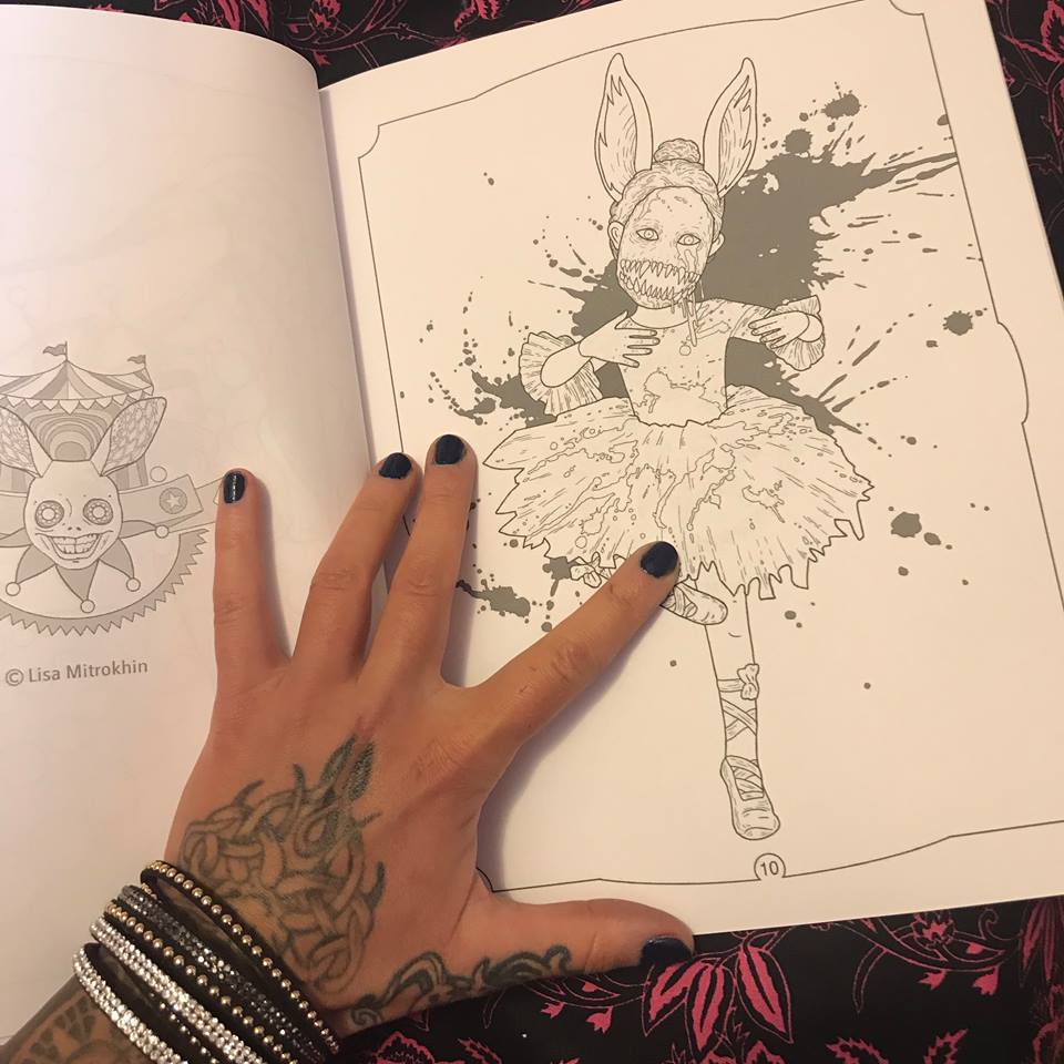
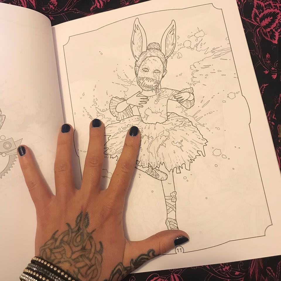
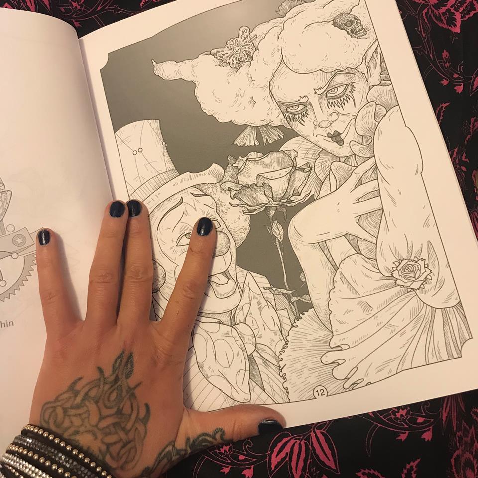
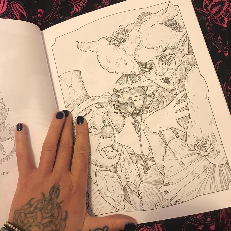
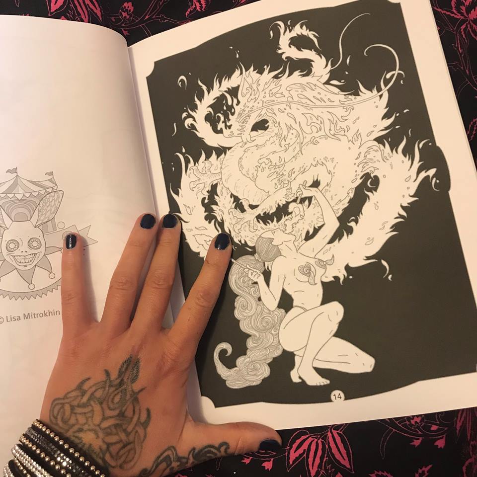
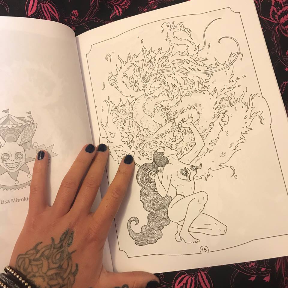
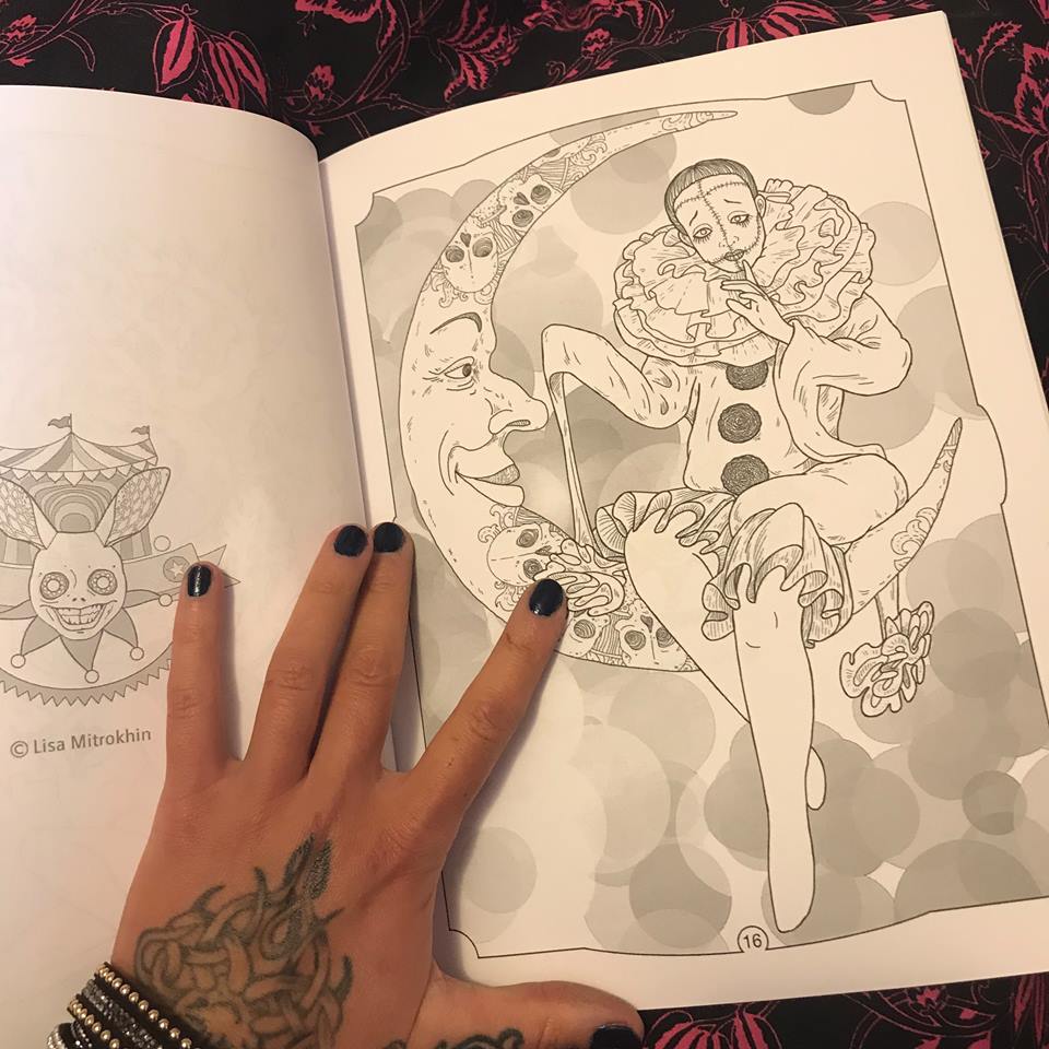
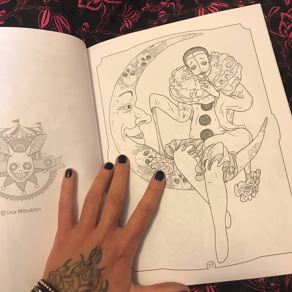
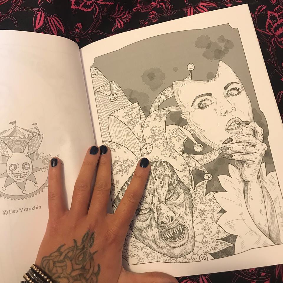
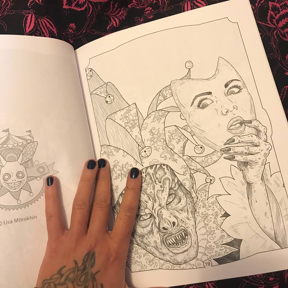
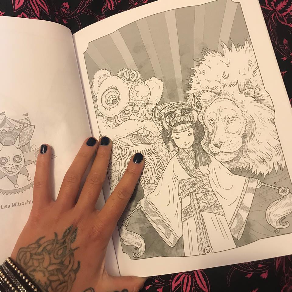
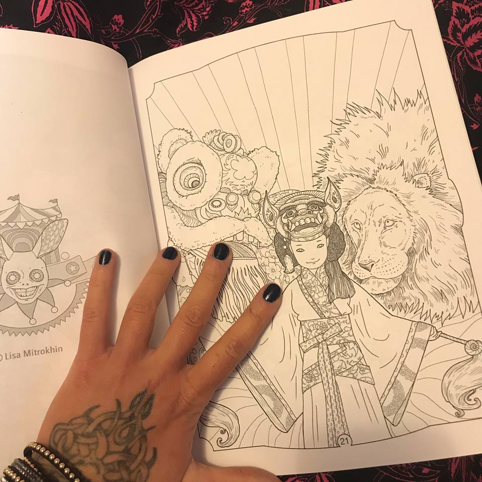
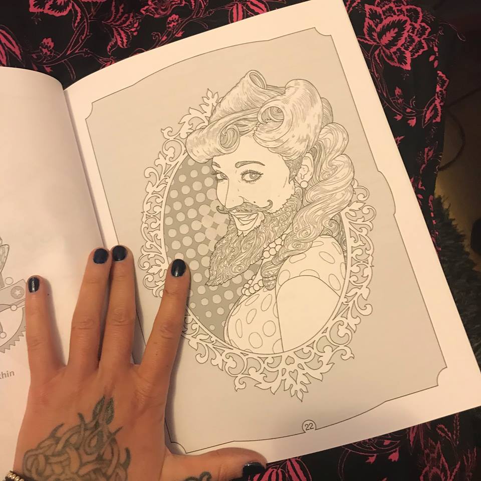
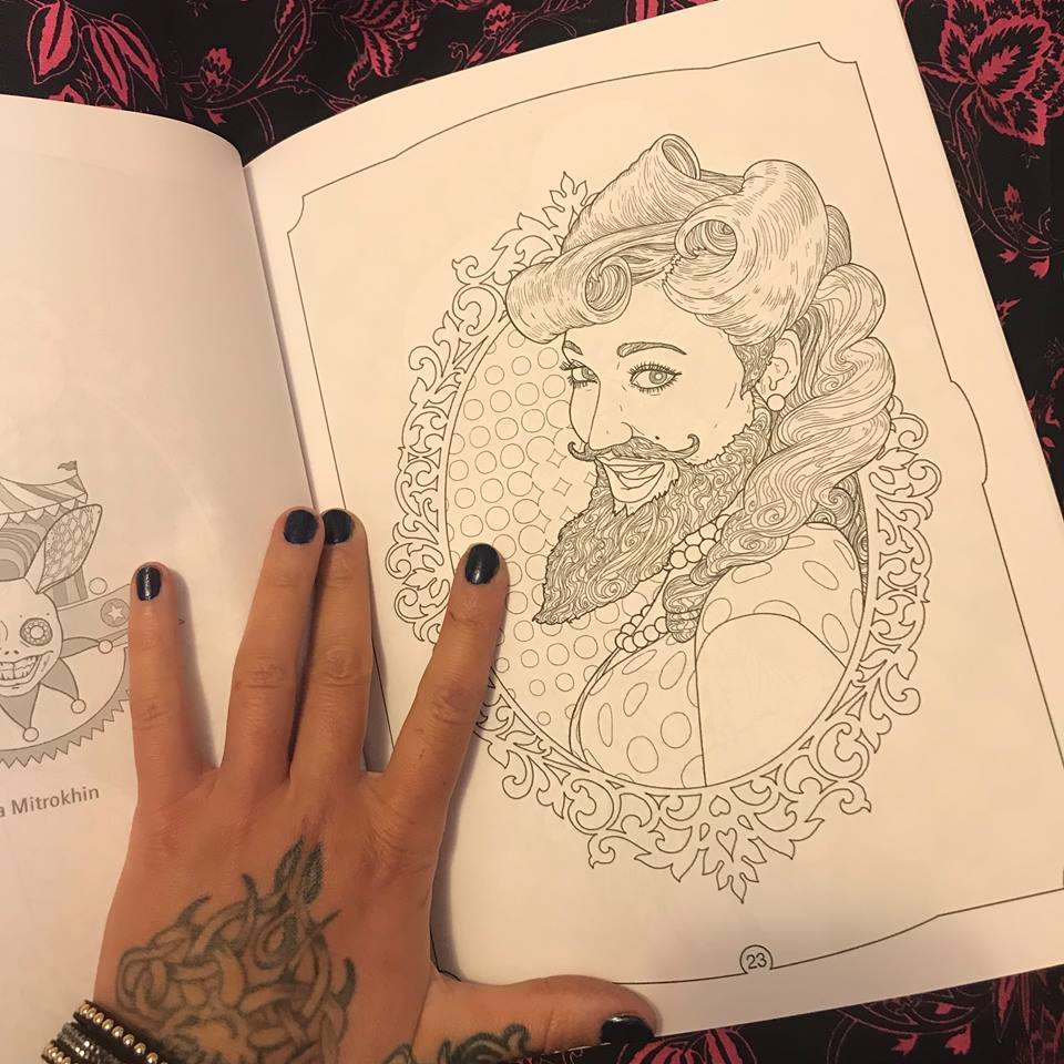
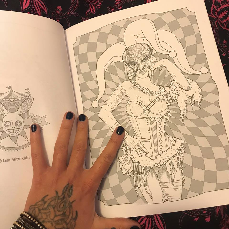
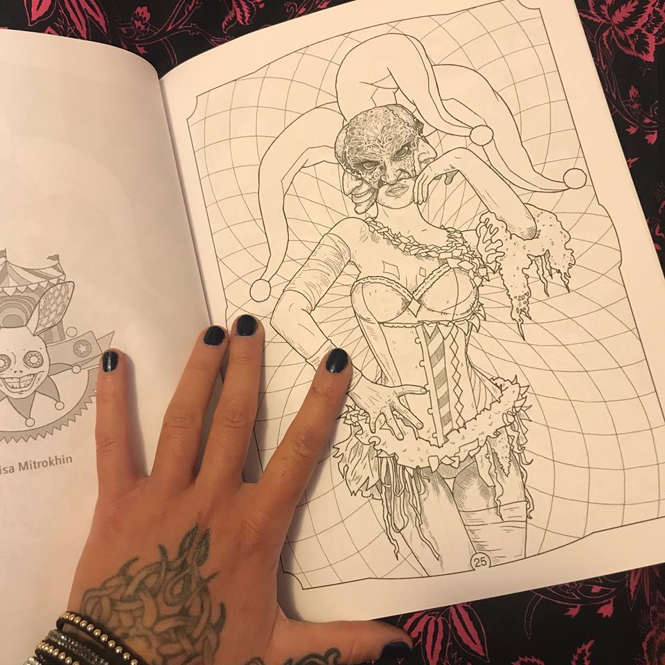
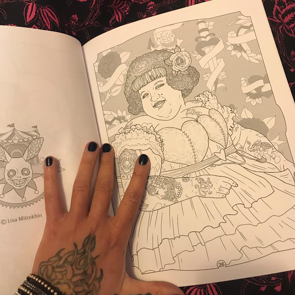
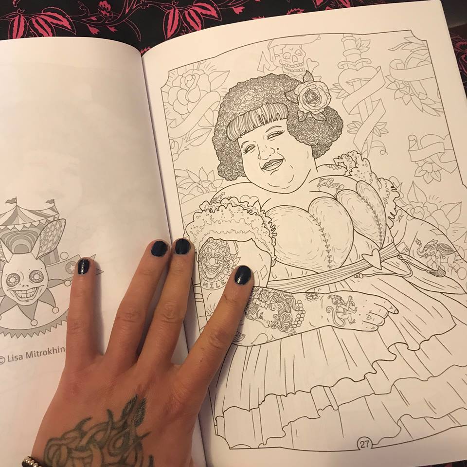
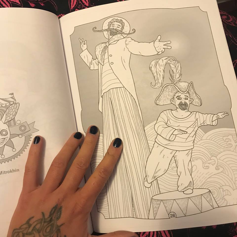
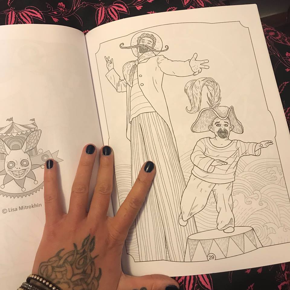
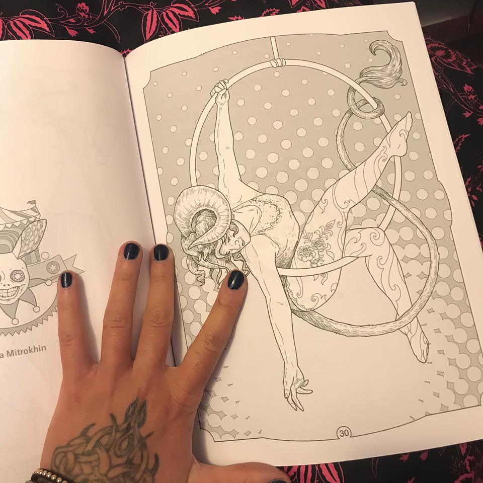
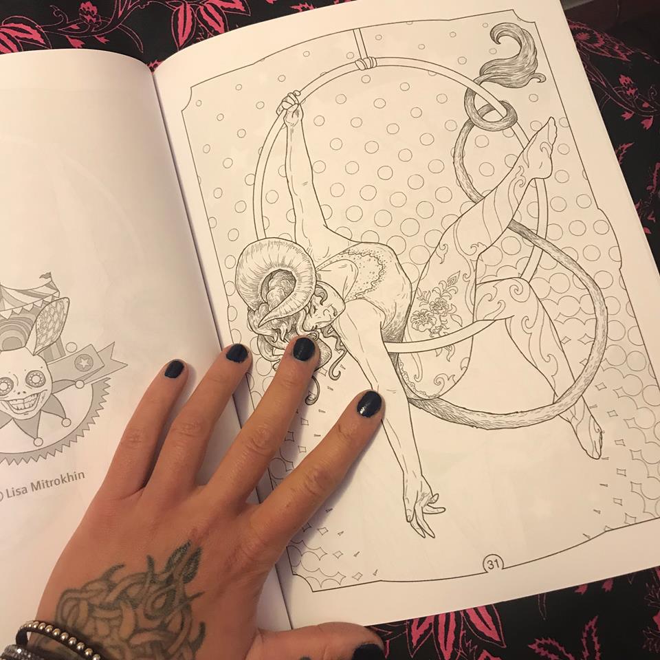
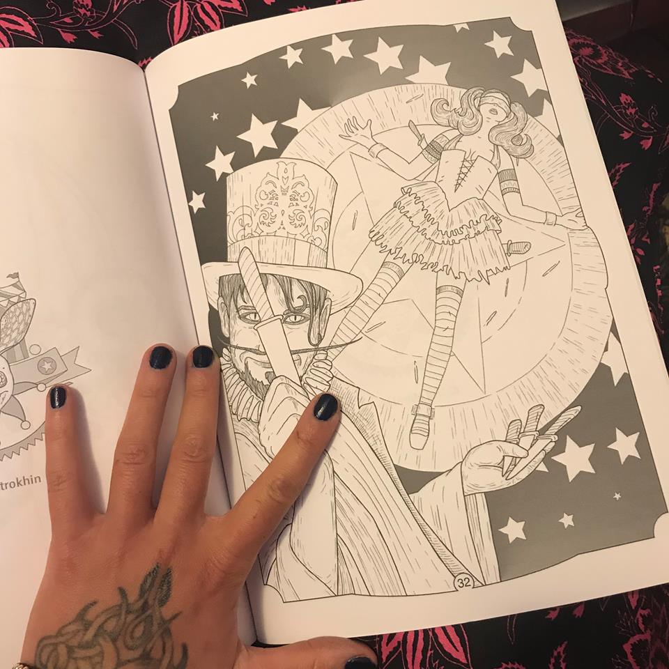
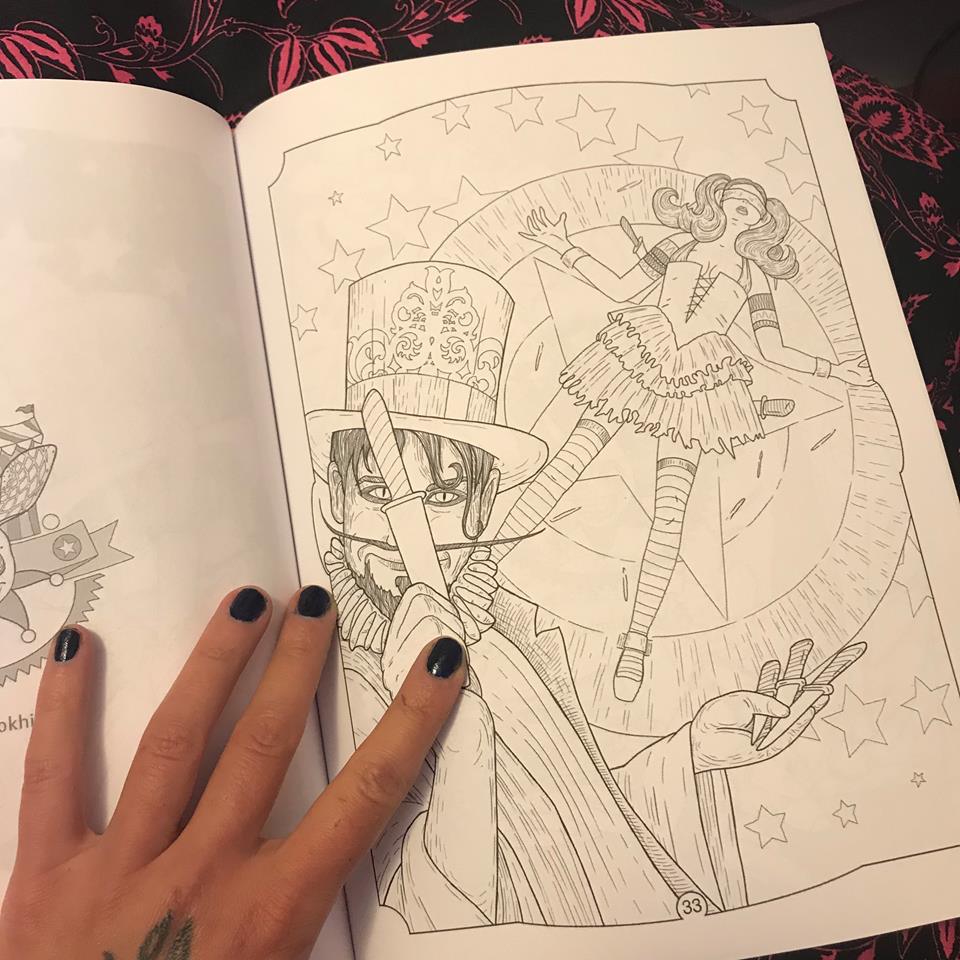
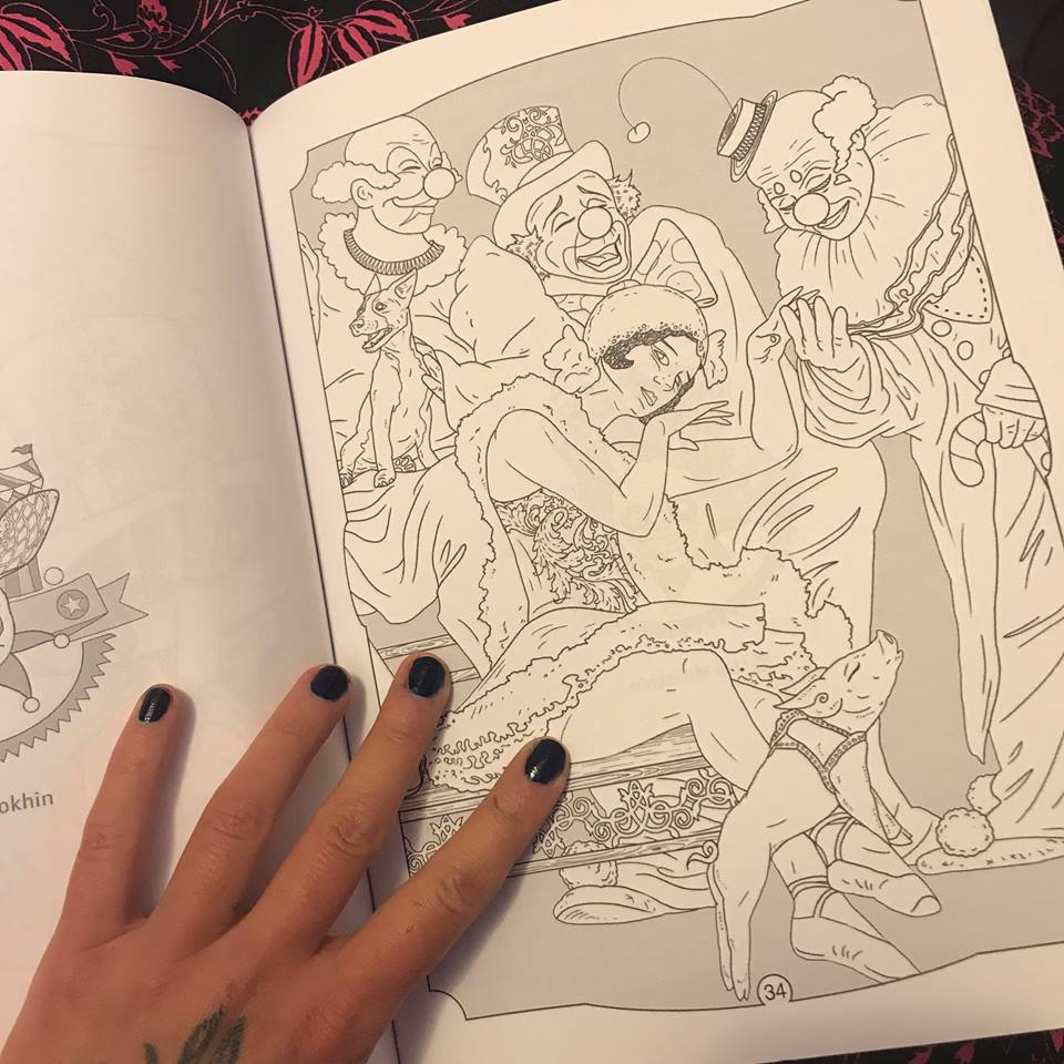
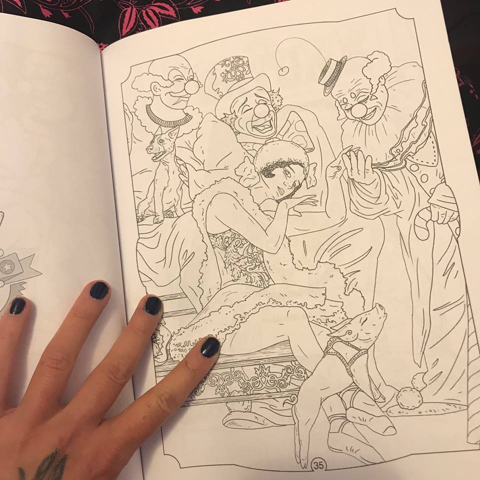
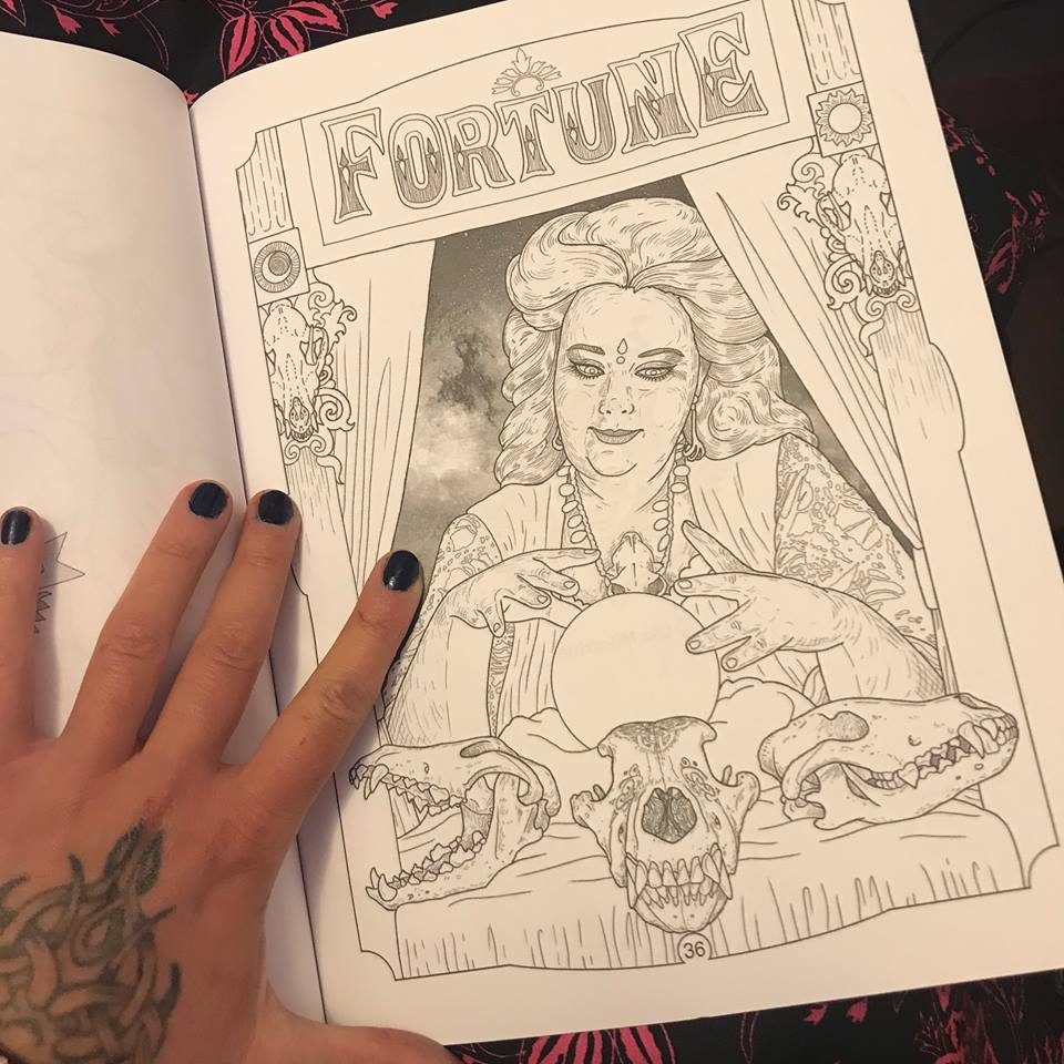
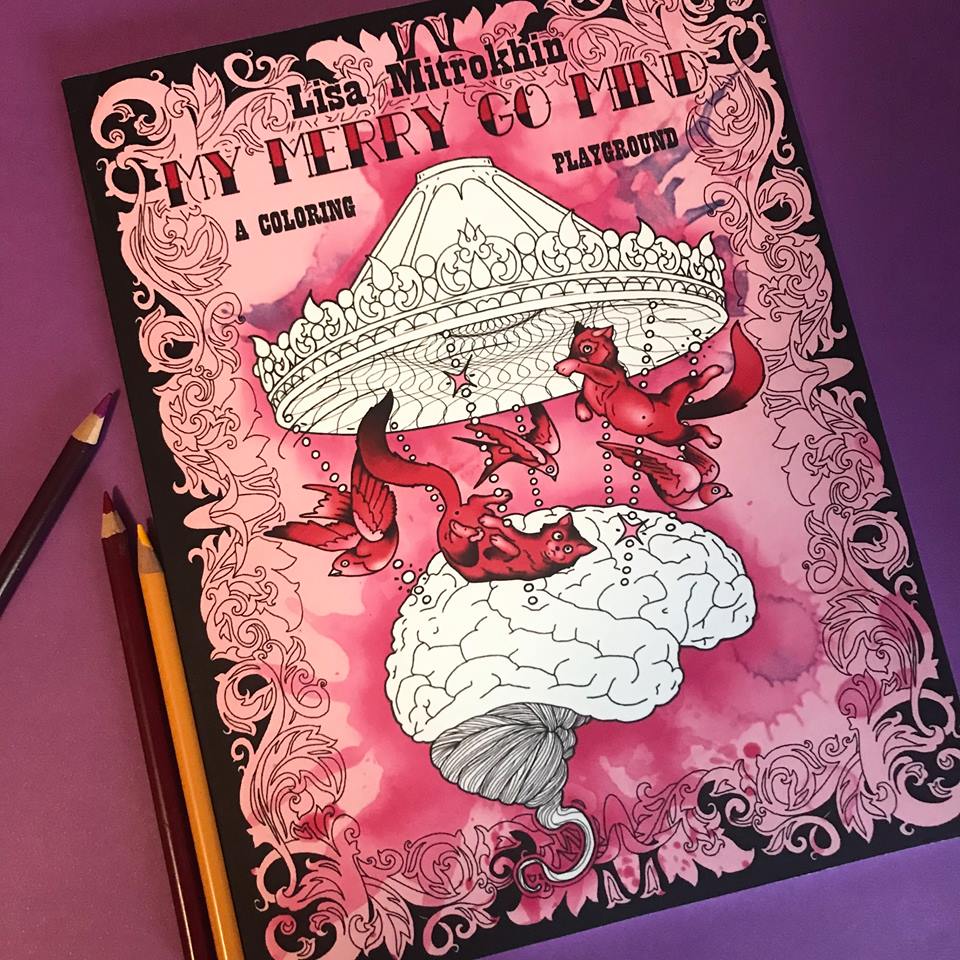
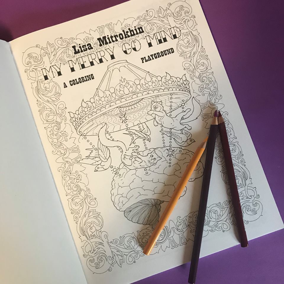
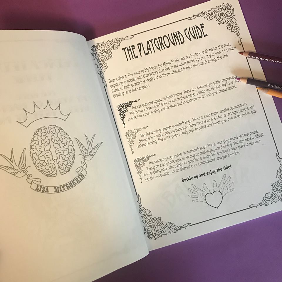
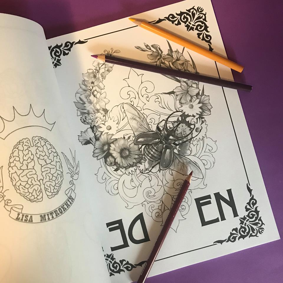
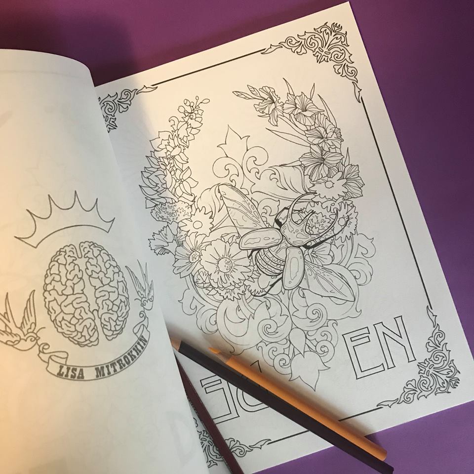
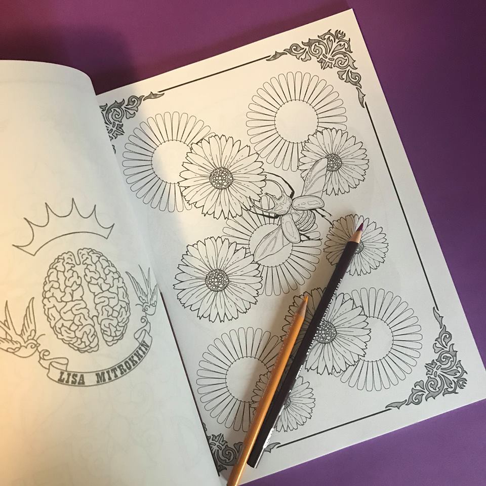
My Merry Go Mind is my second published coloring book for adults and it is one fun ride for those who like unusual coloring and variety.
This book is available in print on Amazon and as a PDF download on ETSY.
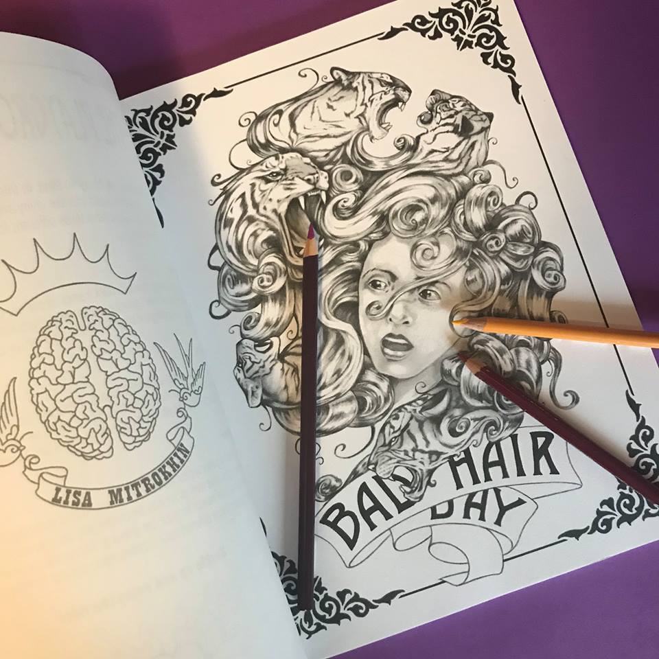
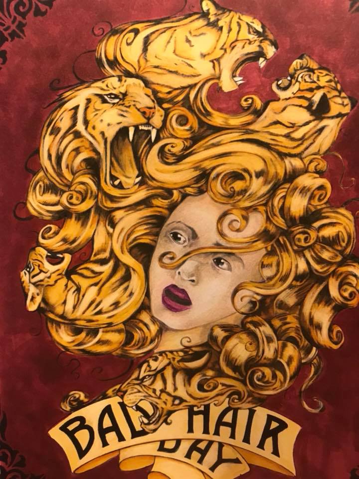
(Colored by Sam Twigger)
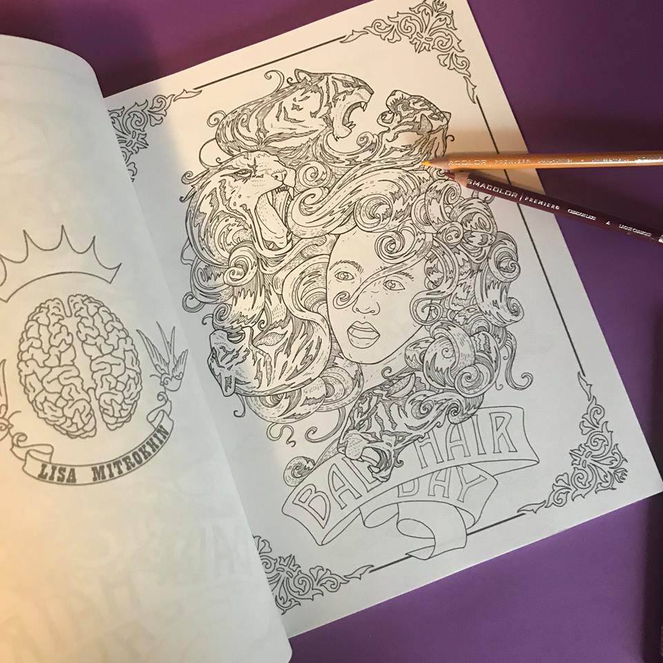
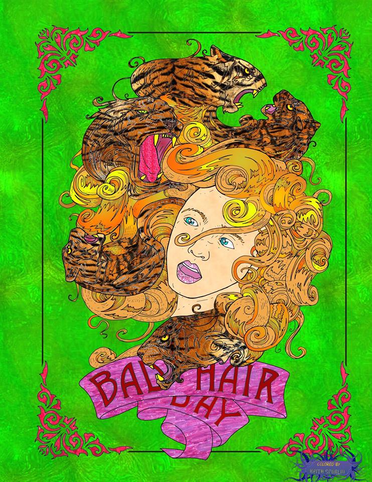
(Colored by Keith Spurlin)
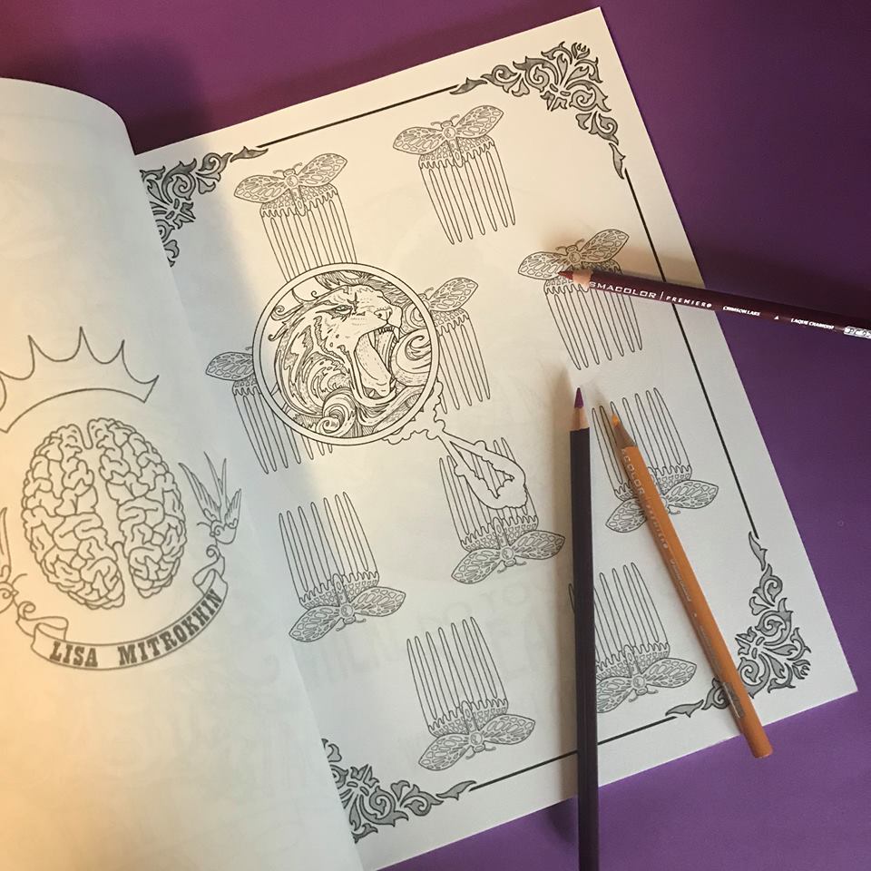
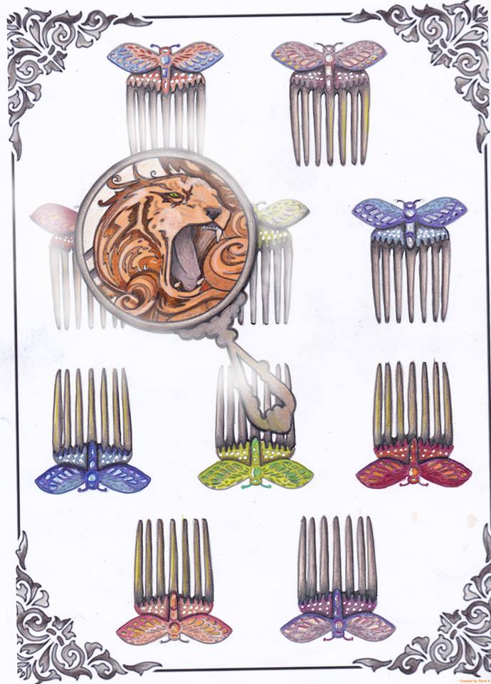
(Colored by Sam Twigger)
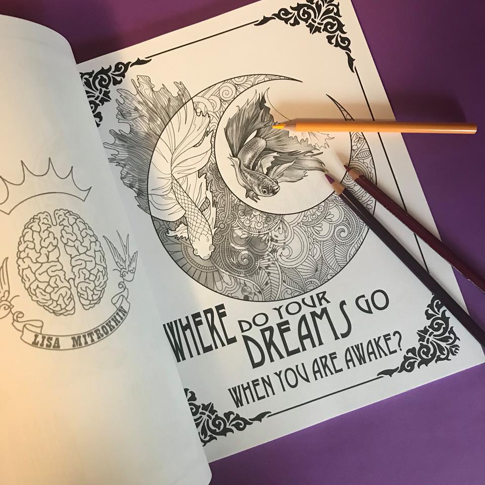
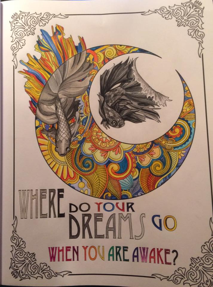
(Colored by Kat Reynolds)
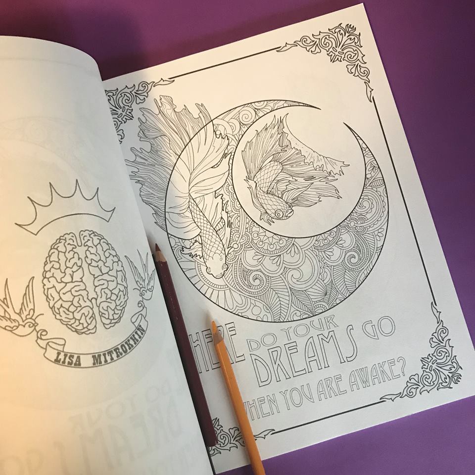
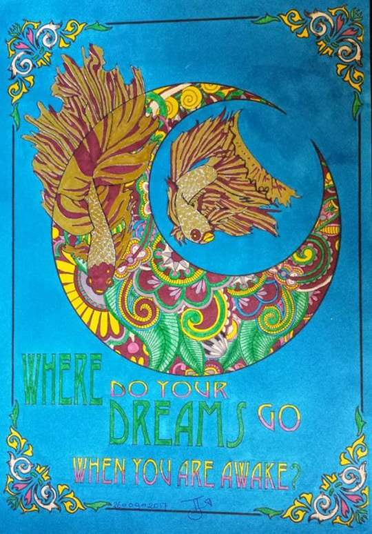
(Colored by Toys Jongeling)
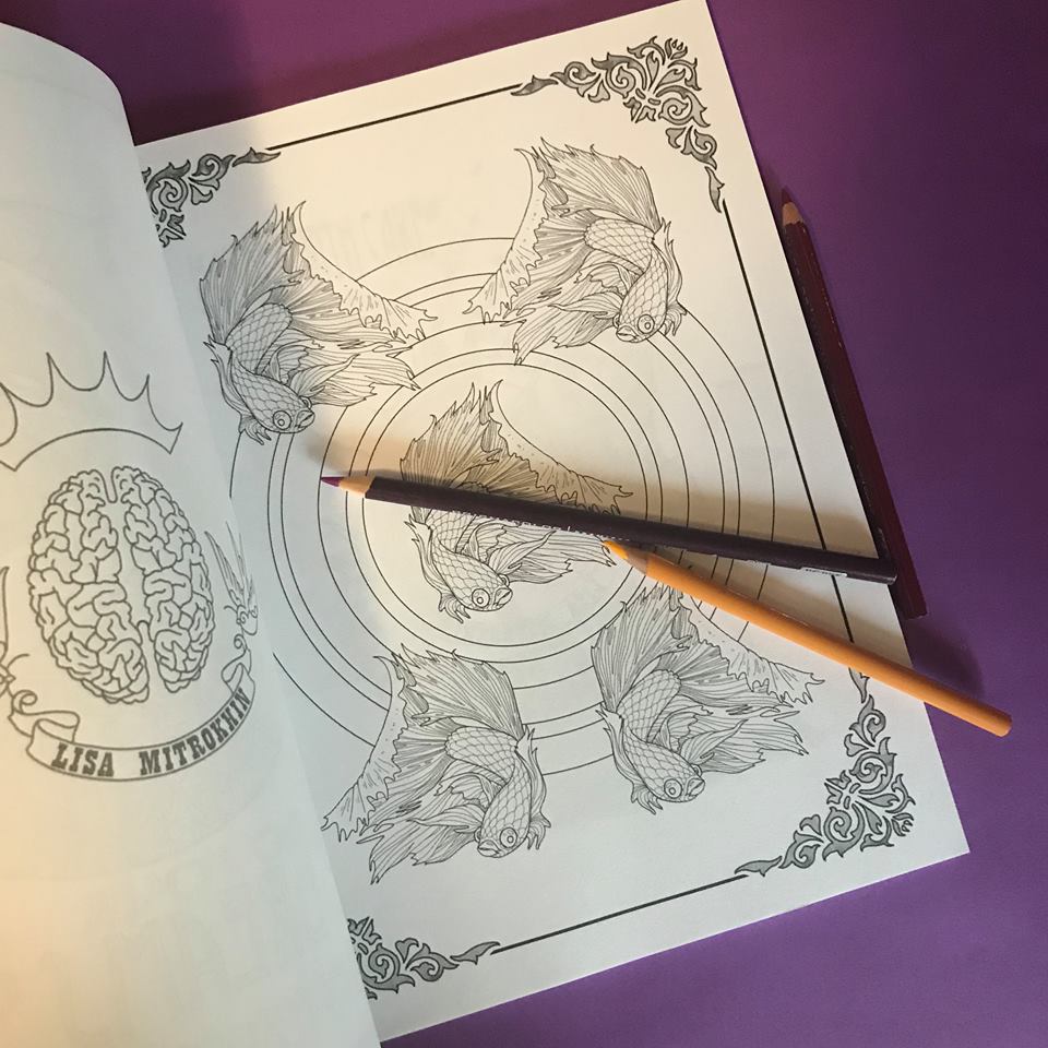
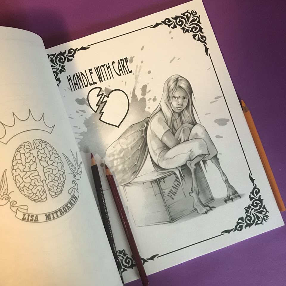
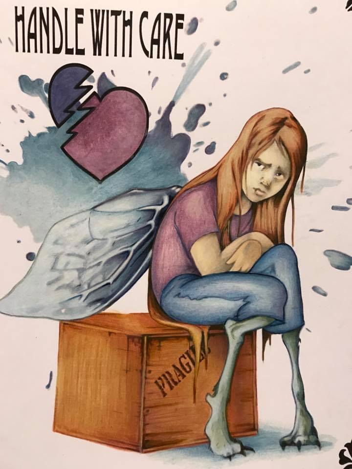
(Colored by Sam Twigger)
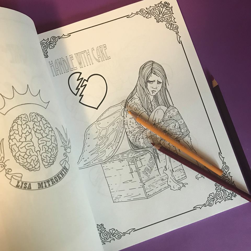
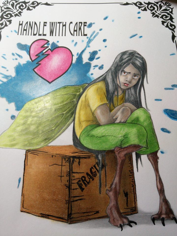
(Colored by Laurie Gregory)
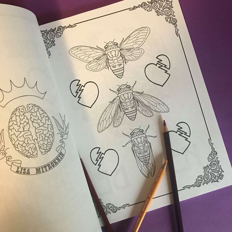
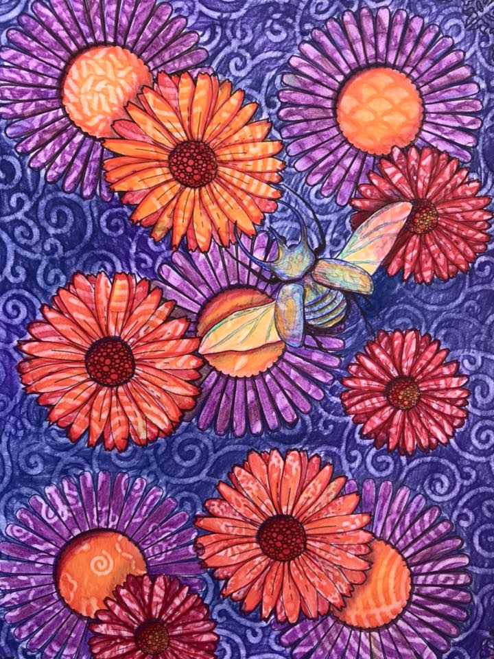
(Colored by Sam Twigger)
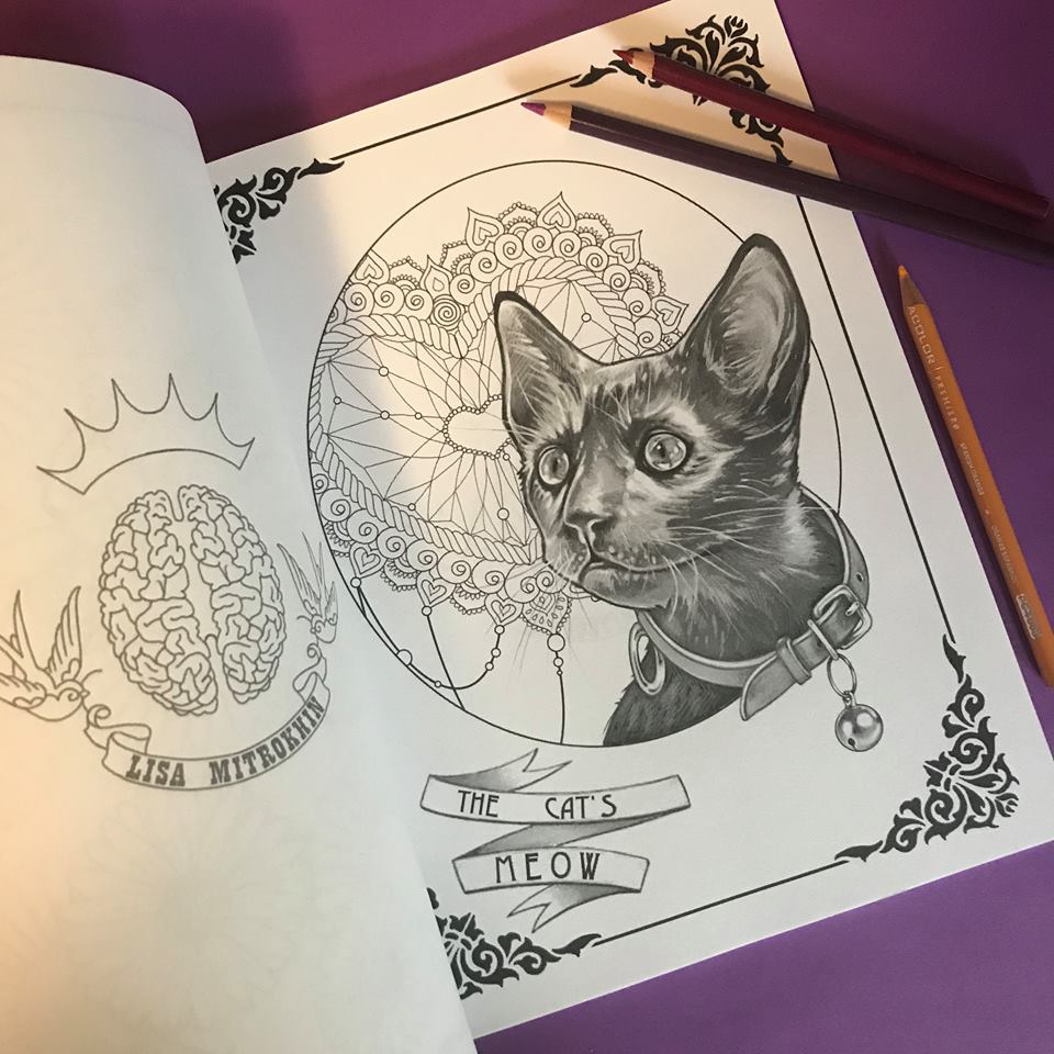

(Colored by Chelsea Marie)
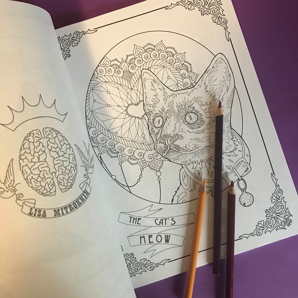
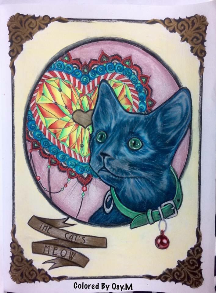
(Colored by Osnat Moskovich)
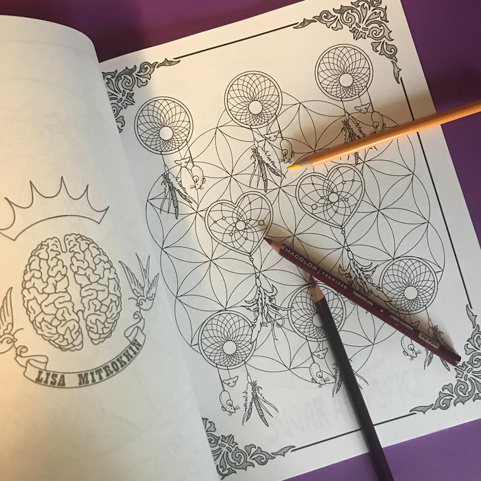
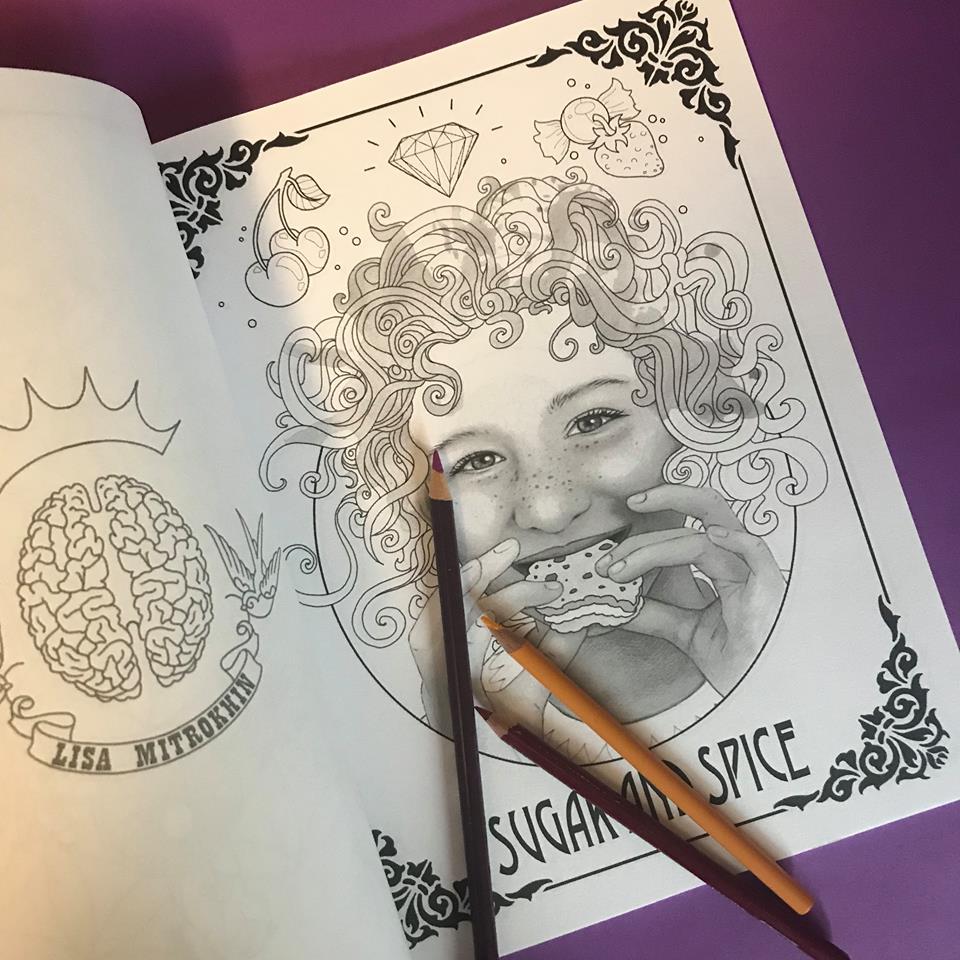
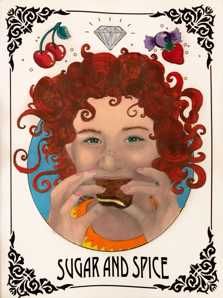
(Colored by Claire Eadie)

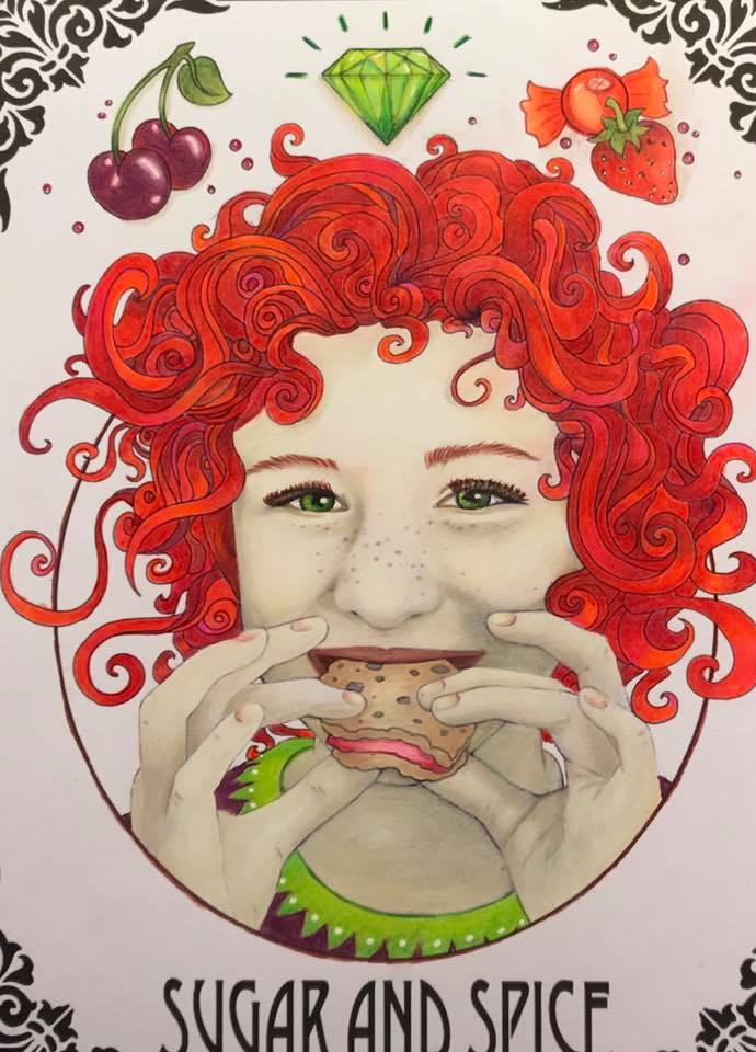
(Colored by Sam Twigger)

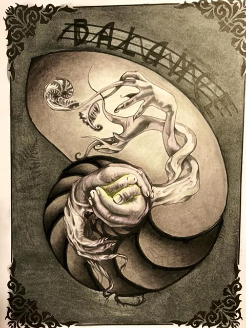
(Colored by Sam Twigger)
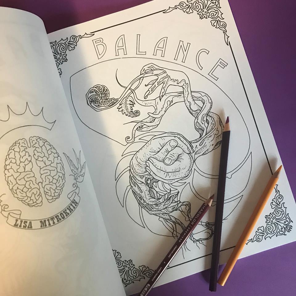
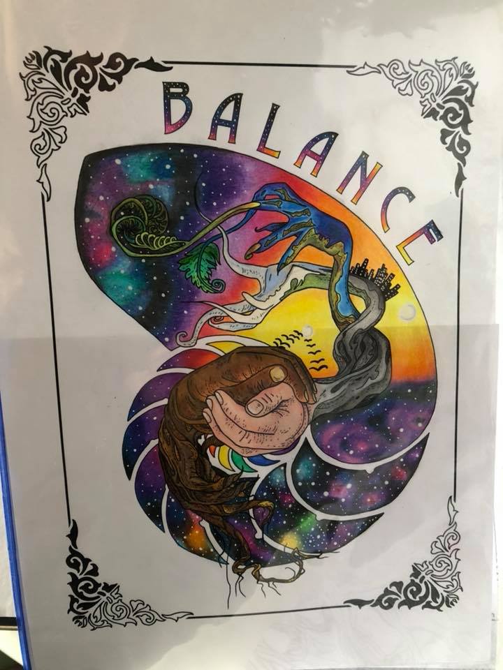
(Colored by Kat Reynolds)
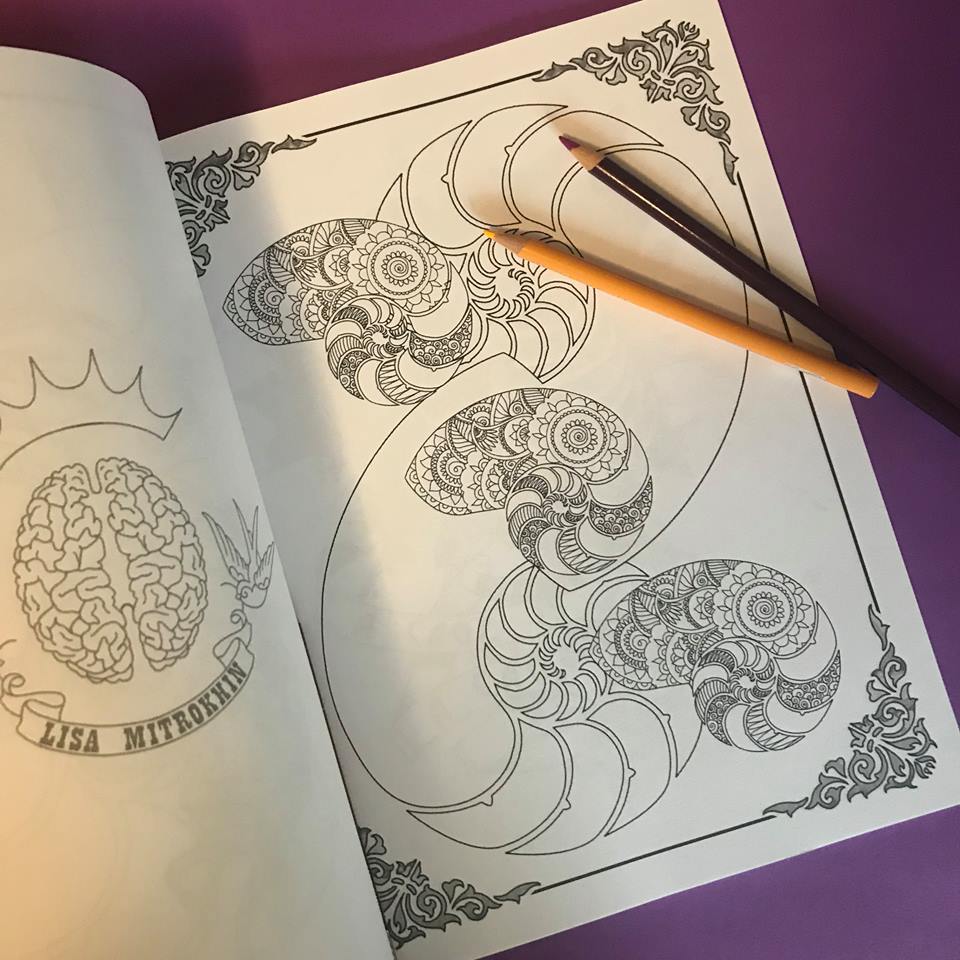
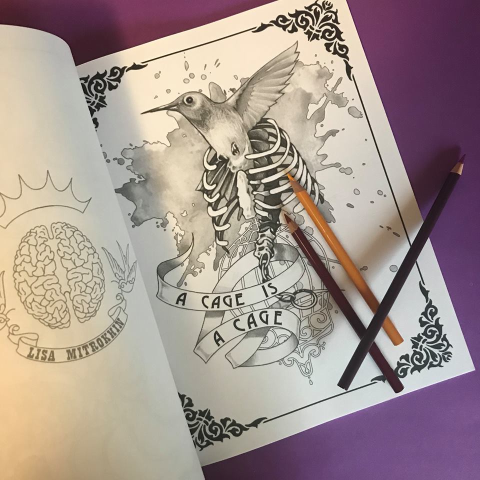
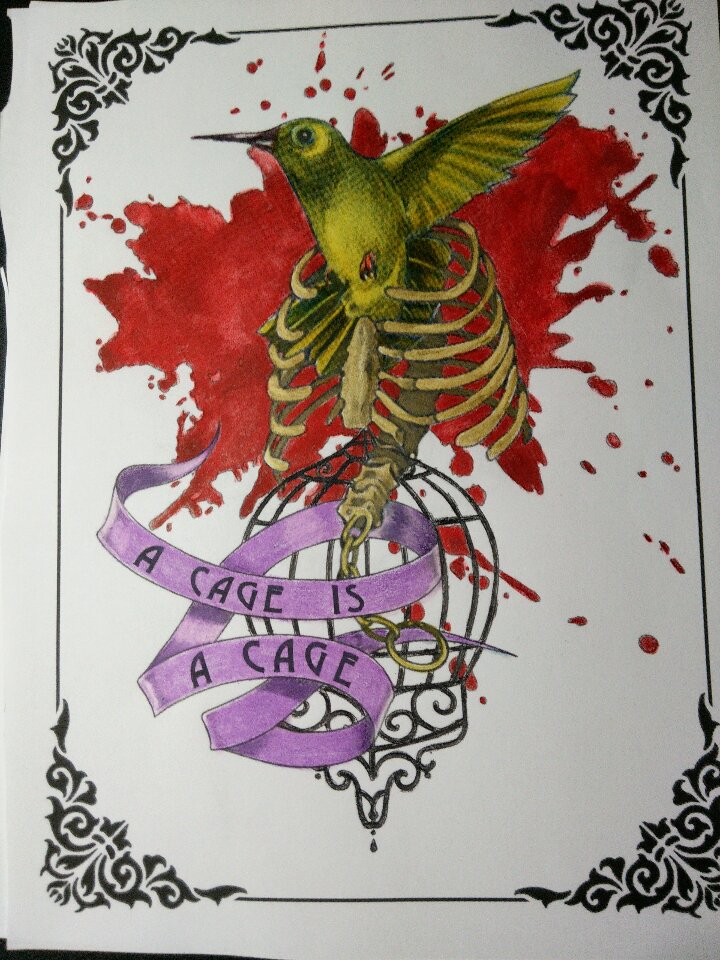
(Colored by Laurie Gregory)
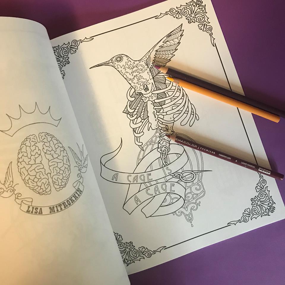
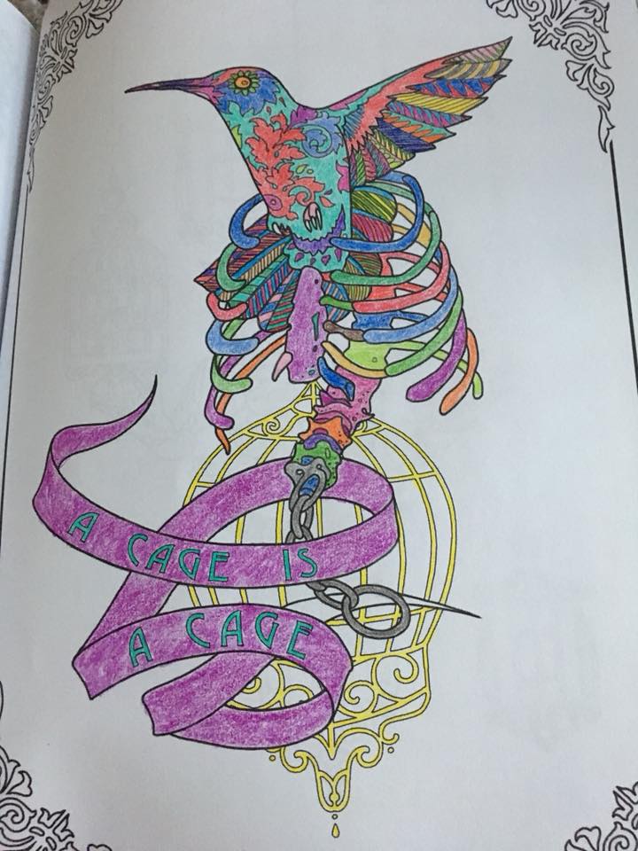
(Colored by Lu Acevedo)
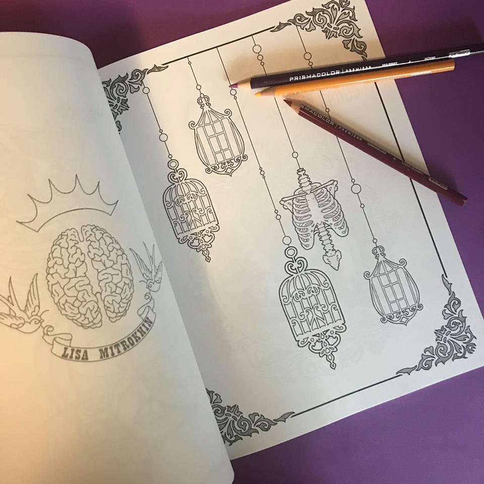
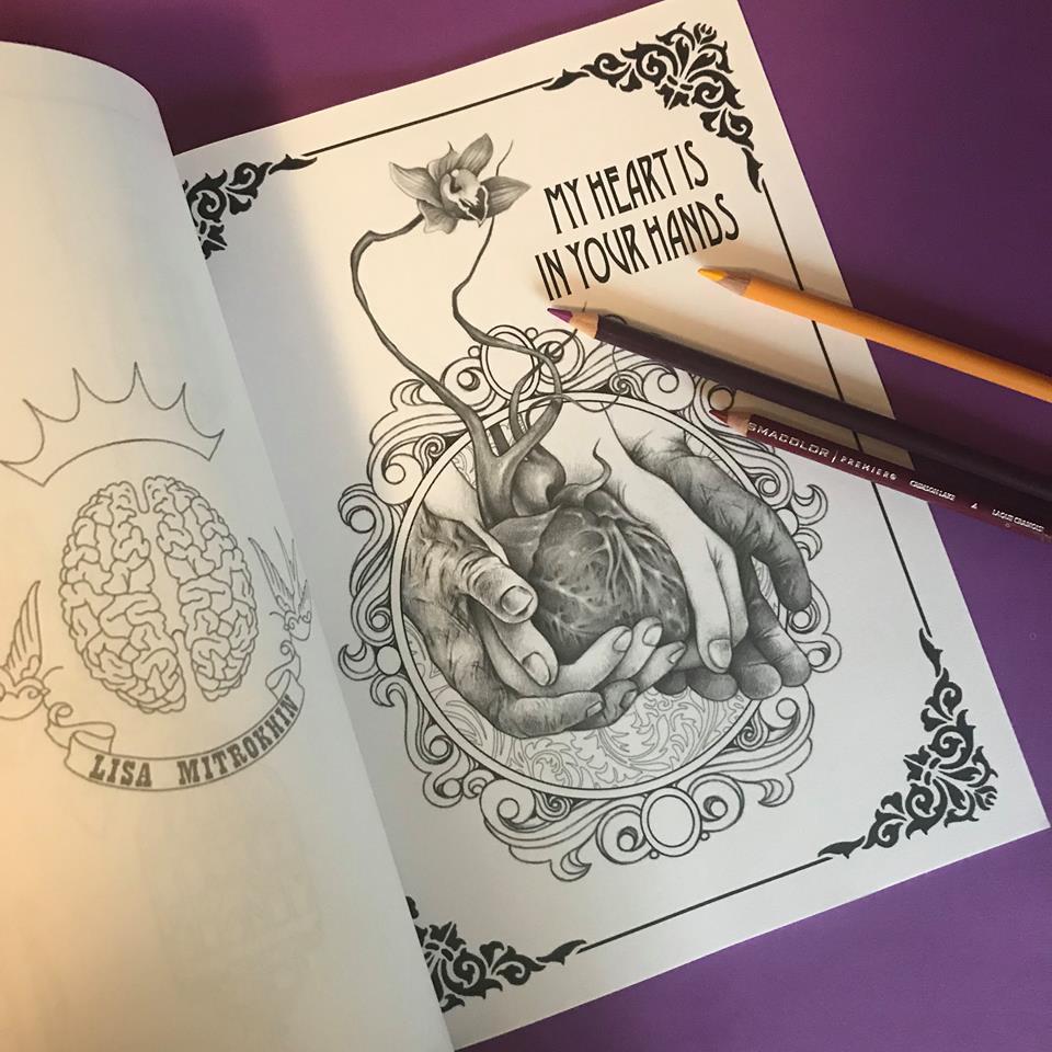
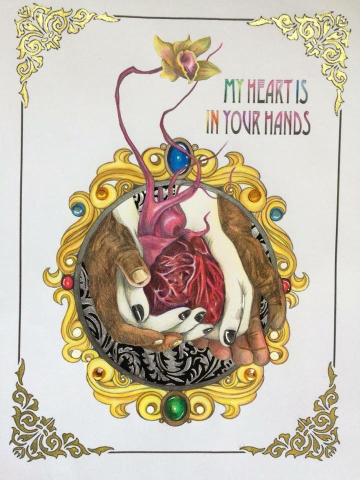
(Colored by Kat Reynolds)
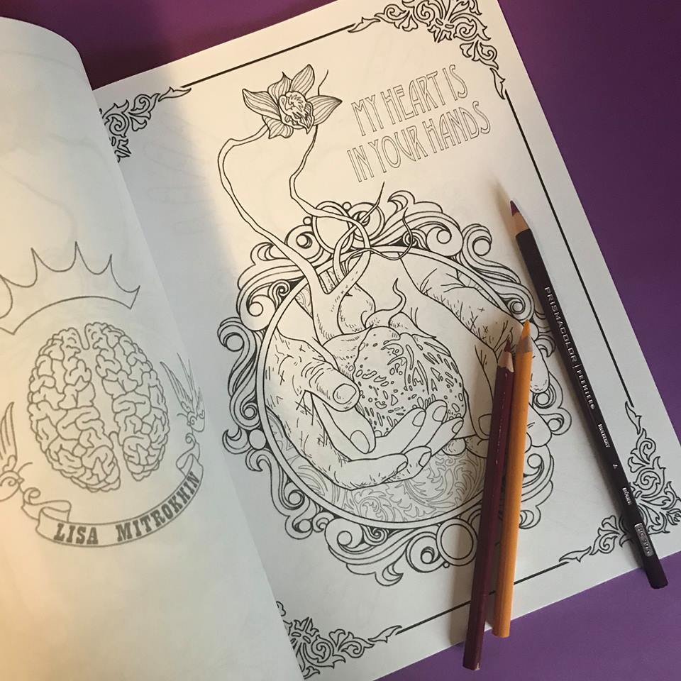
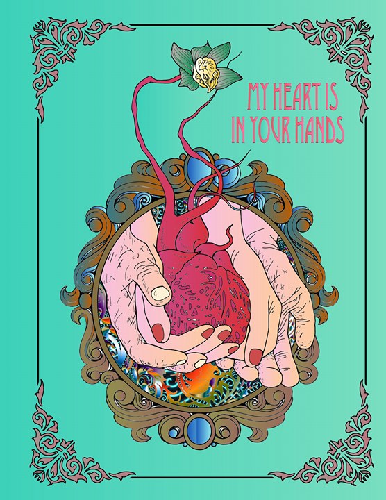
(Colored by Craig Powell)
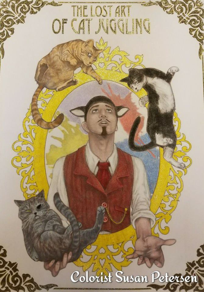
(Colored by Susan Petersen)
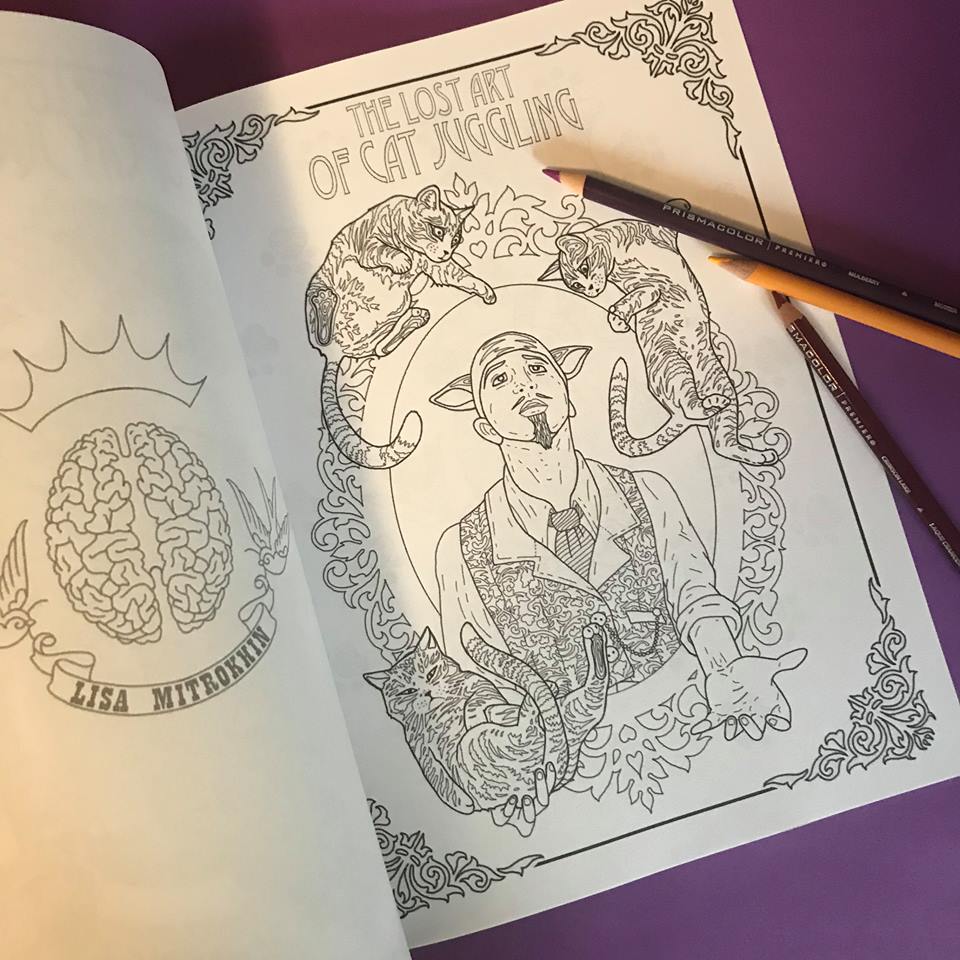
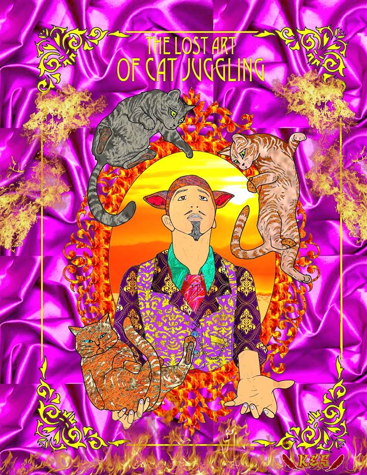
(Colored by Keith Spurlin)
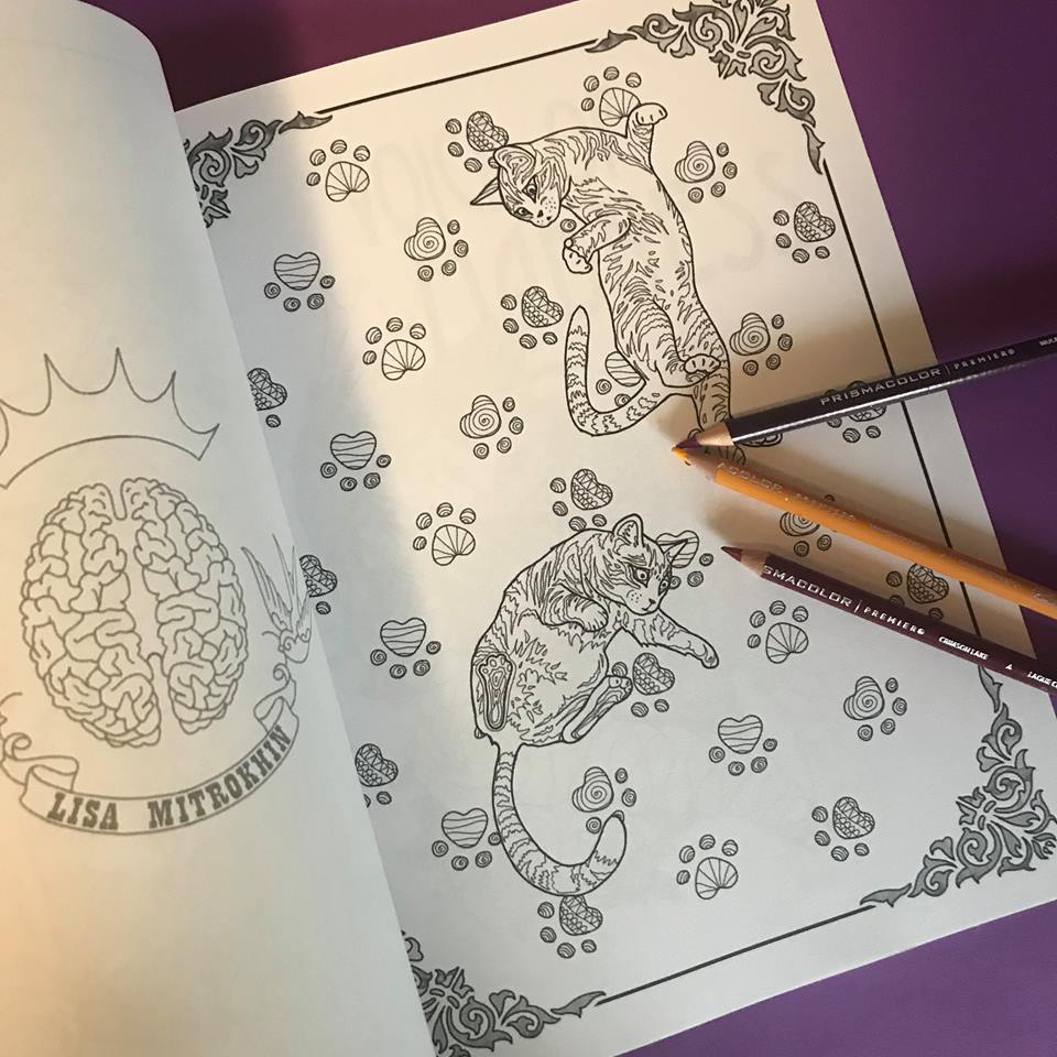
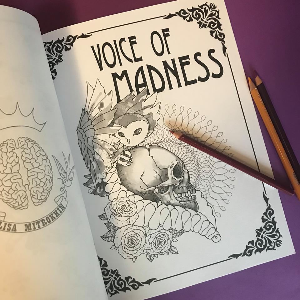
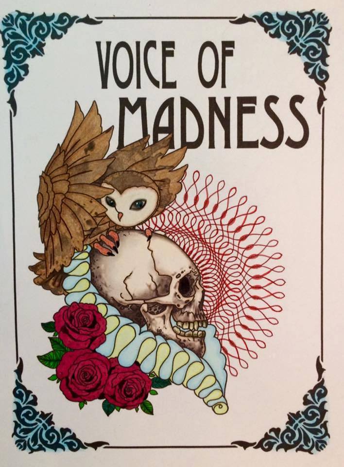
(Colored by Debby Mulkey)
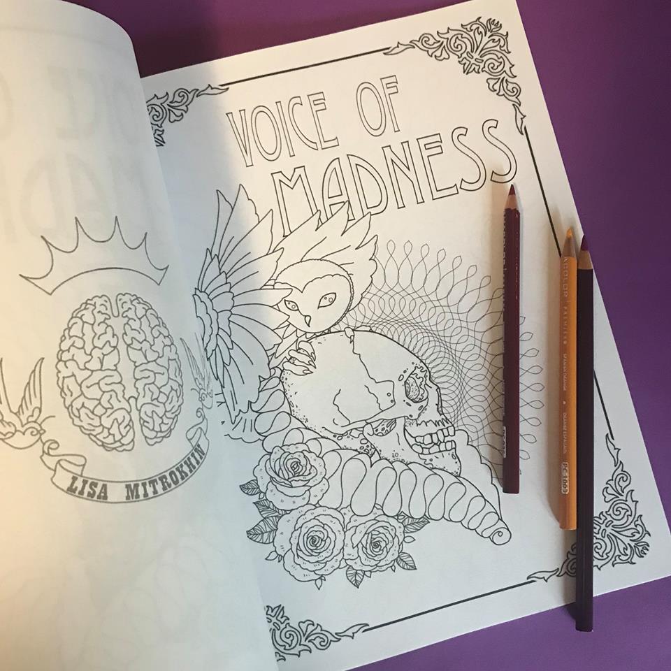
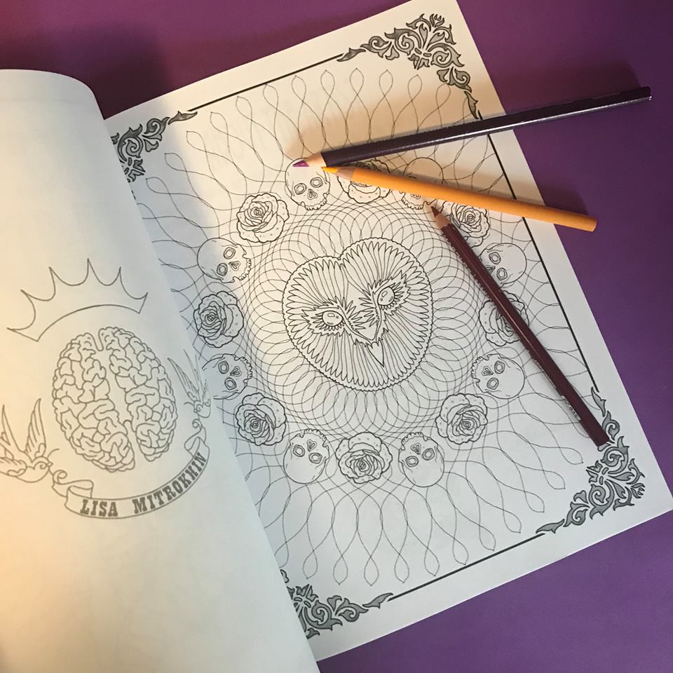
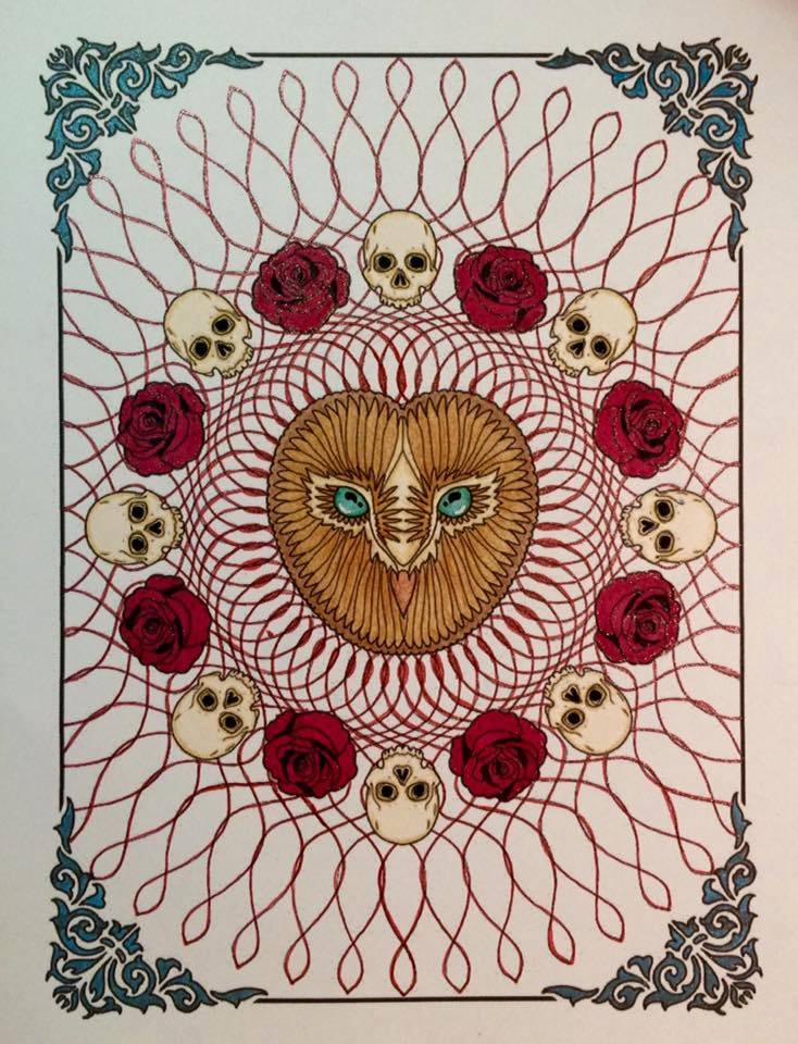
(Colored by Debby Mulkey)
It is a rare occasion when I approach a coloring page with only minor or no alterations at all. Usually I add my own characters or even rearrange or remove some of the existing lines or patterns to create my own scenes with my own back stories. This page in my favorite coloring book by Takumi, however, is perfect the way it is. Not to mention it has hardly any space for additional characters.
I decided to take you along on this coloring journey of Takumi’s Beauty, from Beauty And The Beast.

This is the original page. By the end of this journey you will notice that the delicate alterations I will impose on it will be minor, especially compared with my other coloring projects.
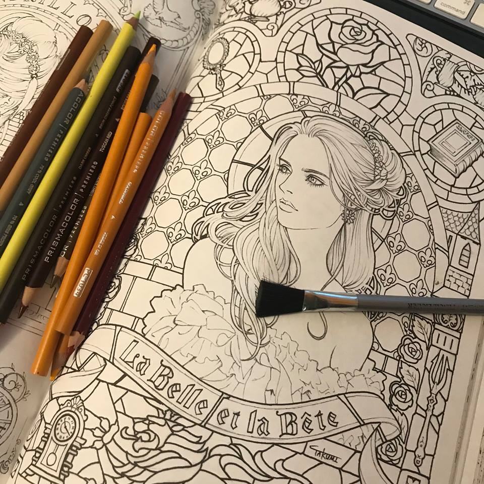
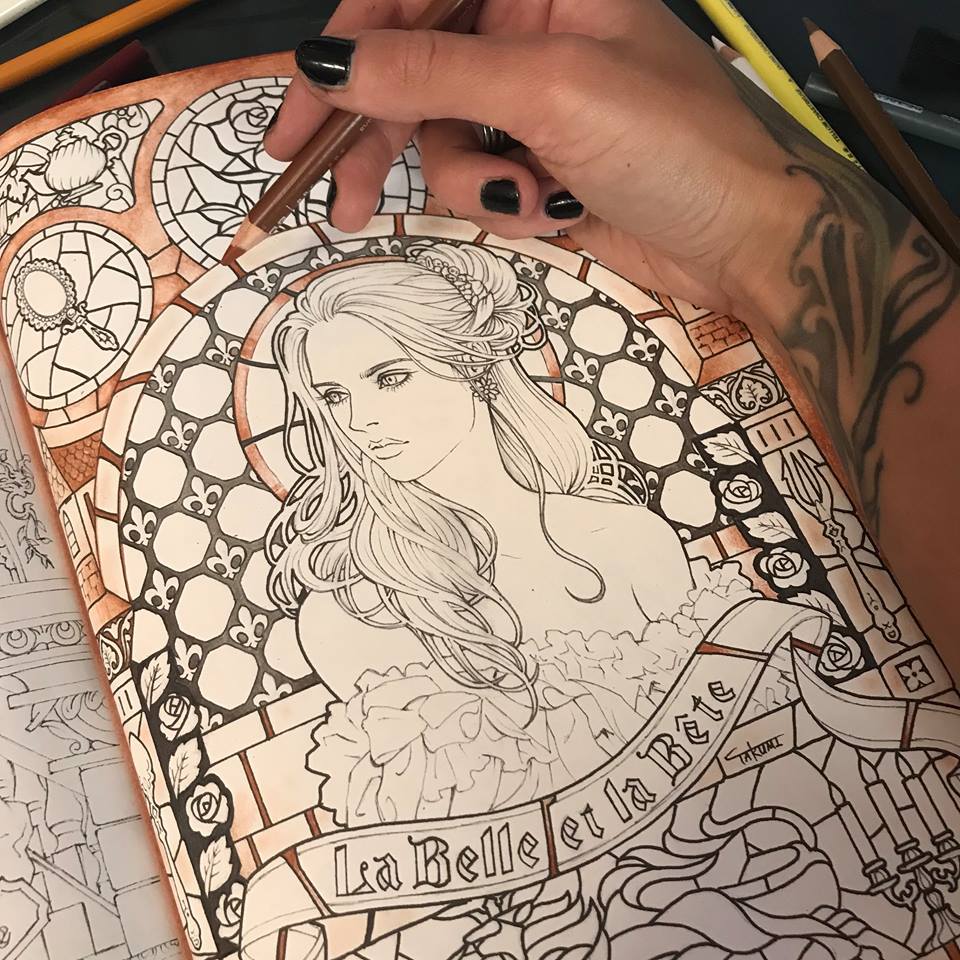
I don’t believe in pencil brands, but I do have my favorites in the towering piles of mixed and matched pencils, that occasionally collapse onto my work space and get pushed away with as a sweep of an arm. I tend to favor softer pencils that lay onto paper, colored or otherwise, almost like pastels, or oil paint. I decided to start with the background. I want it to be daytime and I want the stained glass window behind Beauty to be vibrant in color, but light in atmosphere. I begin with a soft grey.
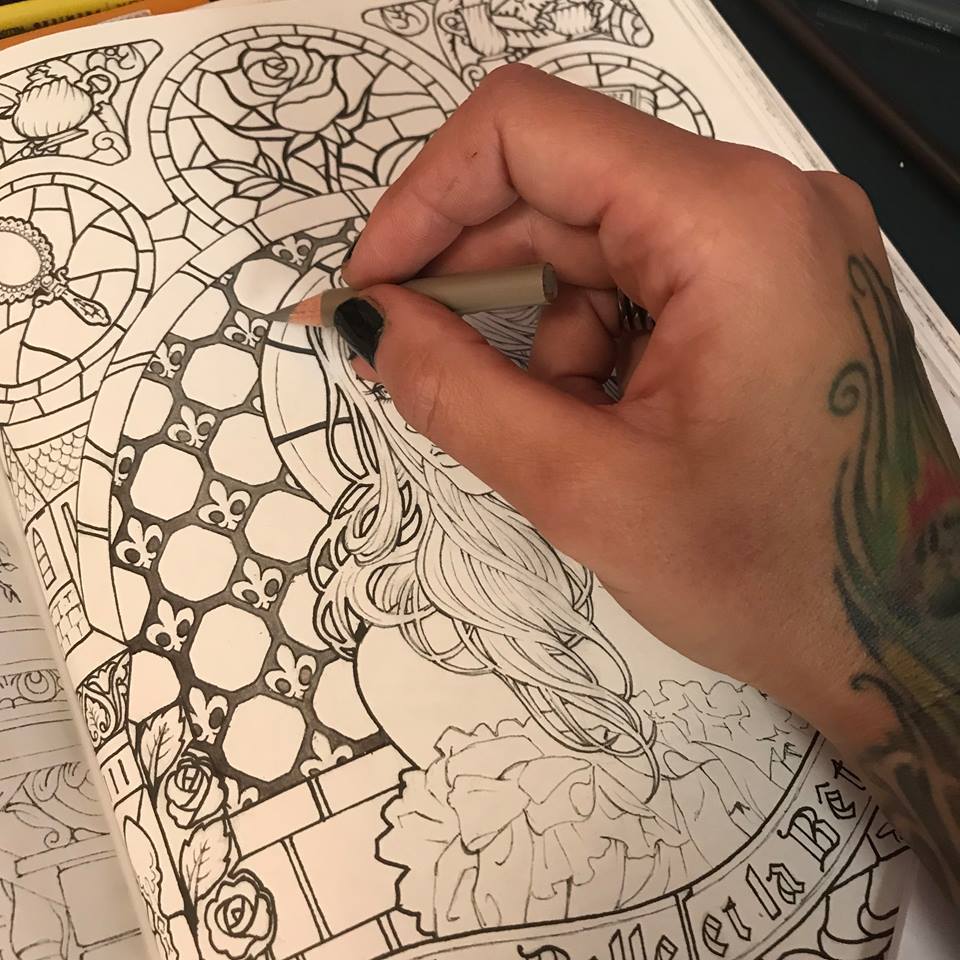
I now have a vision of what my stained glass window will look like. I imagine amber tones that are darker at the edges and golden in the center. I lay down a layer of auburn brown, kind of a middle town to my amber effect.
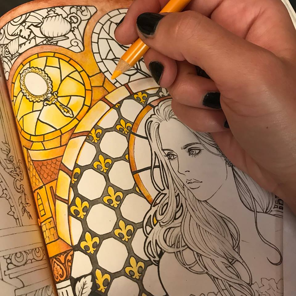
I proceed with a the brightest, most sunshine-like yellow I can find in my piles of art supplies, and I introduce the most vibrant tone of my honey glass.
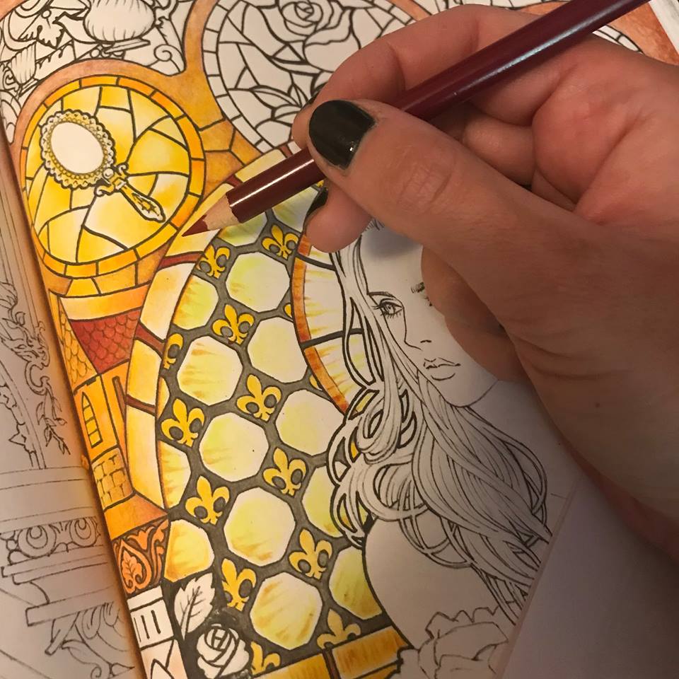
I contrast it with a deep burgundy, beginning to establish structure and give my glass some body.
I use the same burgundy to begin the rose.
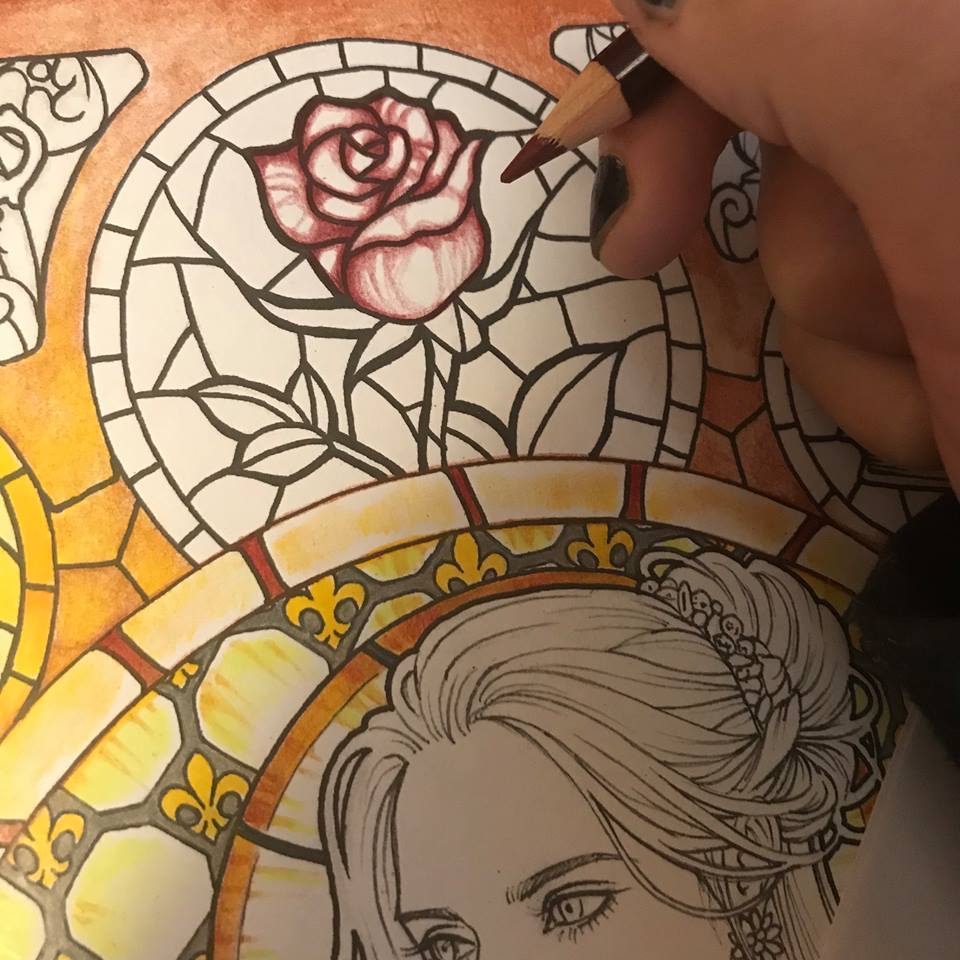
Here’s where having soft pencils comes in handy. I now use a light red for my next layer of the rose, using the pencil itself to bland the burgundy and create a nice gradient. In this particular case I am using Prismacolor pencils.
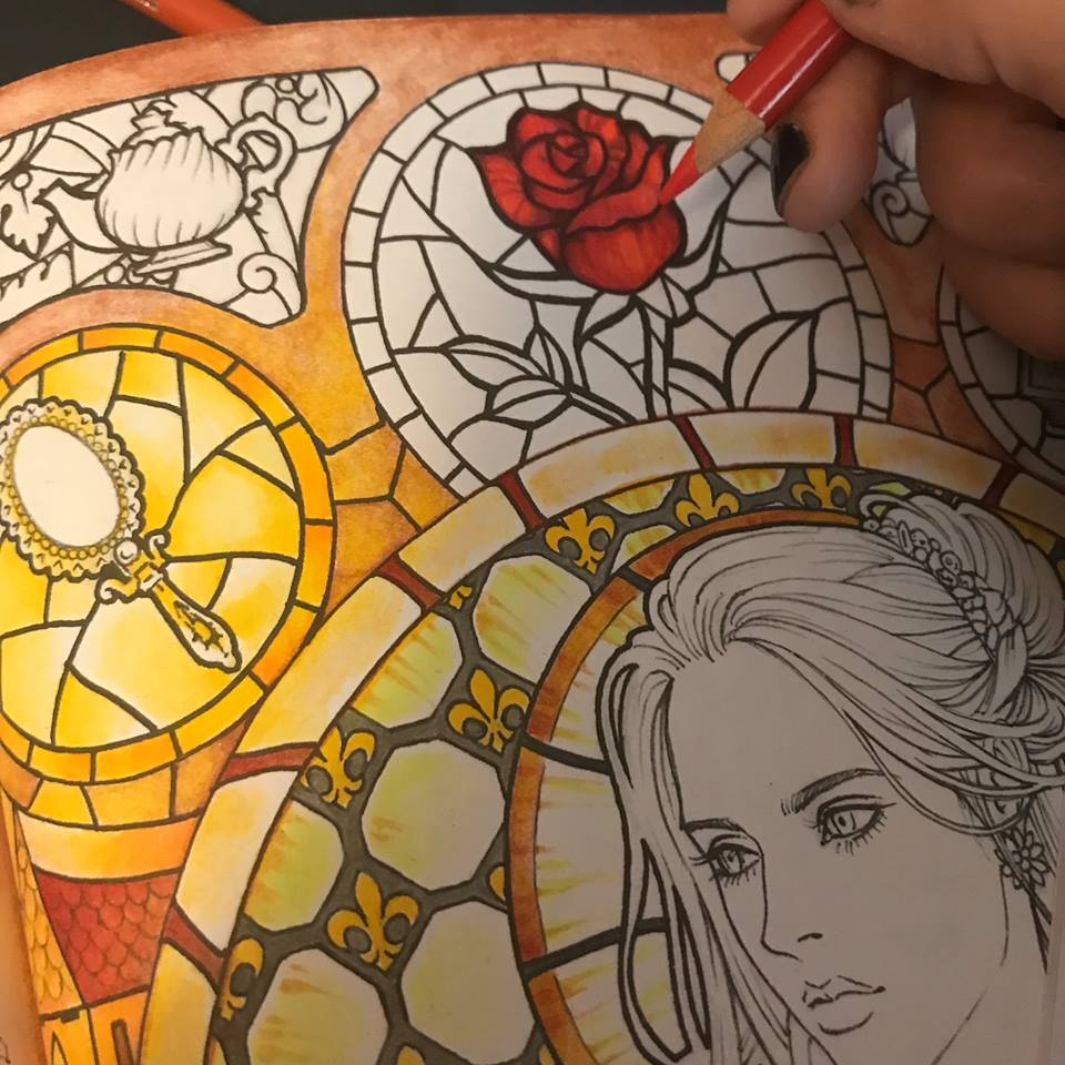
I find a deeper burgundy yet and add some more contrast to the rose. I want that light red to really look like it’s glowing in contrast to the darker reds.
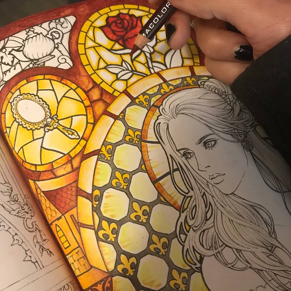
I approach the green leaves with the same principle of darker tones at the edges with lighter tones in the center. Here I use a turquoise green for the main color, the same dark burgundy for the edges and a touch of white for the center. Blending the whole time.
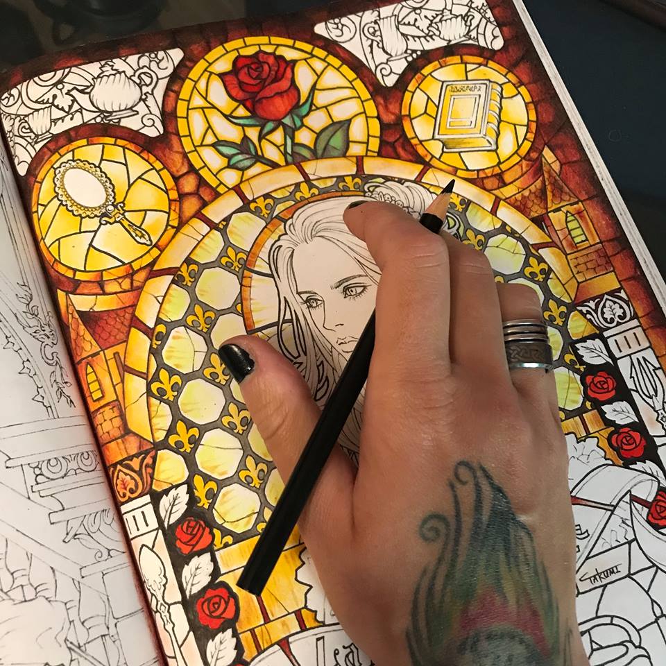
Now, because my artistic mind gets bored working on one element before moving on to another, I feel that I have enough background light and color established to begin coloring the face. I start with the same soft grey I used on the glass frame.
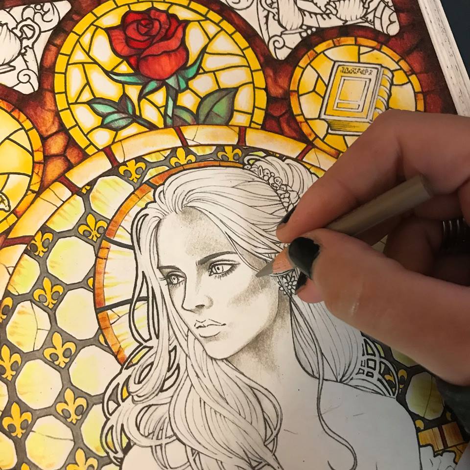
I then add some pale peachy pink as my main base color, playing a little bit with higher and lower saturation all throughout.
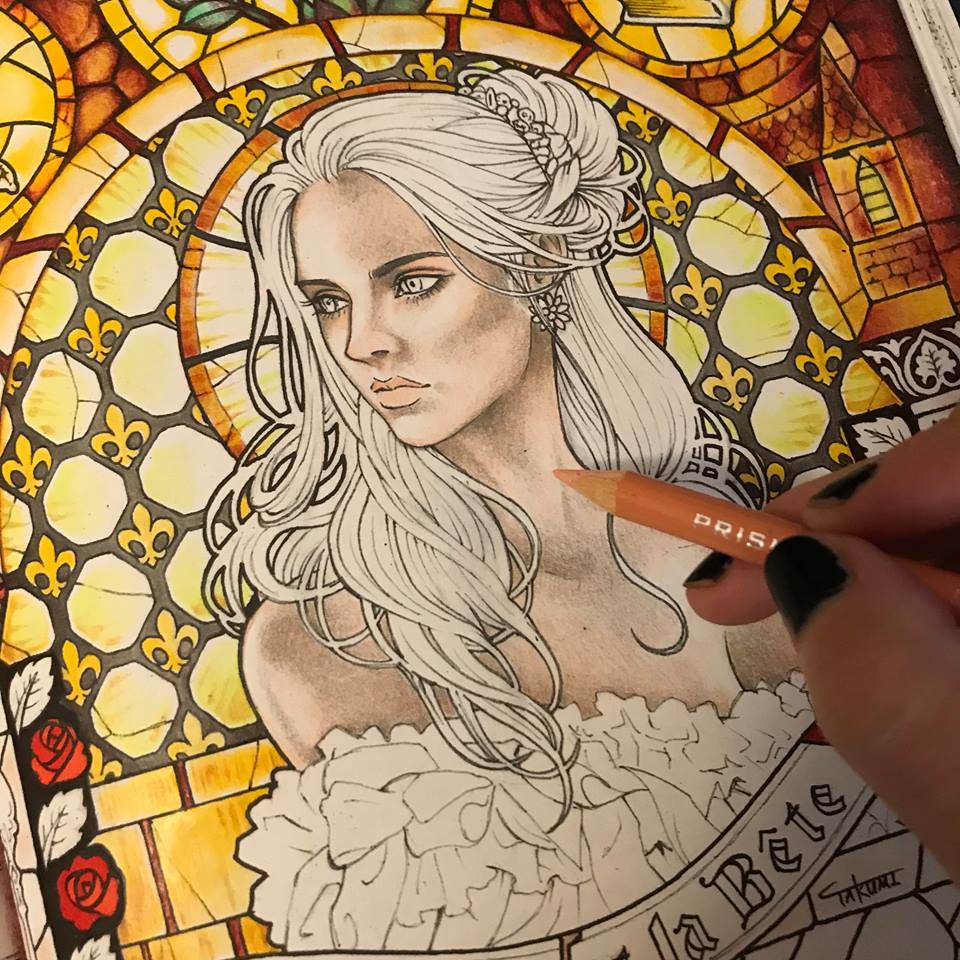
I move on to lilac. Just a few shadows here and there.
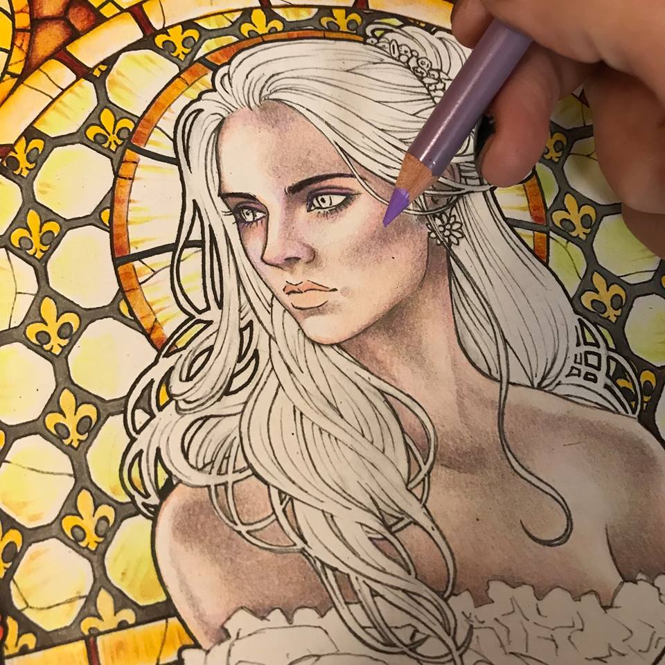
A touch of blue. Just a touch.
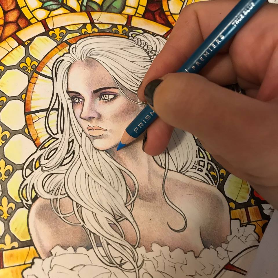
I use one of the lighter burgundy tones to give some volume to the cheek bones and also the eyelids.
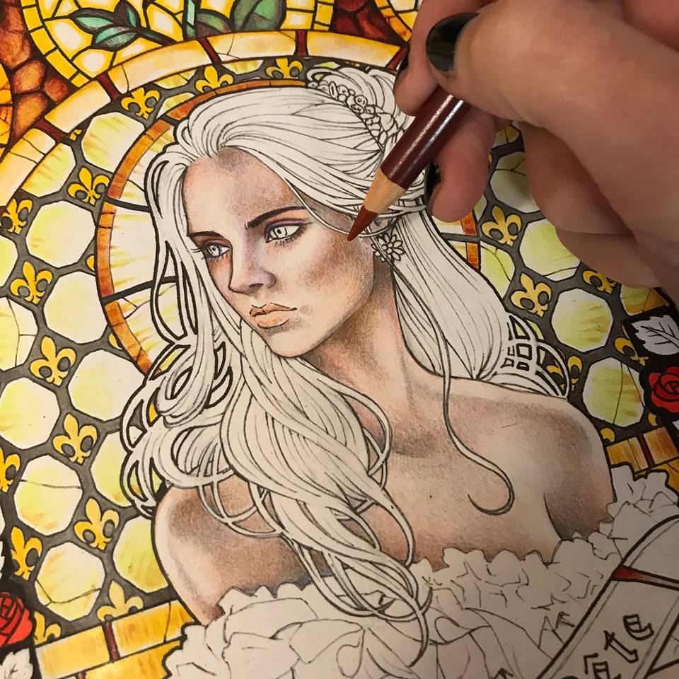
Now it’s time to define the eyes a bit more. I have already been building them up with greys and browns. Finally I add black.
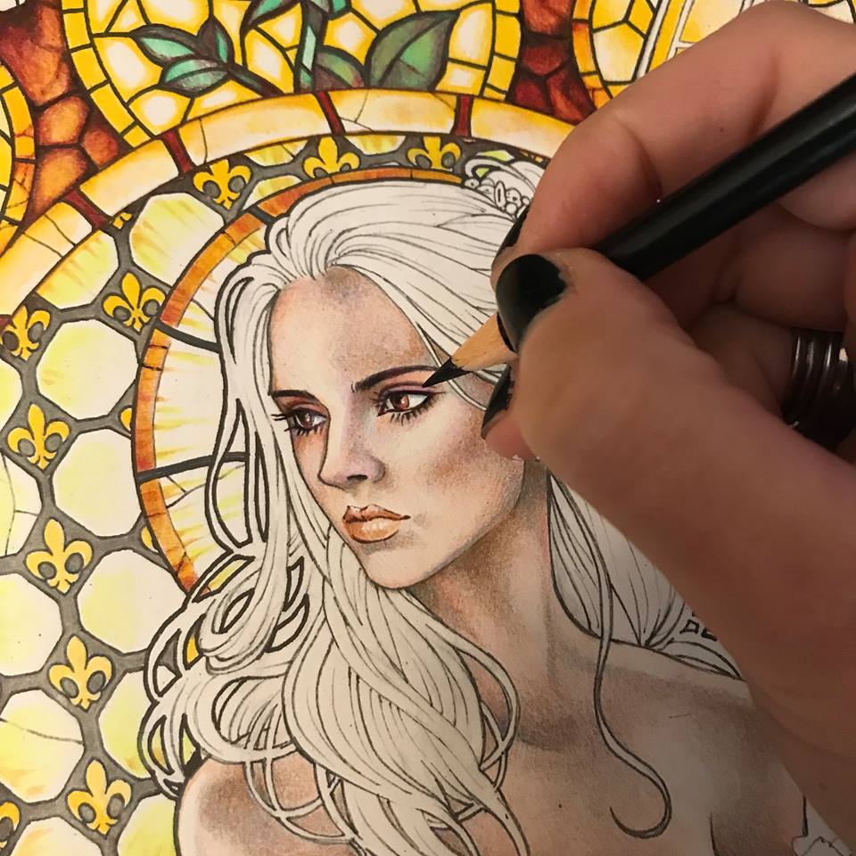
I look around at my yellow light and realize that her skin needs a lot more yellowish tones, so I add a soft layer of pale yellow.
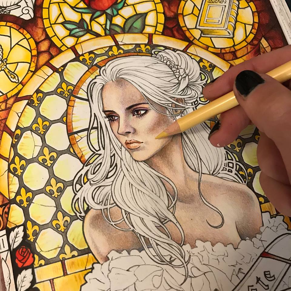
Now it’s time for the hair. I want her to have dark, but somewhat mousy brown hair. I begin with a solid layer or a dull light brown.
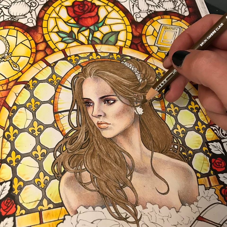
I proceed to give it volume by going over certain parts with a darker brown tone.
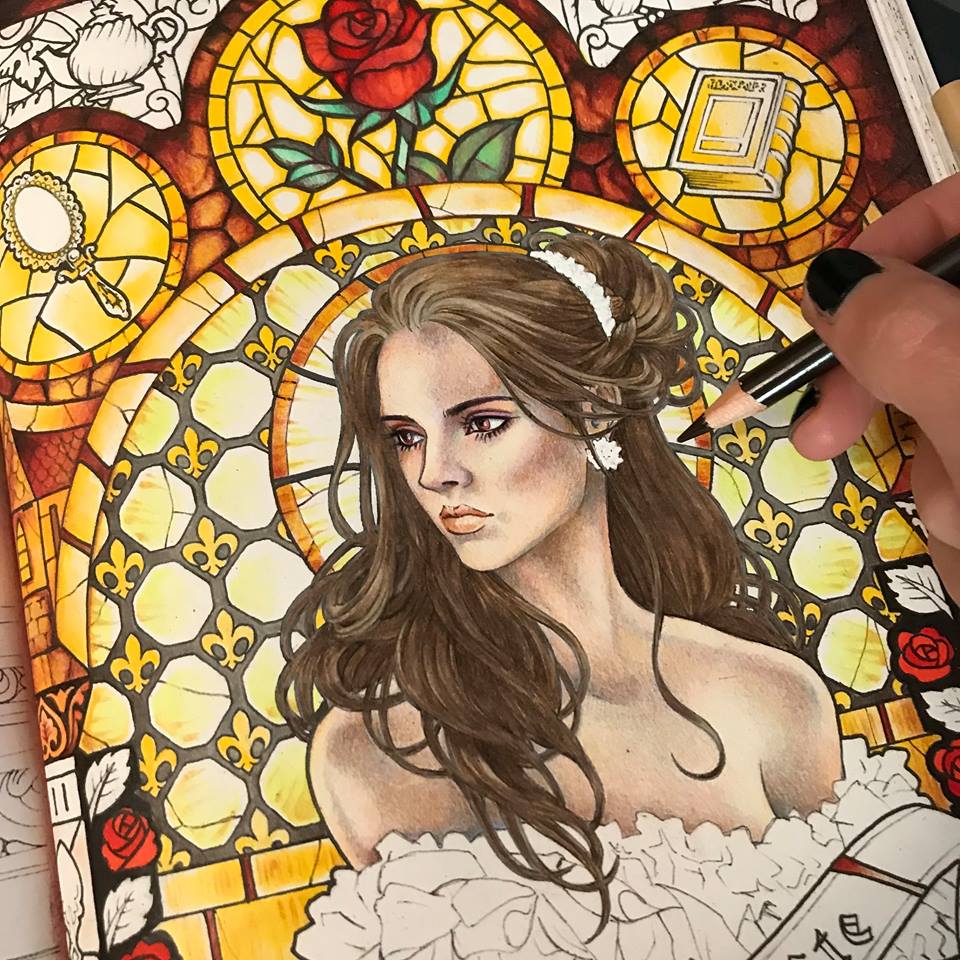
I emphasize the darker parts with actual black.
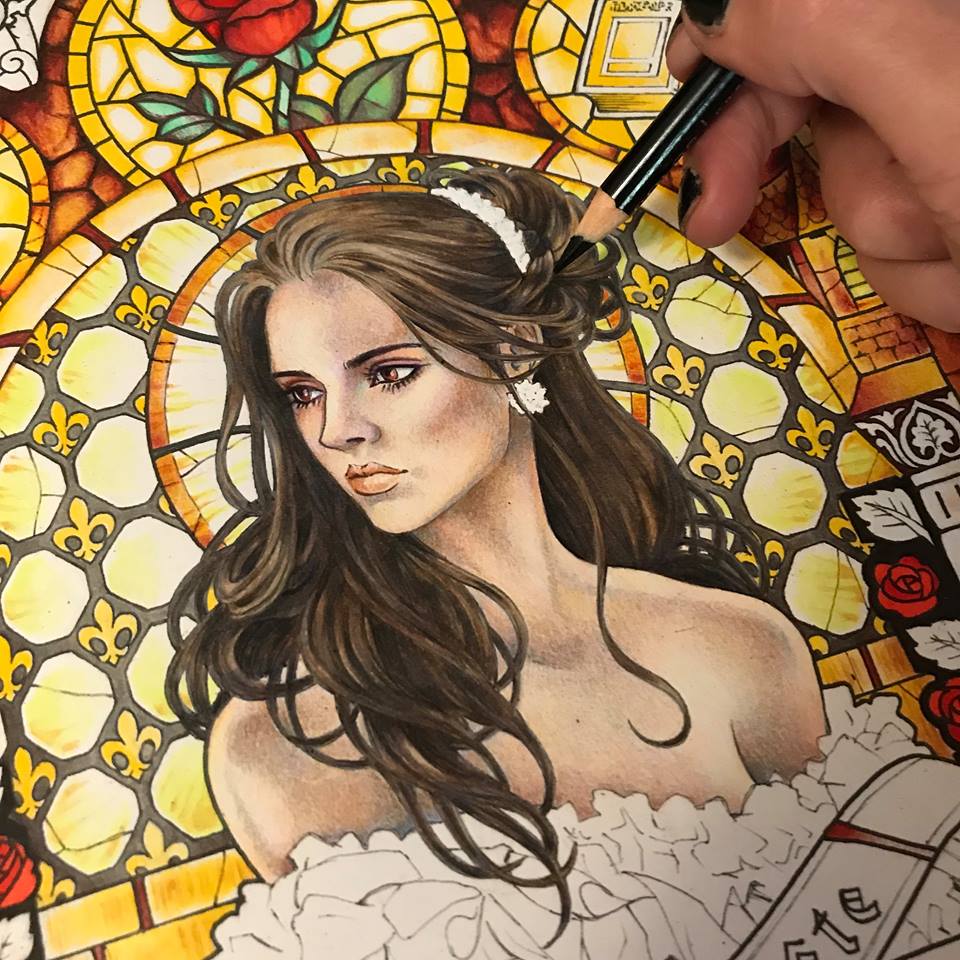
Now that her hair looks three-dimensional, I give it even more volume by adding an occasional white highlight. A soft white pencil is excellent for this purpose. It won’t actually “paint” white over your colors, but it will layer on a soft gentle highlight.
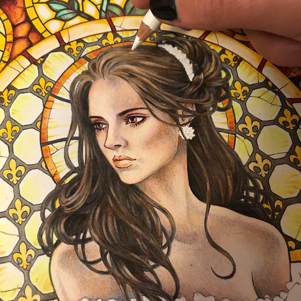
I look at her face and realize I want her to have more pink and peach tones. I want her to look alive and maybe even a bit flushed. Just a bit. I add some rose around her eyes, her cheeks, her lips and the tip of her nose. I also tweak her jewelry.
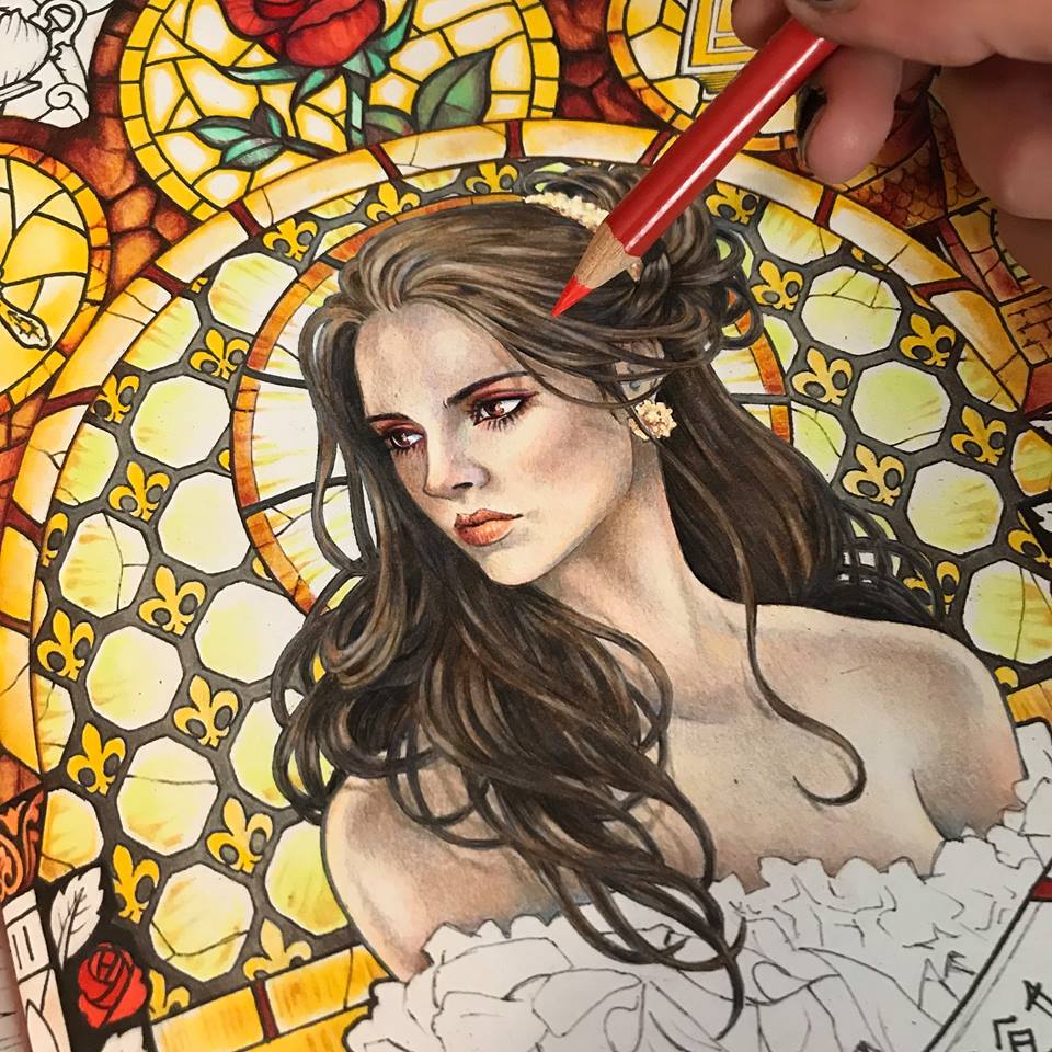
Now that I like her face and hair I feel that her outlines are too stark against the glowing background of the stained glass. The light does not look natural. I take a little bit of white acrylic paint onto a small brush and blur the edges around her hair where the light is the brightest.
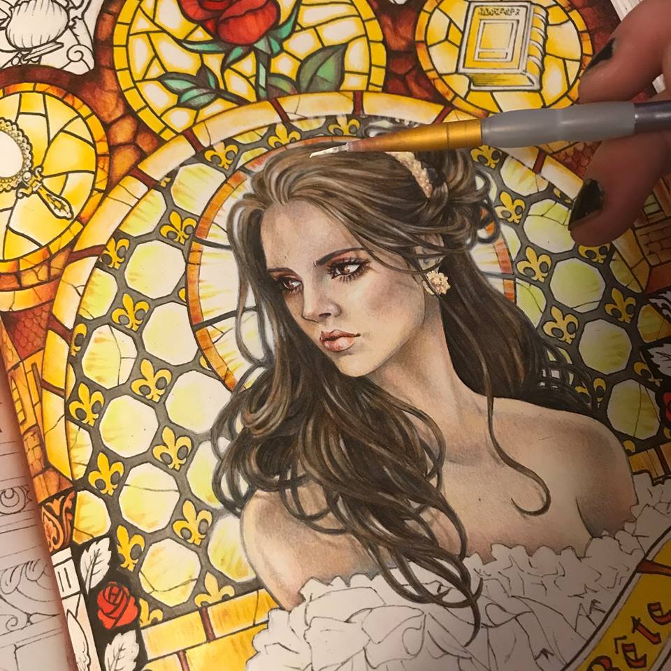
I decorate her dress with silk caramel colored ribbons to match her jewelry and return to the background. I feel that the whole composition is looking a bit monotone is all yellow and gold. It needs some zing. I decide that the turquoise green of the rose leaves needs to be balanced by similar tones. Just perfect to display our golden Beast.
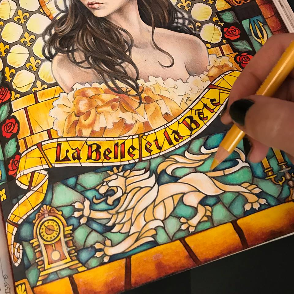
I notice that the stark yellow ribbon with bright red letters looks a little flat and boring, and way to bright. It was a good start, but it needs something else. I mute the colors with a white pencil and add some texture to the glass. You may have noticed that I have also been adding my own glass cracks and some occasional definitions missing in the original drawing. Just tiny tweaks along the way. I’ve also extended my stained glass pattern all the way to the edges of the page.
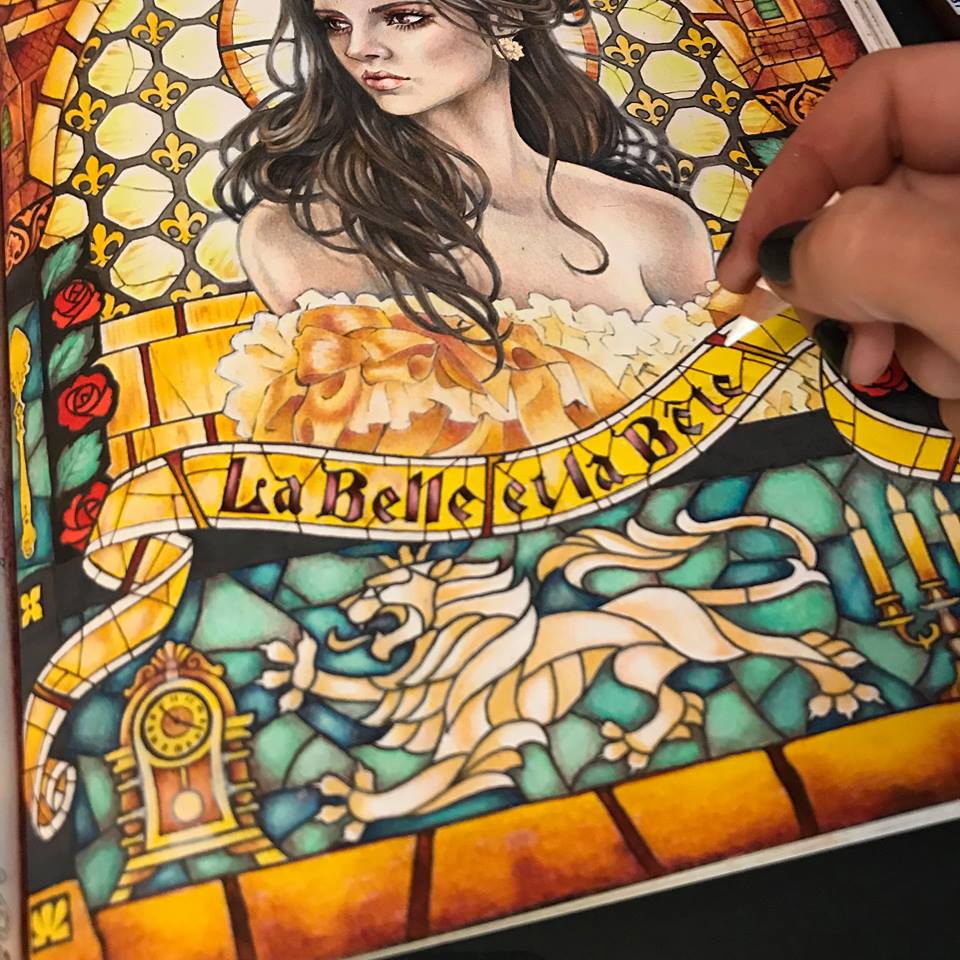
I now step back and look at my composition. The background is so vibrant it mutes all the intricacies of Beautie’s skin. She needs bold golden yellow highlights on her skin, mainly around the edges. That’s better.
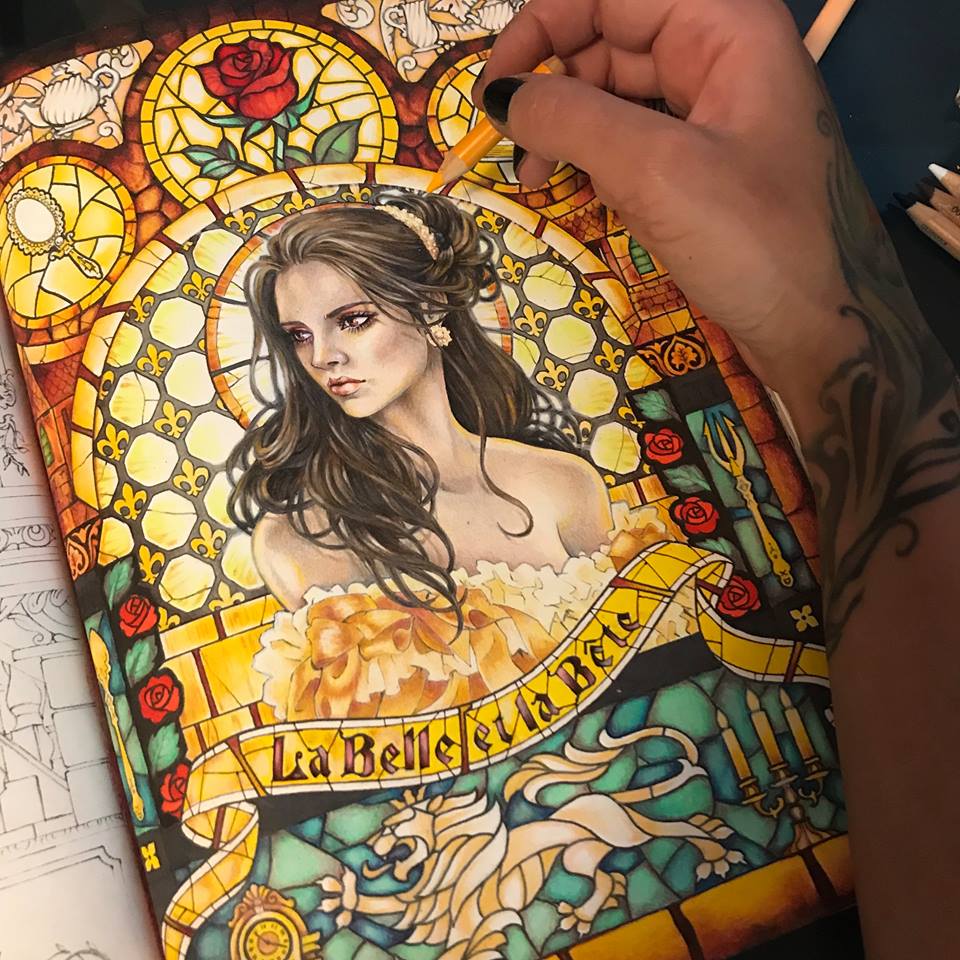
At last I think she is complete. I go over the entire page, scanning it, blending some parts with my rapidly disappearing white pencil, and adding the final highlights all over.
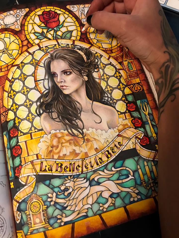
And there she is, in all her beauty, La Belle.
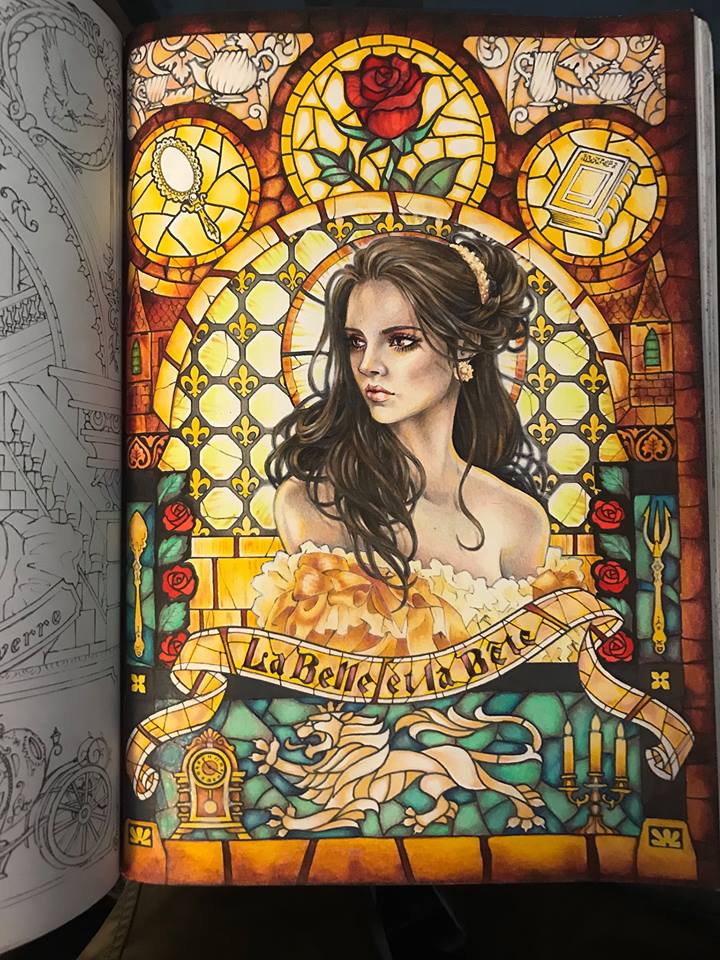
However, having spent three days on this image and feeling a bit overwhelmed by all these colors blasting back at me, I take a moment and run my photograph of the page through a black and white filter. That’s better. I can rest my overworked eyes now and just enjoy the darkness and contrast. If you’ve treated your light and color appropriately, respecting the light source and the saturation levels, resetting your image to black and white should not effect its appearance any more than a digital photograph of your own face may be effected by being suddenly switched to black and white. I rather like it this way.
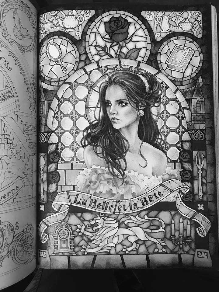
I hope you’ve enjoyed following me on this little adventure as I colored Takumi’s Beauty. I hope to see some of your lovely ladies in all their colors soon. Cheers, and happy coloring.
Many of you already enjoy my published coloring books and various individual coloring pages that I create from time to time to entertain my group members. I invite you now on a small journey behind the scenes of actually creating one of such pages. I create all of my line art designs in a program called Corel Painter, using a stylus to draw directly onto my Wacom drawing screen. (For a more technical description of the process check out my articles How I Paint Digitally and What Is Digital Painting)
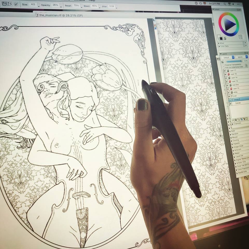
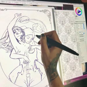 It all begins with an idea. Once I have a clear character concept in my head (which is teaming with ideas at any given moment) I open a new blank document and begin a rough sketch with my pencil tool set to a charcoal or a rough pencil, and usually in a color other than black. I tend to sketch in purple or brown. At this point I am only interested in working on the composition. I freehand my characters the way that I would on a notepad with an actual pencil. I erase a lot to correct my lines as I shape the desired composition. I continue sculpting in this manner for the next hour or so, depending on the complexity of my design. In this case, you will be following the creation of “The Musician” page for an upcoming book. Since this is a book project, instead of a blank page, I am working on a pre-made “frame” page that will be consistent throughout the book.
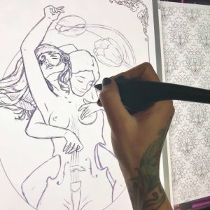 Once I have my composition I create a new layer. I dim the purple layer a bit, and begin drawing clean black lines over the transparent sketch. At this point I have my pencil tool set to “single, circular, (soft) cover” and, generally working on a 2400 x 3000 at a 300 px/in resolution, I set the pencil/brush in the range of 3.2 and 4.2 at a medium to lower opacity, with a rest value of 70%, bleed 40% and jitter at 0.04. The combination variations on these settings are of course unlimited, and every artist sets his own stats according to personal preference. This is by no means an instruction manual on how to set your controls. This is simply what I find to be the most effective given my screen with its wear and tear, the pressure of my hand as I draw, the current tip of my stylus, etc. These numbers are set and adjusted according to so many variables that it would take a book to explain it all. For our immediate purposes, let’s just say that I found my sweet spot and I work with it for best results and consistency, in coloring pages only. I have completely different preferences for other types of digital creations. As a matter of fact I have several palette layouts saved in my window arrangements, and I switch between them depending on my project.
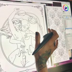 Once my clean black line work is done – a tedious and careful process – I can kill my purple layer. It is no longer needed. Of course I don’t have to erase it all together. I can dim it, or just make it invisible for the time being. Looking at just the black line work, I can see imperfections and inconsistencies. I now zoom in and out a lot, looking for anything that needs cleaner lines, smoother turns, etc. Because this is to be a coloring page, my lines need to be flawless.
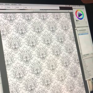 This particular book will be a character centered fantasy compilation, with each individual page presenting a new character drawn in a style closer to my natural drawing style rather than a traditional color-in mosaic page. However, to compensate for this fluidity that may be intimidating to some colorists, each page will also be embellished with elaborate background designs and patterns. Knowing that I will be drawing this character, I already created her background pattern days ago. All of my patterns are my original creations, drawn in the same manner as I am drawing this page, and saved as .jpg files for further use. Now that I have my background pattern, I can copy and paste it onto “The Musician”, resized, styled, and otherwise altered to suit my needs.
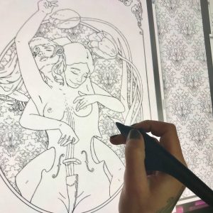 In this case, I minimize my pattern and make it into a gel layer, which I place under the main line layer. Now I can play with cropping and shaping it to appear just in the oval behind my characters. There are multiple ways of doing this. The first being simply starting my design with a patterned oval, then dimming it to comfortably draw my characters in a different layer, and once drawn filling my characters with white inside the outlines, and then bringing up the background pattern. There are many other methods of creating this effect using the fill tool and multiple layer arrangements, and even multiple file combinations, but I chose to do this in a bit of a primitive way this time. When I began this page I had a clear vision of my characters and their positioning in relation to each other and the page, but I did not yet know where and how I may use the pattern that I created days ago, or if I would even use that pattern at all. Having left my pattern work to the last minute, and having under-layed it in a gel layer, I just work around with my eraser tool, taking off all unwanted spill. A bit tedious, I know. With all this technology you would imagine that I can just click this and drag that and voila! a pattern fill, but no. Now I sit for nearly half an hour carving my pattern out to fit its shape. Sometimes that just feels like the better way to do it. This way I know I have complete control of my edges and their cleanliness.
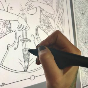 Now I look over my creation and take some time to add tiny detail and decoration. On this particular page, my characters are not wearing any fabrics nor ornaments, so my only decorative bits are the cello details. In some cases I like to draw very fine lines in the hair, giving it shape and volume that is almost realistic, but in this case the background is too thin and busy. If I add many new lines to the characters’ hair, It will be difficult to see its general shape. I chose to leave the hair on both girls nearly blank, with just enough lines to define its structure, allowing the colorist variation in coloring style. There will be many more characters in this book with very finely drawn hair.
Finally, when all is done, I create yet another layer to give my line work more definition. In these complex compositions with multiple layers of fine detail, I like to use lines of various thickness to make the design “readable” and not overwhelmingly complicated. I carefully outline my two main characters and the two tulips with a thicker liner. I take yet more time to slowly revise every single line at a very close zoom. This is the most important part of the entire project. Usually I leave it to another day. After having worked on this page for so long, it is difficult to see mistakes or imperfections. After I’ve been away from the image for some time, I review it again with a fine toothed comb. When I am satisfied that there are no artifacts, spills, or ghost lines, I fuse all my layers into one and save my .riff creation as a .jpg copy. I actually print the image on my layer jet home printer to make sure that on paper it looks exactly as it does on the Wacom. Looking at a printed version may also reveal imperfections that I failed to see on the glowing screen that I’ve now been staring at for days. If any final imperfections are located, I make the necessary adjustments, make more test prints until I am happy with the result, save my image as a PDF file, and it is now ready for publication.
I hope you enjoyed this little journey along with me as I drew “The Musician”. In a couple of months you will see it among several dozen other images in the new book flip-through.